

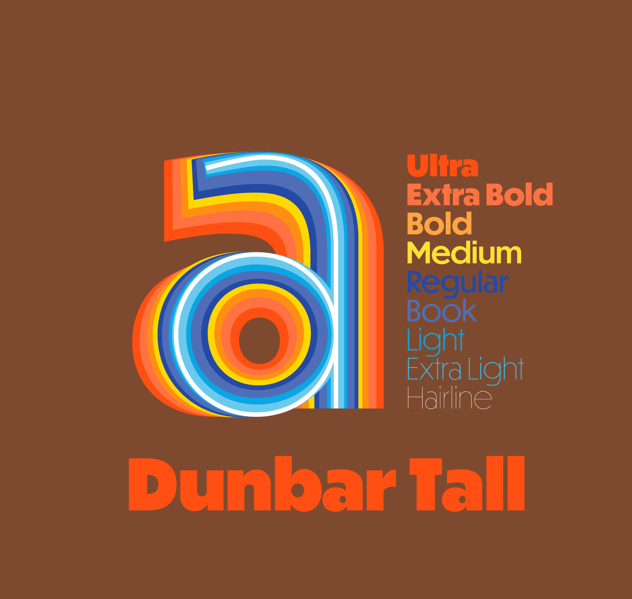
Dunbar Design Features
Dunbar is an exuberant geometric sans with a unique structure, including Tall and Low display versions for large sizes and a Text version for smaller sizes. Inspired by Jakob Erbar’s Erbar-Grotesk, it is not a strict revival but interprets the design for contemporary applications, rediscovering some of Erbar’s innovative ideas of alternate letterforms and proportions.
Optical Sizes

Dunbar Low is expressive in its vertical rhythm and works well with generous vertical space on a page, such as in section openers for editorial or exhibition signage. Dunbar Tall, with its maximal x-height creates a dense line of text for a strong impact and an economical use of space. For smaller usage, Dunbar Text completes the series with less extreme proportions and more breathing space around it, while staying expressive and harmonious with the rest of the Dunbar series.
Terminals
Dunbar Low features radial terminals resulting in rounder forms while Dunbar Tall has vertical terminals enabling more compact settings. The respective other forms are available as stylistic alternates and grouped in Stylistic Set 5 (SS05).

Optically Adjusted Caps
In Dunbar Tall, some uppercase letters needed to be optically adjusted to better harmonize with the very large x-height of the lowercase. The respective alternate forms are available in all fonts via Stylistic Set 04 (SS04, see below).

Case Sensitive Forms
If you apply all-caps styling to text, an OpenType feature will change the default form of punctuation to one that better fits uppercase letters (CASE feature).

Fractions, Superiors, and Inferiors
Dunbar includes OpenType features to set proper fractions (FRAC, NUMR and DNOM feature), along with superiors (SUPS feature) and inferior numerals (SINF feature).

Stylistic Alternates
Dunbar Tall and Low include sets with stylistic alternate glyphs for umlauts and diëresis in which the trema is lowered using Stylistic Set 03 (SS03, see below). This is handy for texts with tight line spacings where vertical clearance could be an issue or in expressive display use cases.
 Alternate terminals can be accessed via SS05.
 All fonts also include an optional single story a (SS02) as well as alternates for all-caps settings (SS04), full-width en and em dashes (SS18), real primes (SS19), full-sized registered glyph (SS01) and a slashed zero (ZERO feature).

Discretionary Ligatures
Traditional German ch and ck ligatures are included in Dunbar as discretionary ligatures, so if you're typesetting a Drucksache you'll be covered.

Italic Forms
Dunbar italic styles use alternate forms for a, b, e, and M
 The Tall and Low italics have a subtle but effective 6 degree slant for display use, whereas the Text styles have a 10 degree slant which is optimized for use at smaller sizes.

Extended Character Set
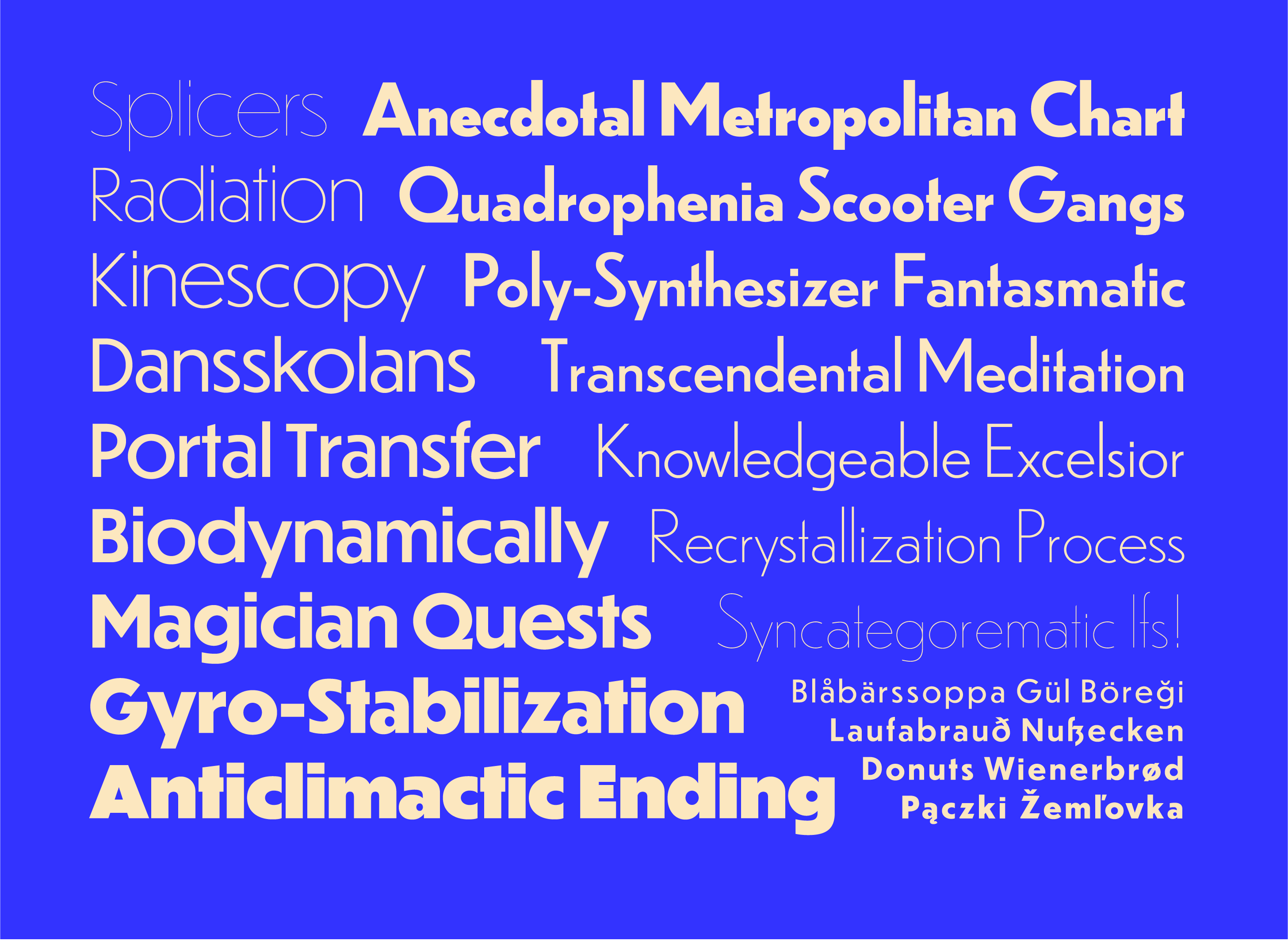
Dunbar’s extended Latin character set covers most Western and Eastern European languages along with multiple sets of numerals and punctuation.
fffiflffiffl ch ck
Supported Languages are Afrikaans, Albanian, Basque, Belarussian, Bosnian, Breton, Catalan, Chichewa (Chewa, Nyanja), Croatian, Czech, Danish, Dutch, Flemish, English, Esperanto, Estonian, Faroese, Fijian, Filipino, Finnish, French, Frisian, Galician, German, Greenlandic, Hawaiian, Hungarian, Icelandic, Inari Sami, Indonesian, Irish, Italian, Kashubian, Kurdish, Latin, Latvian, Lithuanian, Lower Sorbian, Lule Sami, Luxembourgish, Malay, Maltese, Maori, Northern Sami, Norwegian, Occitan, Polish, Portuguese, Provencal, Romansh, Romany, Samoan, Scottish Gaelic, Serbian, Slovak, Slovenian, Sotho, Southern Sami, Spanish, Swahili, Swedish, Tswana, Turkish, Turkmen, Upper Sorbian, Walloon, Welsh, Wolof, Yapese.
Get DunbarOn Erbar and Early Geometric Sans Serifs
Sans serifs were still a rather new genre of typefaces at the beginning of the 20th century. The vernacular grotesque style — occasionally crude, usually fat, often compact and with straight-sided rounds — had made them popular for advertising and other eye-catching display typography. But there were two alternative strands developing in the 1910s and ’20s. The English, spearheaded by Edward Johnston and later Eric Gill, were looking for a more readable style of grotesques based on traditional models of calligraphy (see Johnston’s alphabet for the London Underground for instance, or Gill Sans). In Germany on the other hand, modernists were calling for new letterforms that could express the feeling and style of the time and would not cite historic models as much as traditional text typefaces or the forms proposed by the English designers.
Jakob Erbar’s Erbar-Grotesk was one of the first proposals for a sans serif in the new, simplified, modern style. It is not as radically constructivist as other experiments of the time though, perhaps because Erbar already had some experience in drawing/designing typefaces as well as training in calligraphy and lettering.
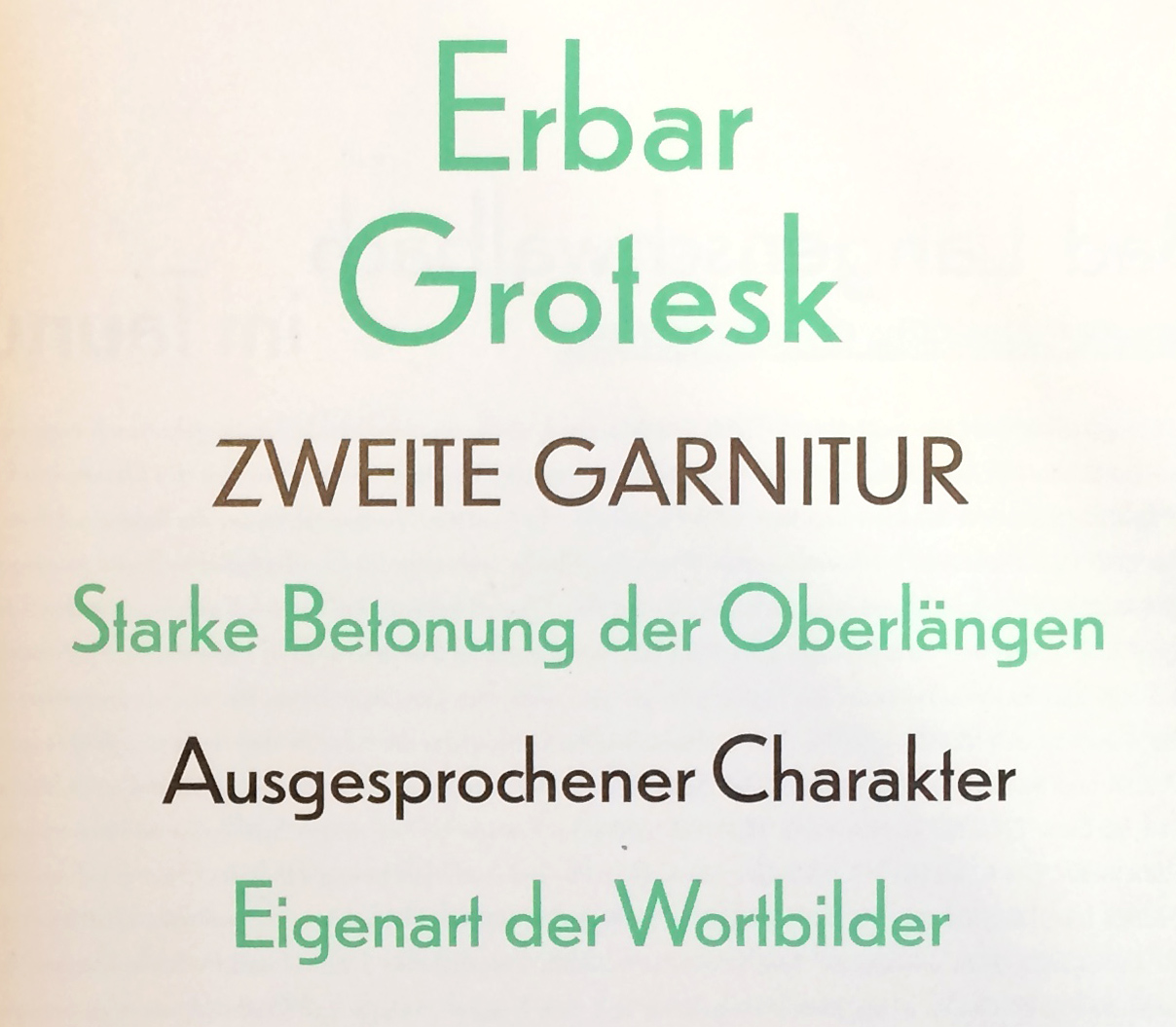
Born 1878 in Düsseldorf, Jakob Erbar trained as a typesetter and worked as an educator at the Düsseldorf school of printing, and later as professor at the school of arts and crafts in Cologne. His first typeface was the innovative sans serif with stroke contrast Feder-Grotesk in 1909 — back then the first typeface in this style, which was later popularized by Lydian and has recently seen a remarkable revival. A chancery blackletter (Erbar Kanzlei, 1913) and a serif family (Erbar Mediaeval, 1914) followed before Ludwig & Mayer published Erbar’s Lichte Fette Grotesk, a striking inline display face, in 1923.
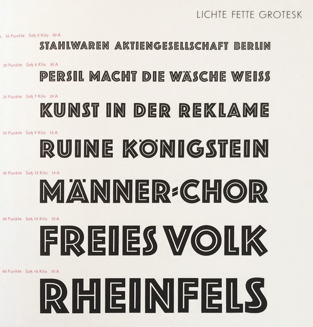
Lichte Fette Grotesk – a rather generic name translatable into Bold Inline Grotesk and known as Phosphor abroad — can be regarded as the prelude to Erbar-Grotesk. It originally consisted of capitals only. (Later, a lowercase seems to have been added somewhere along the way). As with many typefaces by Erbar, it had alternate glyphs available, in this case versions with straight or diagonal terminals for K R Y as well as an narrow alternate S. The basic forms are very similar to the later Erbar-Grotesk bold styles.
Although Erbar-Grotesk is generally dated to 1926 (some mention October 1925), Jakob Erbar claims to have worked on a modern sans serif as early as 1914, interrupted by WWI (see: Walter Tracy, Letters of Credit, p 93), definitely in the 1920s though as this sketch from 1922 suggests — thus before any of the other geometric typefaces were released.
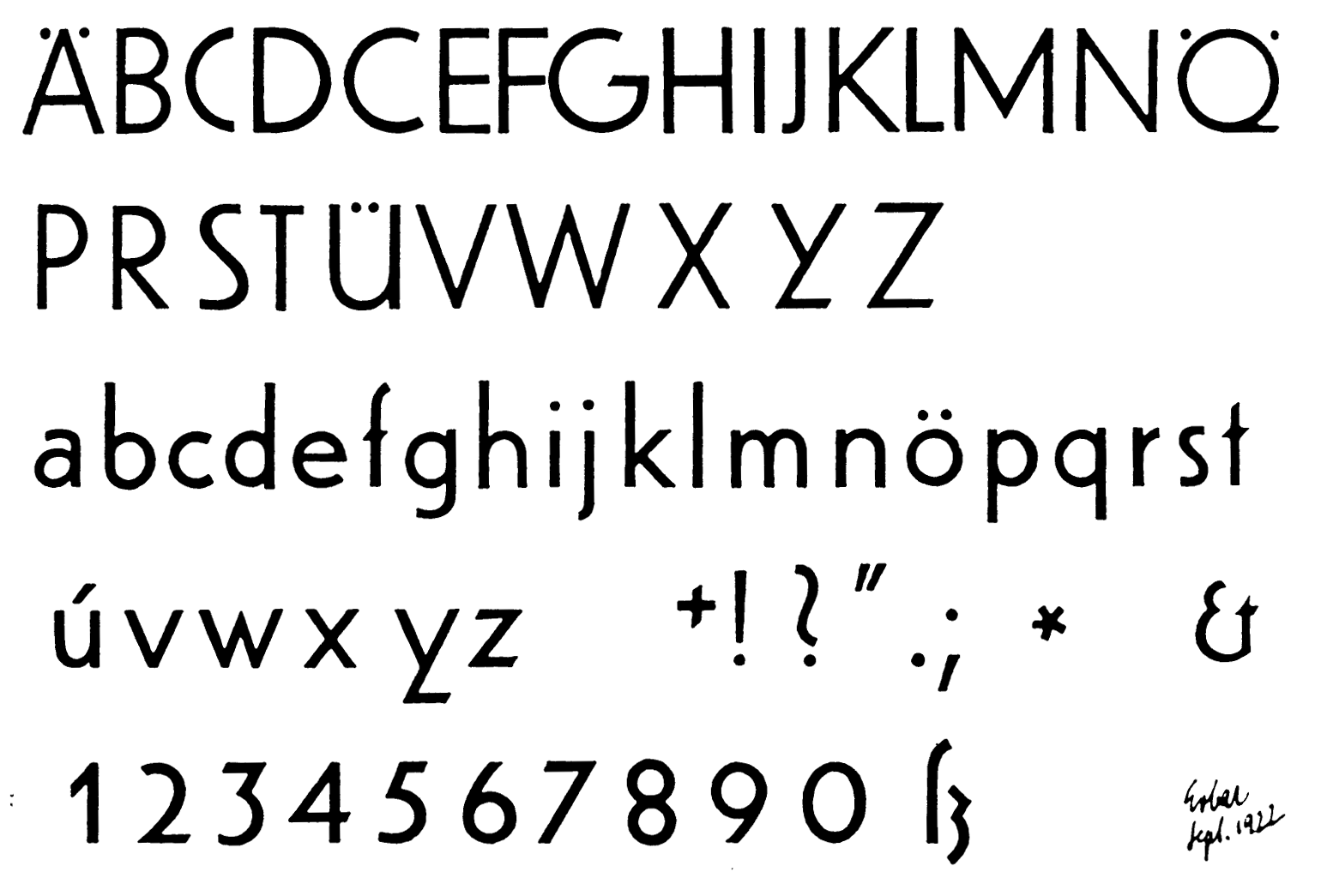
These drawings show a moderate geometric construction by someone who seems to know calligraphy and classic proportions of letterforms. After all, he was a student of Fritz Ehmcke and Anna Simons, who in turn were students of Edward Johnston. (Compare Erbar’s drawings to early sketches for Futura by Paul Renner for instance.) Much less radically constructivist than Herbert Bayer’s experiments at the Bauhaus, Erbar incorporated classical proportions of the capitals, slight optical corrections where rounds or diagonals meet straight stems, and most iconically, a two-story a where other geometric types usually preferred the single story form. This pot-belly-like a is now often referred to as ‘Erbar-a’ since it is a signature feature in almost all of his typefaces.
The initial release included regular and bold weights and a knocked-out all-caps display style called Lucina, followed by a light weight and italic in 1927. The comparably low x-height of Erbar-Grotesk was a common trait at that time, but Erbar and Ludwig & Mayer went even further and offered Erbar in two sets: Set I with “normal” (low) x-height, and Set II with especially low x-height. Plus, there was an Extra Set with matching caps for Set II, as well as alternate forms for capitals A M N V W with pointy apexes and vertices. (As typically for foundry type, the actual proportions differed slightly across point sizes, with comparably larger x-height for text sizes and lower x-height and tighter spacing for larger point sizes.)
Another key design feature of Erbar-Grotesk is the distinct ß. You can still find it widely on Berlin street signs for which Erbar-Grotesk was the model, slightly differently adapted in former East and Western parts of Berlin. The classic roman proportions of the caps make Erbar-Grotesk also very well suited for use in all-caps setting. Jakob Erbar designed several all-caps display variants to go with his Grotesk family: the already mentioned Lichte Fette Grotesk (bold inline style, 1923) and Lucina (knocked-out white on black with border elements, 1926), Lumina (with heavy outline, 1928) and Lux (open inline thin-thick version, 1929)
After the release of Erbar-Grotesk, and especially Bauer’s Futura in 1927, the genre became highly popular. Almost every German foundry quickly followed suit and added a geometric sans serif to their catalog. Also geometric (all-caps) display typefaces in the style of Fette Lichte Grotesk, Lumina etc. were published widely. Nevertheless, Erbar and Futura, together with Kabel, became the most popular ones and were also available abroad, increasingly popular in the US (while the UK remains a Gill-Sans-nation to this day).
By 1930 — the heydays of geometric sans — the Erbar-Grotesk family was remarkably extensive, offering four weights, two of them in three different sets, italics and a condensed variant in two weights, plus the four separate display styles. In 1931, Erbar-Grotesk also became available for the Linotype system in sizes as small as 6 pt (4 pt for hand composition!). Many characters were available in alternate forms, for instance a single-story a, a spurless u, A M N V W with pointy apexes, a M with splayed stems, or a Y with horizontal base.
Although the first of its kind and certainly popular until the 1950s, Erbar-Grotesk ended up in the shadow of Futura, especially internationally. Perhaps also because of Tschichold’s endorsement of Futura in die neue typography. Tschichold, in his influential 1928 book, mentions Erbar and Kabel as being too much of a Künstlerschrift, feeling too designed. For him Futura was the best of the new geometric sans but he still preferred the original nameless grotesques.
Swiss archivist Philipp Messner adds, that Erbar-Grotesk was quite popular in Switzerland in the 1940s and 1950s, e.g. used on many forms and documents, but fell out of favor in the 1960s and was replaced by Helvetica — a fate that most geometric sans serifs shared. Until their glorious, overarching revival in the 2010s.

Designing Dunbar
The idea for Dunbar came up in a conversation with Indra Kupferschmid in early 2015 about iconic sans serifs and the original metal version of Erbar-Grotesk. And in a way, it stayed a conversation, with the typeface. Dunbar is not a strict revival of Erbar. It is inspired by its design but just as much by its concept of variations and alternates in form and proportion that seemed just made for today’s type technology and easy implementation in OpenType. Jakob Erbar was ahead of his time devising a desire for, and offering different sets and alternate glyphs that can very drastically change the character of the whole typeface.
I started out working quite closely off high-res scans of Erbar-Grotesk specimens in various sizes. As common with handset metal type, the proportions and spacing across point sizes differ significantly if you compare the 5 pt version with display sizes for instance, and I had to decide carefully what sizes to base my versions on. Ludwig & Mayer did an astonishingly good job at adapting the design for text sizes, for instance by increasing the x-height, adding more optical corrections at joints, and loosening the spacing. You wouldn’t think that a geometric sans could make for such a pleasant, legible text face for body copy or marginalia but metal Erbar did. When looking at all of the variations across sizes and weights and alternate cuts throughout the years, I had to make decisions about which characteristics I wanted to preserve and how I wanted to structure my interpretation for contemporary use. I imagined how designers would want to use such a typeface today and what is possible with current technology.
I was drawn to the extremely low x-height which had such a nice vertical rhythm, but I knew this alone would have limited uses. So I wanted to explore the designspace of a variable x-height. When I designed versions with the x-height pushed to a very tall extreme it reminded me of what happened in the ’60s and ’70s with phototype versions of iconic typefaces, which had a completely different feel than the original designs they referenced. Both of these Low and Tall extremes were interesting to me and I thought that developing both of these display variants could make for an interesting family. To round out the series I designed a companion Text version for smaller sizes.
All three variants are available in a wide range of weights: Dunbar Tall in nine weights from Hairline to Ultra, Dunbar Text in Regular, Medium, Bold and Extra Bold, and Dunbar Low in seven weights from Hairline to Bold. All fonts in the sub-families contain a number of alternate characters and OpenType features that were originally available for Erbar-Grotesk and more.
Dunbar is a type family for Akzidenzsatz — a jobbing face for display use and short texts, labels, banners, posters, packaging, etc. It can be retro in more than one way and contemporary in another. At least this is how I imagine it. I can’t wait to see how you use Dunbar.
Get DunbarFootnotes
-
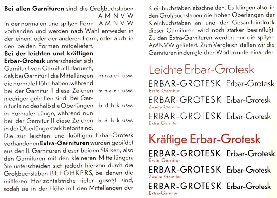
Translation: “In all sets, the capital letters A M N C W are available in their standard and pointy [peaked] Form and can be supplied either in the first, or latter, or both forms. In the light and regular Erbar-Grotesk weights, Set I and Set II differ regarding their x-height. In Set I, the letters m n a e i etc. feature the standard x-height while in Set II, these glyphs are kept lower. As a result, the ascenders of b d h k etc. in Set I are of normal length, while in Set II they appear to be strongly emphasized.
The Extra Sets available for light and regular Erbar-Grotesk were formed from Set II of those two weights, thus the sets with the lower x-height. They differ from them in the capital letters B E F G H K P R S who’s mid horizontal strokes [waists] were lowered so that they close up with the x-height of the lowercase. Thus the long ascenders of the lowercase are reflected in the uppercase and the general impression of this set is further intensified. For the Extra Sets, only the pointy form of capitals A M N V W are supplied. For comparison, we present the same words in the showing below.” - Early German Geometric Sans Serifs: Kabel from Klingspor in 1927, Stempel Elegant-Grotesk 1928, also Berthold Grotesk 1928, Nobel from Lettergieterij Amsterdam in 1929 (an adaption of Berthold Grotesk), Linotype/Stempel’s Neuzeit-Grotesk in 1929/1930, Super-Grotesk from Schriftguß KG 1930, Polar-Grotesk (aka Wagner’s Kristall-Grotesk) by John Söhne 1930, Rhythmus from Schelter & Giesecke 1931, Weber’s Rund-Grotesk 1931, Stempel’s Reform-Grotesk B 1931 (geometric adaption of their older grotesque), Atlantis-Grotesk by Woellmer 1933, also Friedrich-Bauer-Grotesk, Trennert, 1933, or, late to the game, Ludwig Wagner’s Fundamental in 1938. (Dates refer to first styles published, source: Seemann Handbuch der Schriften)
- Tschichold writes: “There is no doubt that the sanserif types available today are not yet wholly satisfactory as all-purpose faces. The essential characteristics of this type have not been fully worked out: the lower-case letter especially are still too like their “humanistic” counterparts. Most of them, in particular the newest designs such as Erbar and Kabel, are inferior to the old anonymous sanserifs, and have modifications which place them basically in line with the rest of the “art” faces. As bread-and-butter faces they are less good than the old sans faces. Paul Renner’s Futura makes a significant step in the right direction.” (From the translation by Ruari McLean, University of California Press, 1995)