“I'd buy that for a dollar”
Would anyone actually want to buy an “interpolation error” of a single glyph for $1? What if it came in the form of an OpenType 1.8 Variable Font, or “Super Font”, a new font format which was just released?
Well, we can find out, because now is your chance to buy an interpolation error of one single glyph, in a range of weights all stored in a single file, in this new font format. Or, if you want to buy the error-free version which interpolates smoothly you can buy that too.
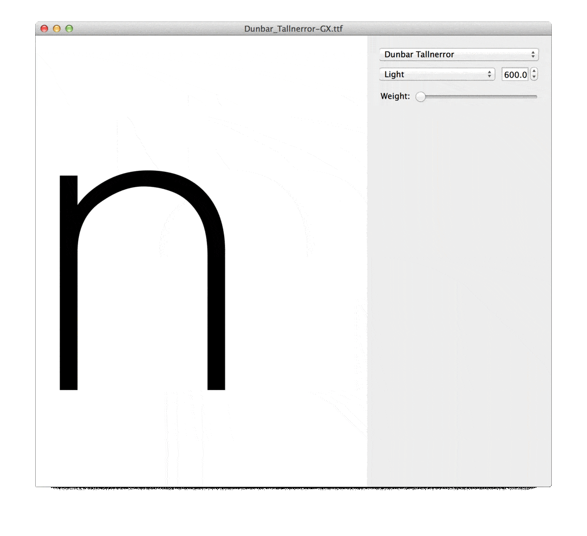
Dunbar “n” with interpolation error
A font with one single glyph “n” with an interpolation error, in “Super Font” format (aka OpenType 1.8 Variable Font)
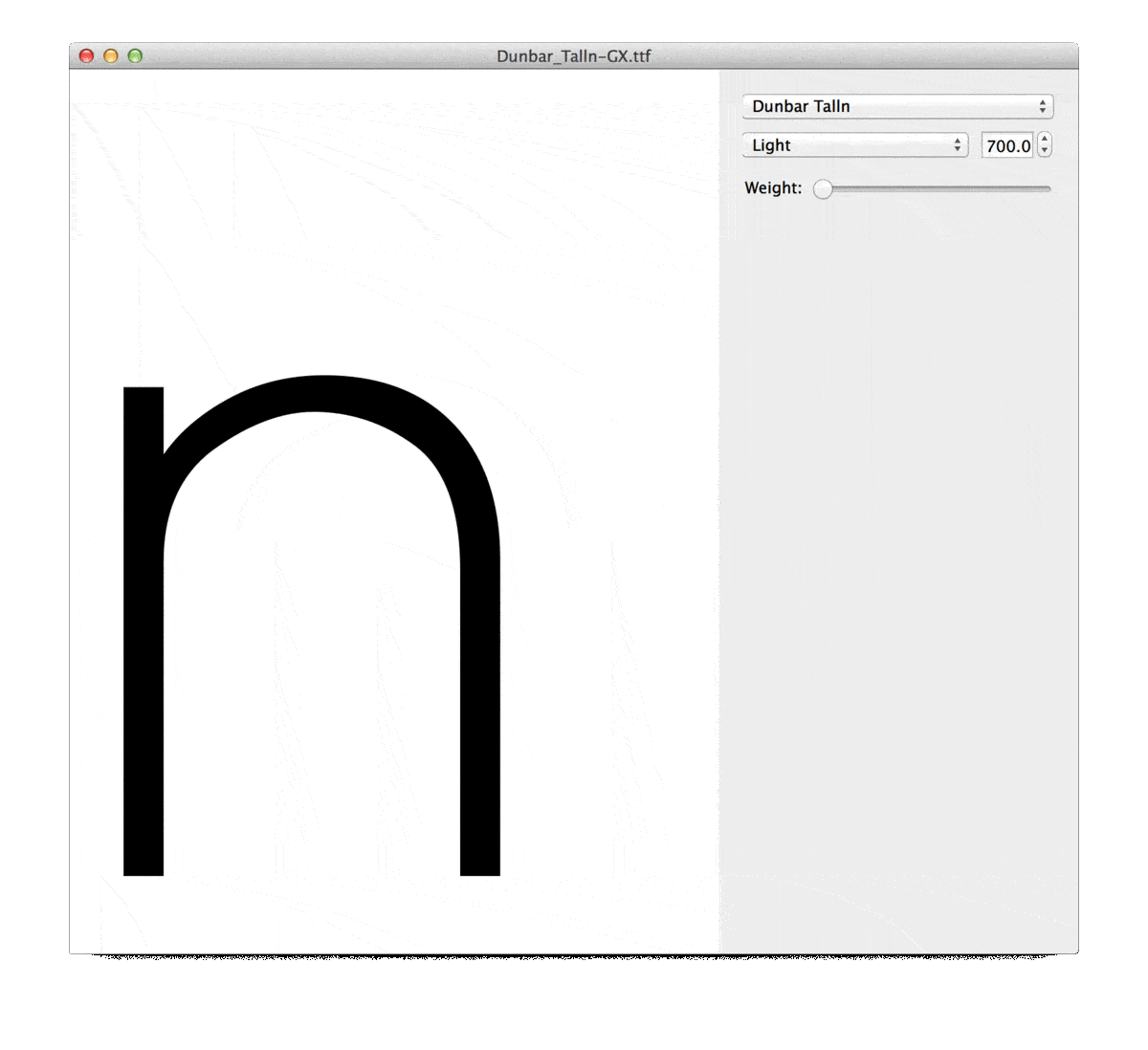
Dunbar “n” without interpolation error
A font with one single glyph “n” without interpolation error, in “Super Font” format (aka OpenType 1.8 Variable Font)
Background Information
This project is in response to a new font format, and a way to showcase my (soon to be released) typeface Dunbar, which, unlike this experiment, will have a full Extended Latin character set with a full range of weights, optical and stylistic variants and will be (hopefully) without interpolation errors.
The announcement of this new font format was made on 2016-09-14 by representatives of Apple, Google, Microsoft, and Adobe at the ATypI conference in Warsaw. The new format allows for a single file to contain an entire family, or multiple related families, of font instances. Previously if you wanted to license an entire font family with a range of weights for your website (like Light, Regular, Medium, Bold, Extra Bold, and Ultra) the type foundry would generate a separate font file for each style. But now it's possible for type foundries to put all of these styles into a single file, so the file will be smaller and you'll only have to make a single http request. This file format can also allow for subtle variations beyond the specified instances, like the ability to make your Bold font “slightly bolder, but not quite as bold as the Extra Bold”. In addition to working on the web, this font format will work in desktop applications, though applications will need to be updated to support it.
The work required to design a font family with many instances that work together like this will be no less work that it takes now to design a similar family now with all separate font files (contrary to what some might hope), aka there is no magic here. In fact it can take more design work and engineering to get them all into a single file in this new format, which I can tell you from personal experience in the last few day. But the benefit is that it can provide a tremendous added value of flexibility and compression to graphic designers, web designers, and other pro users. Currently the applications which support this new font format are very limited, in fact the only one I know of is called Font View. But Behdad Esfahbod of Google showed a live demo at ATypI in an upcoming version of Chrome, and because the format was announced by Apple, Google, Microsoft, and Adobe I think it won't be long before more applications support this format.
After hearing this announcement I was excited to see what’s involved in generating a font family in this new format. Erik van Blokland helped me navigate the process, and I adapted the sources for my upcoming typeface Dunbar to work in this new format. I showed a demo of Dunbar in this format on Twitter and some fun documentation of this moment was captured by Roxanne Gataud. This led to a question from @Typographica about what happens if the typeface isn't designed correctly for this process and my video reply sparked the titular comment by Chris Lewis. I know this could be a joke, but I also know Chris Lewis well enough to he might actually buy an interpolation error for the nerdy tech novelty (as would I).
Since Dunbar isn't released yet I decided why not just pre-release a single glyph in this new format as an interpolation error version and also an error free version as a fun experiment, promotional piece, and proof of concept? Indeed I have often found the "happy accident" of a good interpolation error to be quite beautiful and expressive in a Jackson-Pollock-abstract or Rorschach-ink-blot kind of way. I've been fascinated with interpolation errors for a while now and Delorean, my RoboFont extension from 2014, was made to find these errors and to help figure out how to fix them.
My hope is that this project will give font users a chance to interact with the new font format in a tangible way and hopefully appreciate the beauty and fun of an interpolation error.
More info about the new format:
Huge thanks to: Erik van Blokland for helping me through the process of generating a variable font or “Super Font”, and for his work on MutatorMath and his related application Superpolator which is the best tool for interpolation in type design and has been supporting variation design since 2004. To Behdad Estabood and his team, and all FontTools contributors for making this new format possible, Adobe, Apple, Google & Microsoft for adopting the format, and Stephen Coles, Chris Lewis, Indra Kupferschmid, Bianca Berning, Nick Sherman, Tal Leming, Frederik Berlaen, David Berlow, Petr van Blokland, Just Van Rossum, David Jonathan Ross, Font Bureau, and Type Network.
Notes
If it wasn't already clear, this project of selling interpolation errors and fonts with a single glyph is meant for novelty purpose and to raise awareness of the new format. My future typeface designs will still have lots of glyphs as you'd expect now and they will hopefully not have interpolation errors.
To use these fonts you will have to download an application which supports OpenType 1.8 Variation Fonts, and for now the only application I'm aware of is Font View and a compiled version for OSX is here.
I heard the term “Super Font” from Erik van Blokland and that’s why I use it here. His application Superpolator refers to the fact that the outlines are superimposed on top of eachother. Superimposed outlines > Superpolator > Super Fonts.