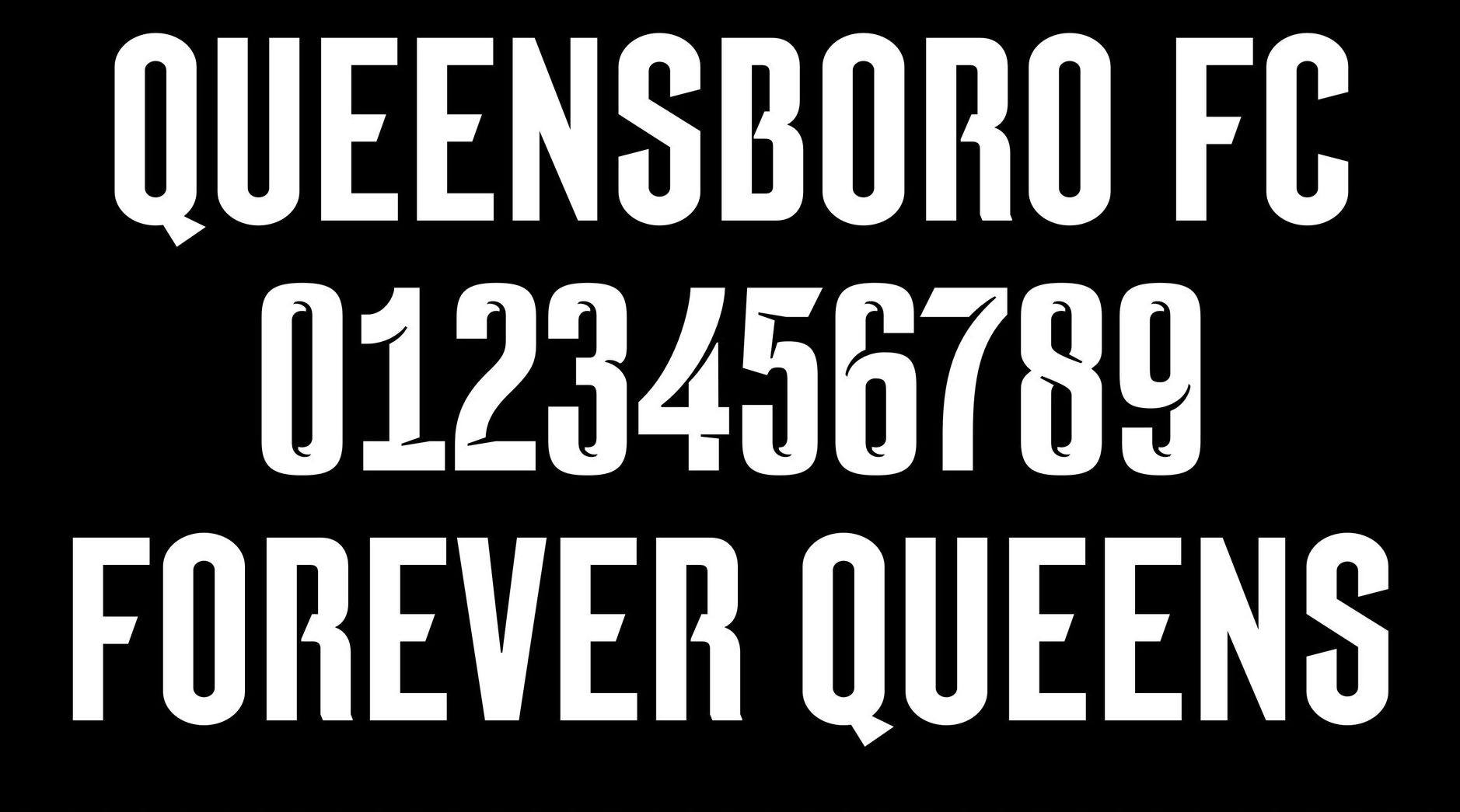
Queensboro FC custom typeface
by CJ Type (typeface design), Carbone Smolan Agency (identity design) Counterpress Custom
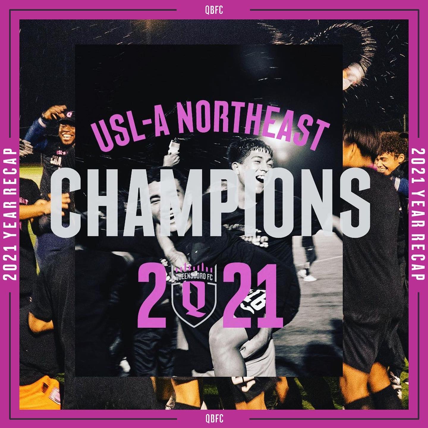
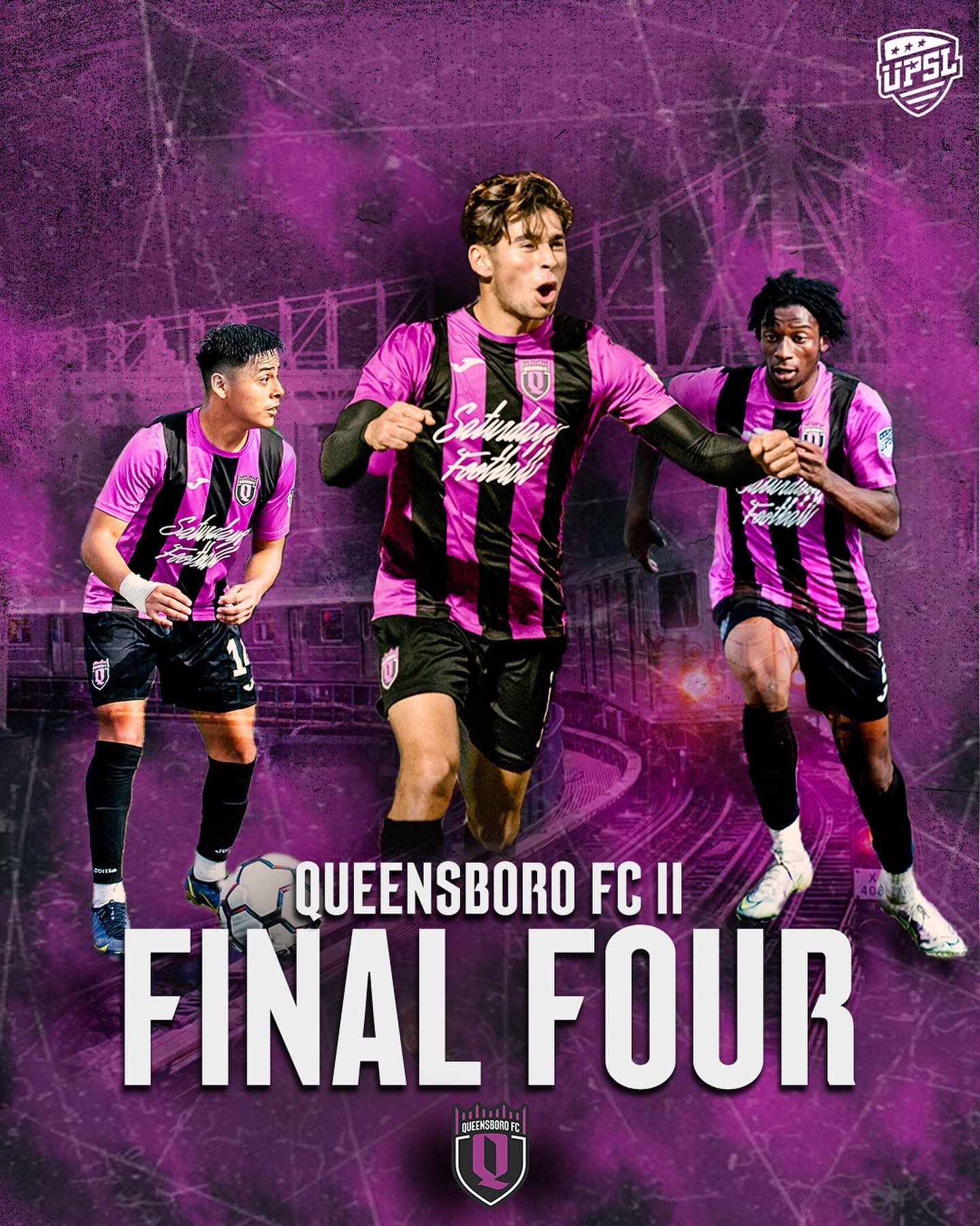
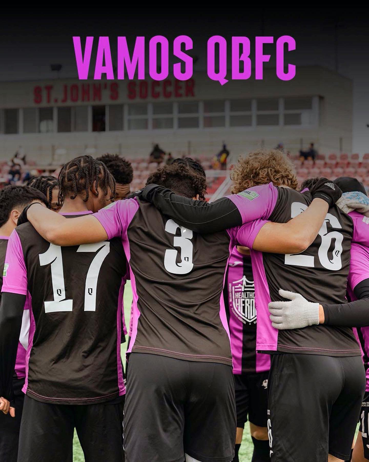
QBFC Plaza is a custom typeface designed for Queensboro FC, a new professional soccer team based in Queens, NY. The QBFC Mens pro team will be debuting in the USL Championship League in 2023, while the QBFC W, the Womens pro team, debuted in the USL W League in 2022 as did QBFC II, the academy team, in the USL-A League in 2021 where they were the division champions.


The QBFC custom typeface, designed by CJ Dunn (CJType), was commissioned by David Decepida of Carbone Smolan Agency, the agency who designed the QBFC identity.
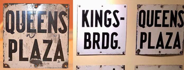
One reference for the proportions and weight of the typeface was a sign for the Queens Plaza subway station from the IRT line in the 1930s. Blackletter signage and architectural façade lettering in Queens was also a reference, with a focus on the the boad-edged pen angularity of these forms. The broad-edged pen style letters became a through-line for the typographic explorations as it resonated with the many languages and cultures represented in Queens. We saw connections to these forms from Latin American Blackletter to Korean Hangul, Hebrew to Hindi. This all came together in a sketch done in the proportion of the Queens Plaza sign, made with a broad-edged pen held at a 45 degree angle. We had in-depth conversations about building out a multi-script wordmark with a team of multi-lingual designers to represent the over 100 languages spoken natively in Queens, but alas it was unfortunately out of scope for this phase of the project.
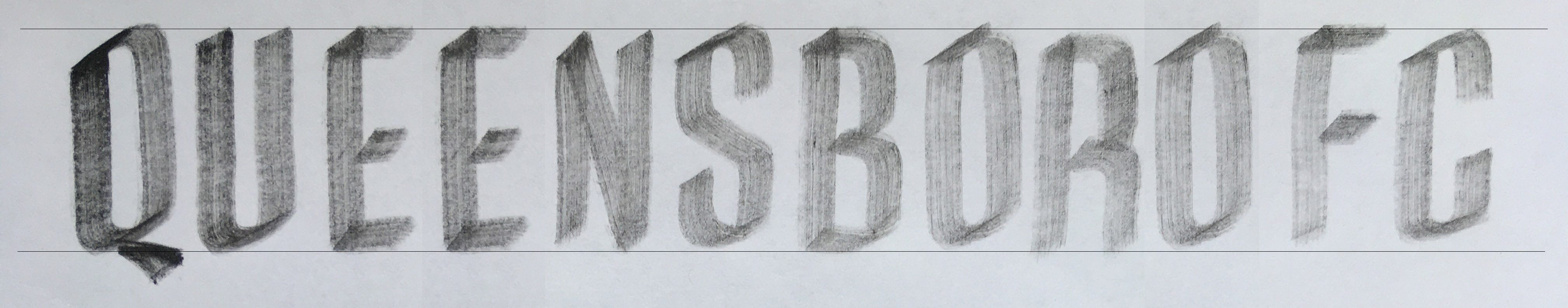
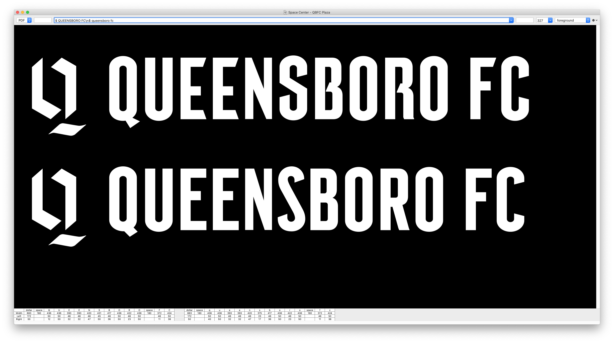
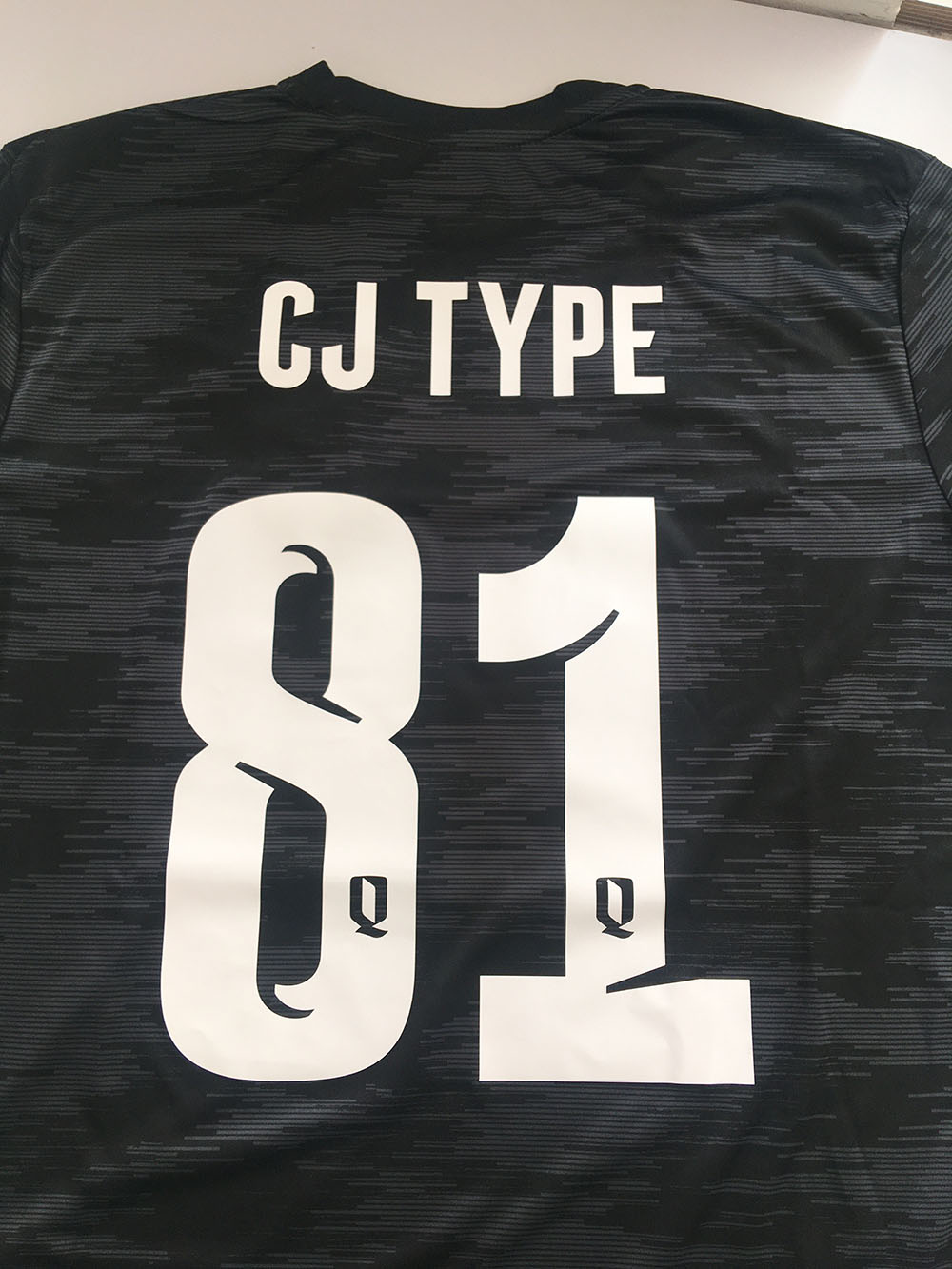
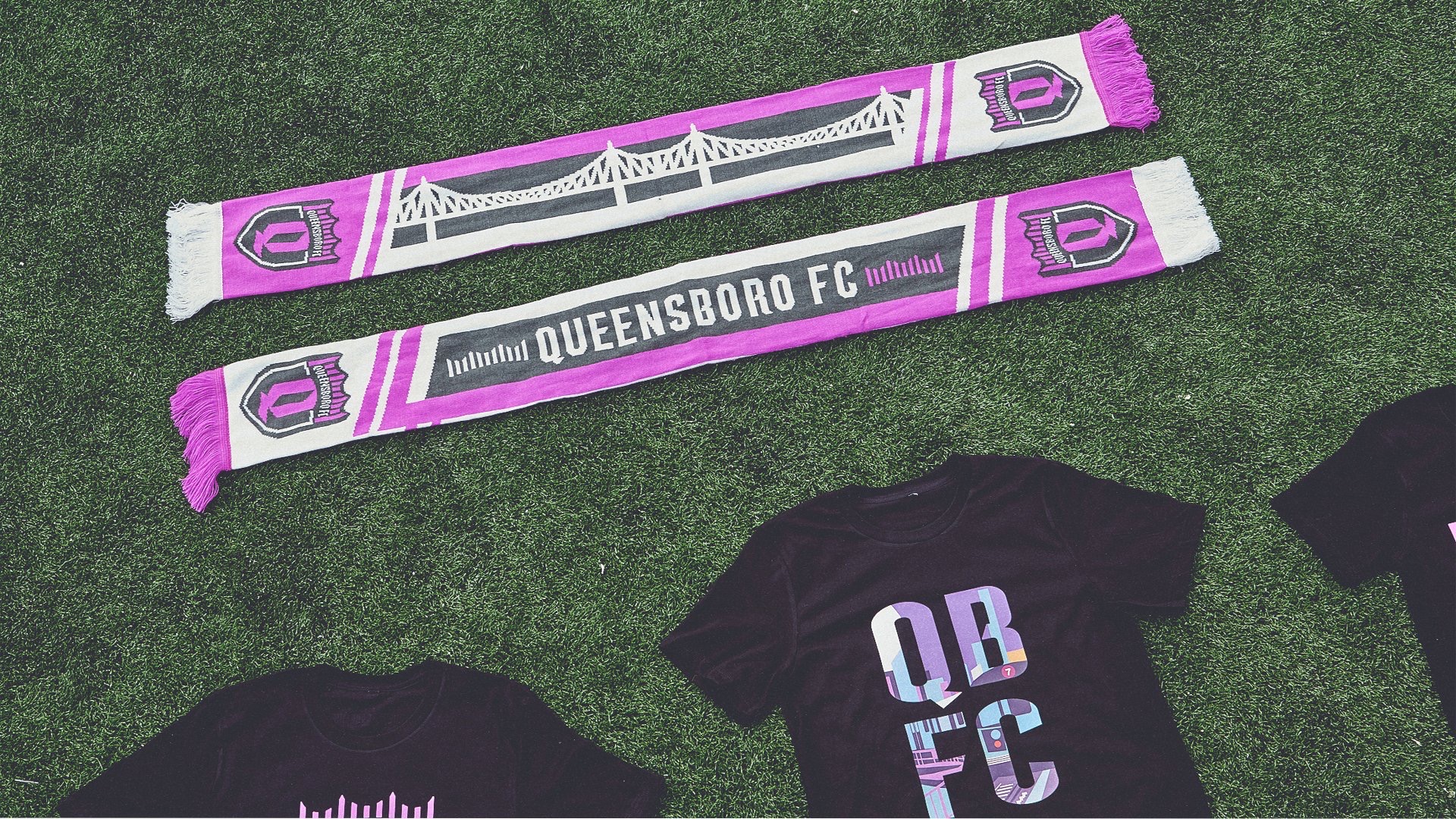
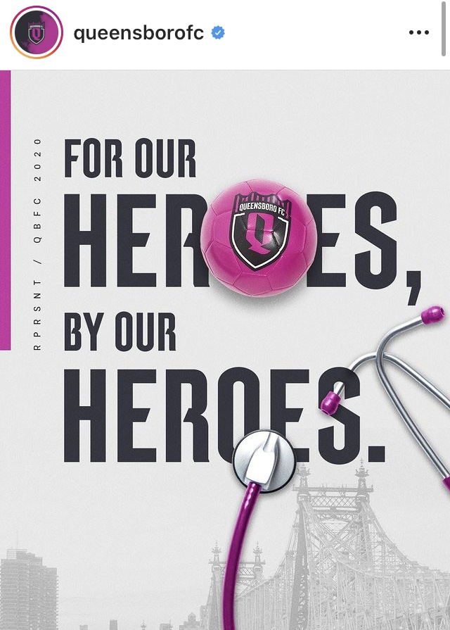
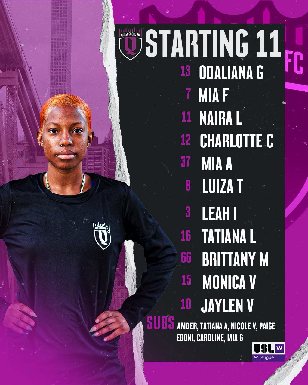
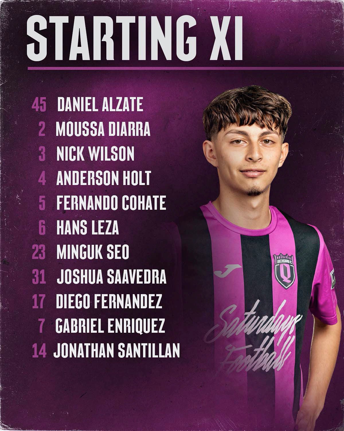
This angularity, along with the bold condensed type, became the defining feature of the logomark, logotype and the custom typeface. A custom number set with cut-ins was also added to the typeface for large usage on the jerseys to add more character and personality. The QBFC typeface is used throughout the teams’ kits, merchandise, print, web, and social media.