TeamWBC architects
by TeamWBC Pennypacker
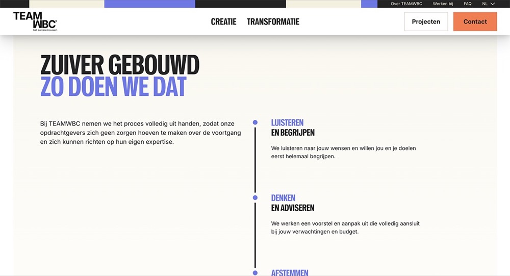
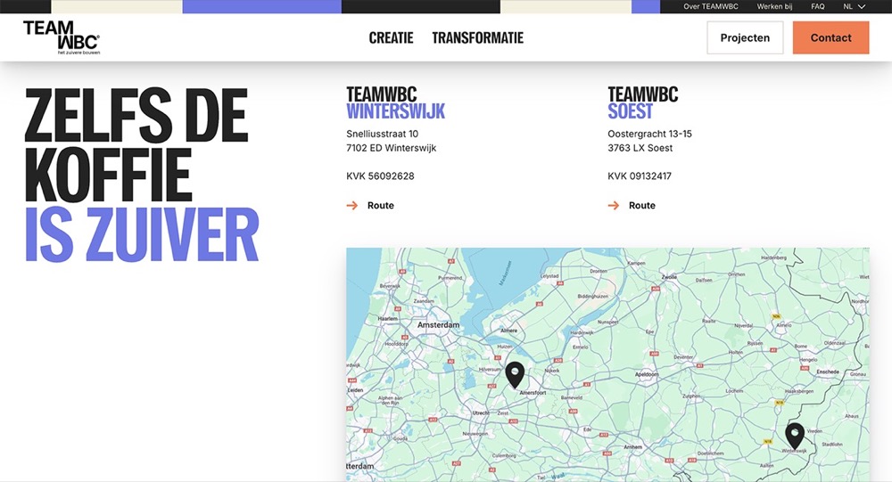
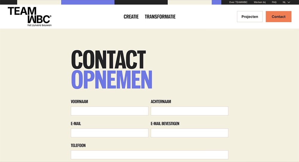
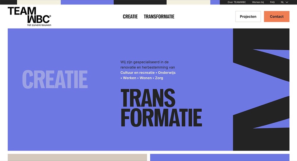
Pennypacker has been used nicely by Dutch architectural building firm TeamWBC whose brand presence and typography communicates a modern, reliable, practical and business confident attitude.
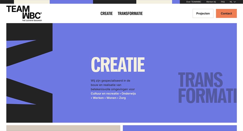
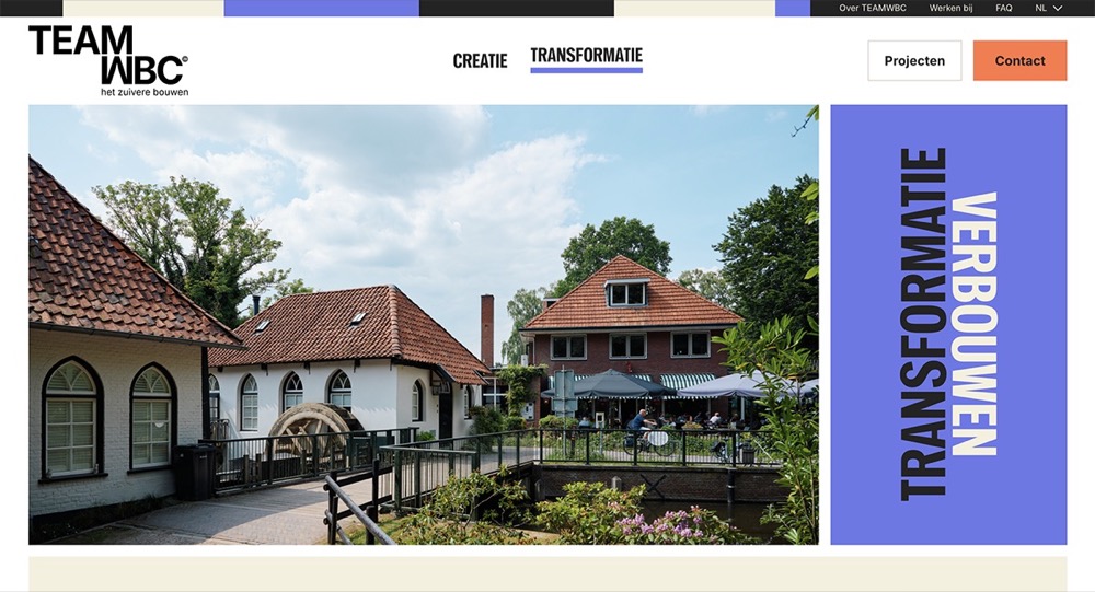
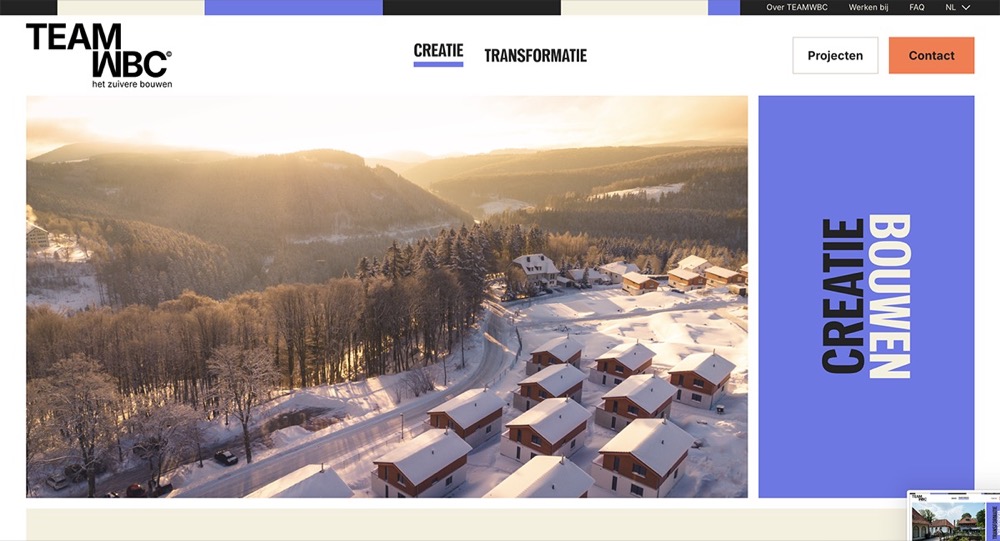
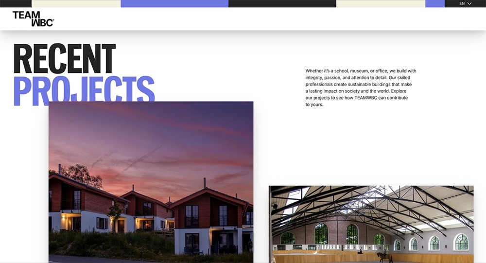
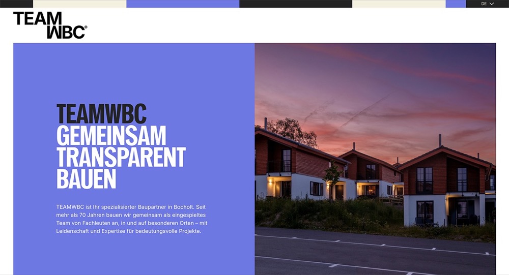
For the titles on their website and most headings Pennypacker Compressed is used in all-caps to maintain a heavily rectangular silhouette matching the imagery of TeamWBC’s portfolio.
The title treatment of the two main pages on the website “CREATIE” and “TRANSFORMATIE” use vertical stacking of the words “CREATIE BOUWEN” and “TRANSFORMATIE VERBOUWEN” mirroring the idea of architectural elements such as pillars or tall apartment buildings adding dynamism to the typography used in its clean rigid grid system.
Text: Sophia Tai via Fonts In Use. Images: teamwbc.nl