
Counterpress stylishly fits into tight spaces with its tall x-height and short descenders

Counterpress is a compact, industious design that packs a punch.
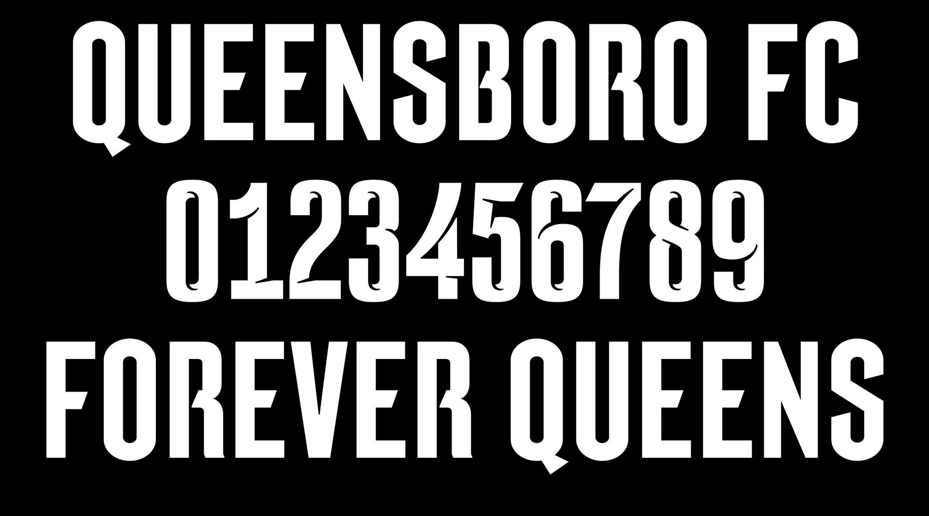
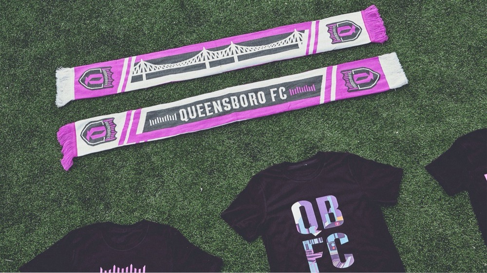
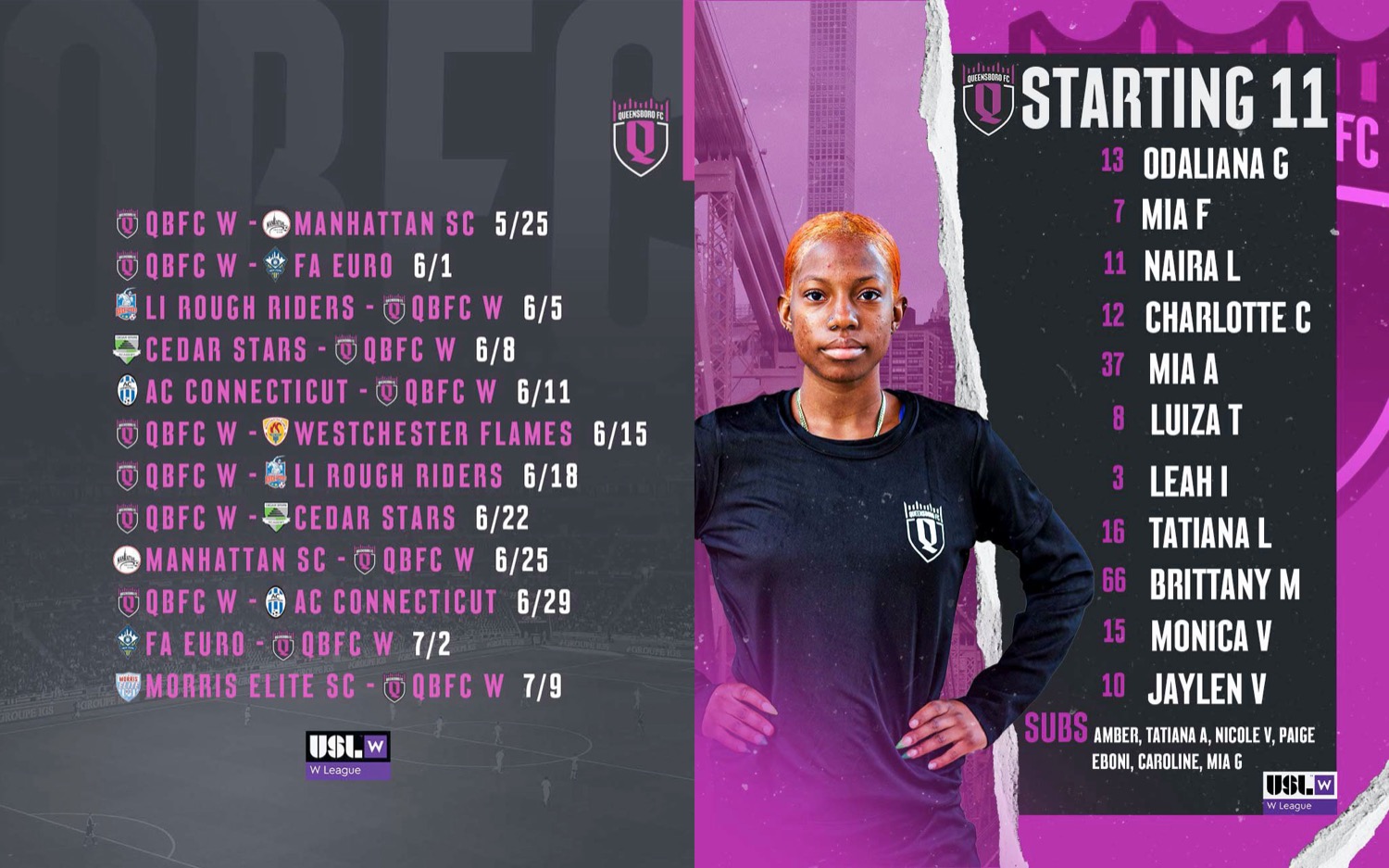
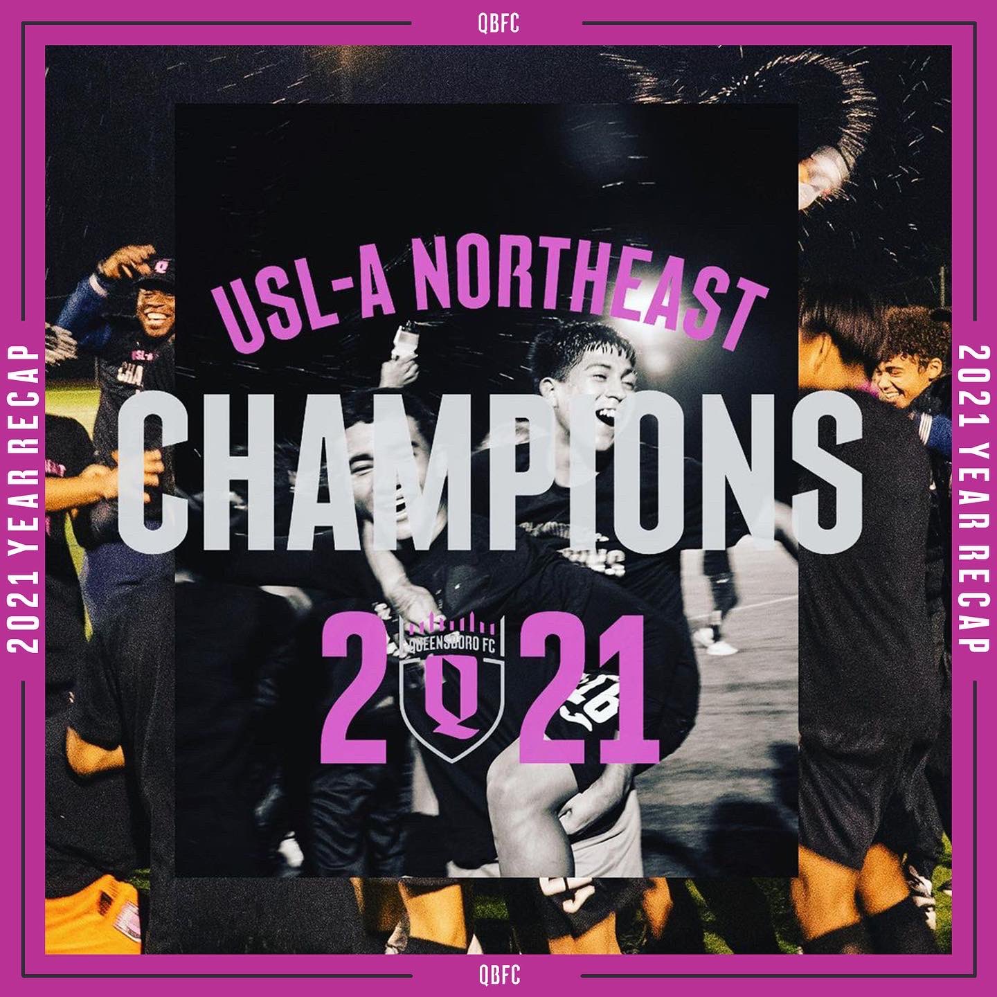
Counterpress was originally drawn as a custom typeface for professional soccer team Queensboro FC as an all caps design. This design was used on QBFC team merchandise, team uniforms, and across marketing, advertising and social media campaigns.
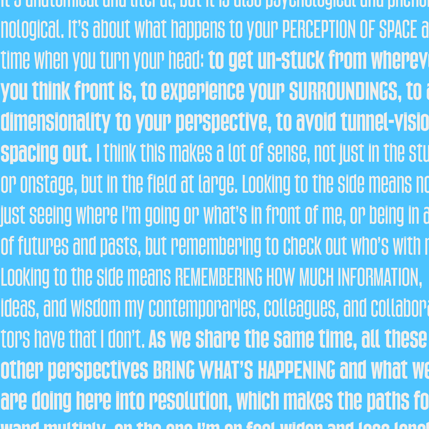
Made with an economy of strokes, the letterforms use a hardworking, industrial approach. They are designed to fit more words at a large size in a limited amount of space. Think tall narrow “PED XING” letters on asphalt, industrial signage, welded letters, or transportation signage made more likely by an engineer than an artist.
Added lowercase, accents, punctuation and additional weights
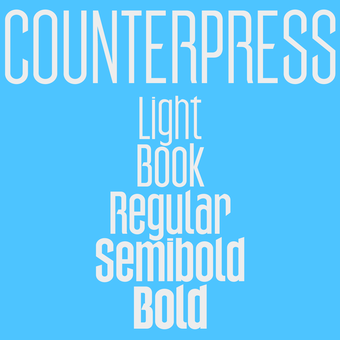
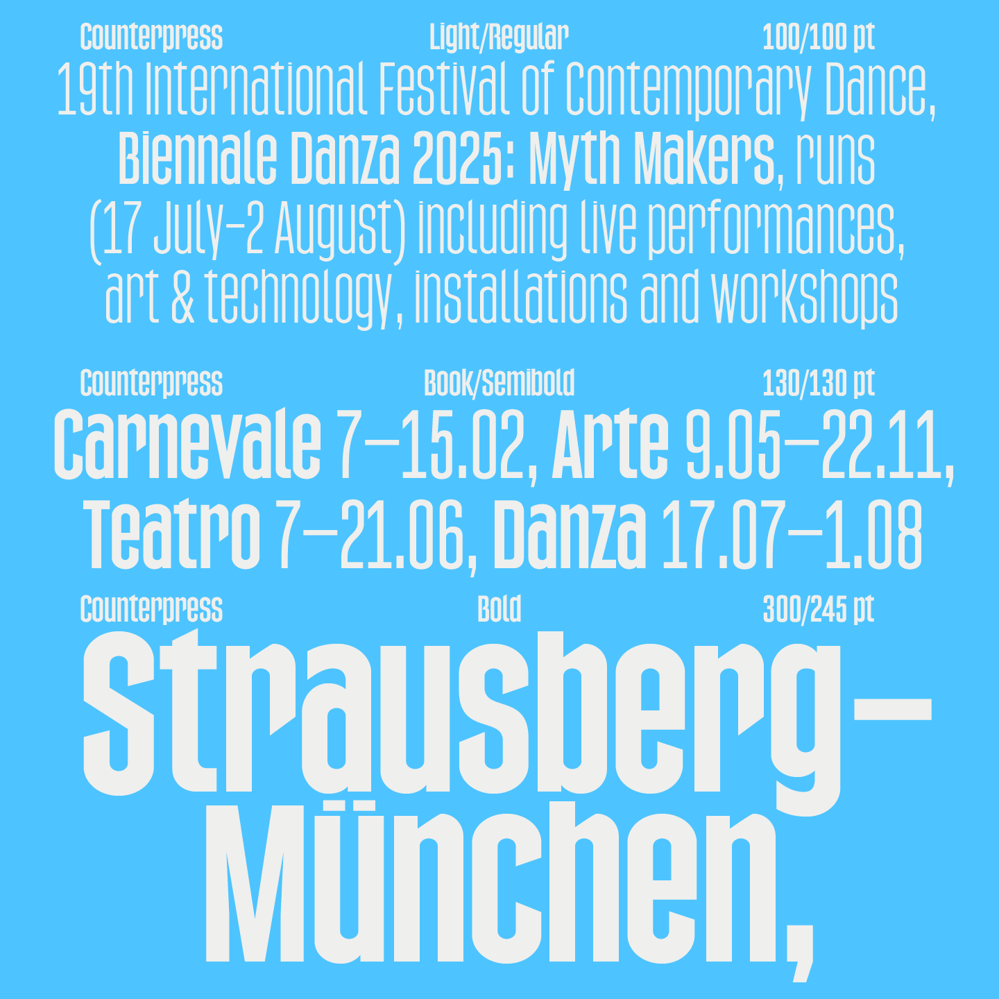
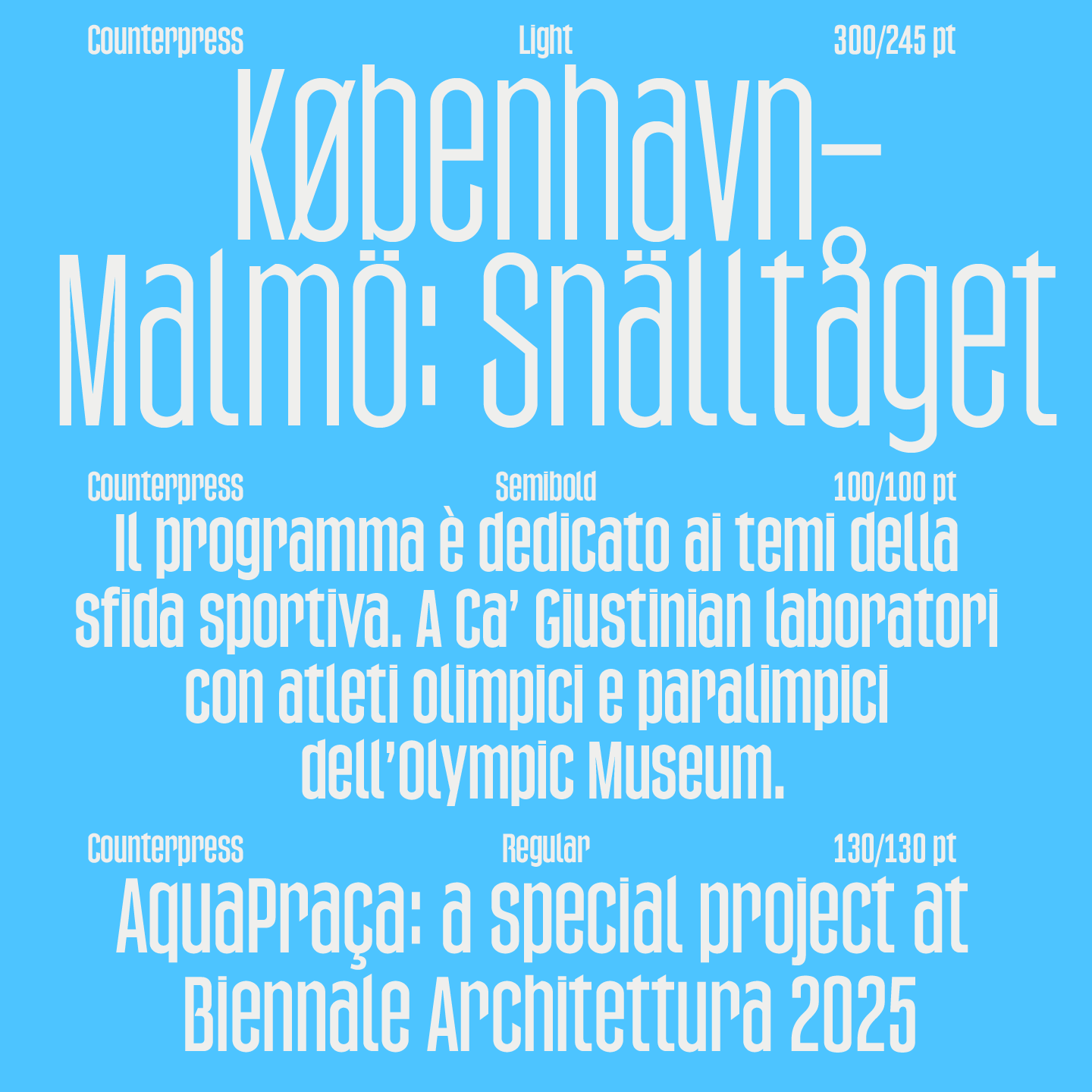
Counterpress has since been expanded to the Extended Latin character set. Now with a range of weights, from Light to Bold, it is perfect for usage in cohesive typographic design systems, from eye-catching signage and packaging, to multi-line headings and longer passages of display text.
+−±÷×=<> $¢£¤¥€ƒ^~©℗®™ªº°◊- ¯ μ · ‘’ ←↖↑↗→↘↓↙
Counterpress comes complete with an extended set of punctuation and accented characters supporting most Eastern and Western European languages.

Counterpress Family