
The ‘Ōpua Typeface collection is made up of ‘Ōpua Mauka, ‘Ōpua Makai, & ‘Ōpua Ko‘olau
A design rooted in ‘Āina¹, the ‘Ōpua Typeface Collection is made up of Mauka², Makai³, and Ko‘olau⁴ subfamilies.
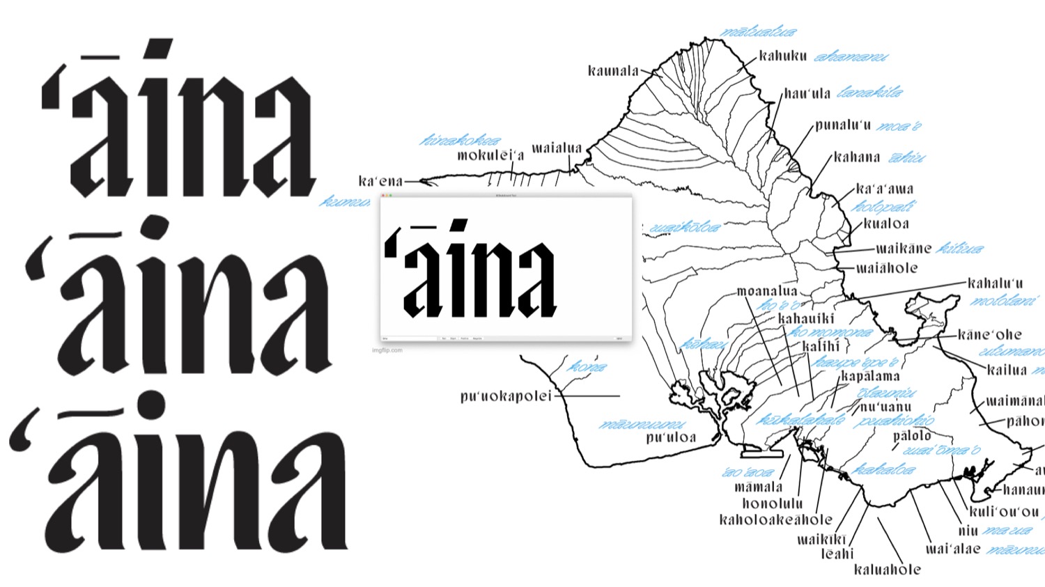
1. ‘Āina = “The land”
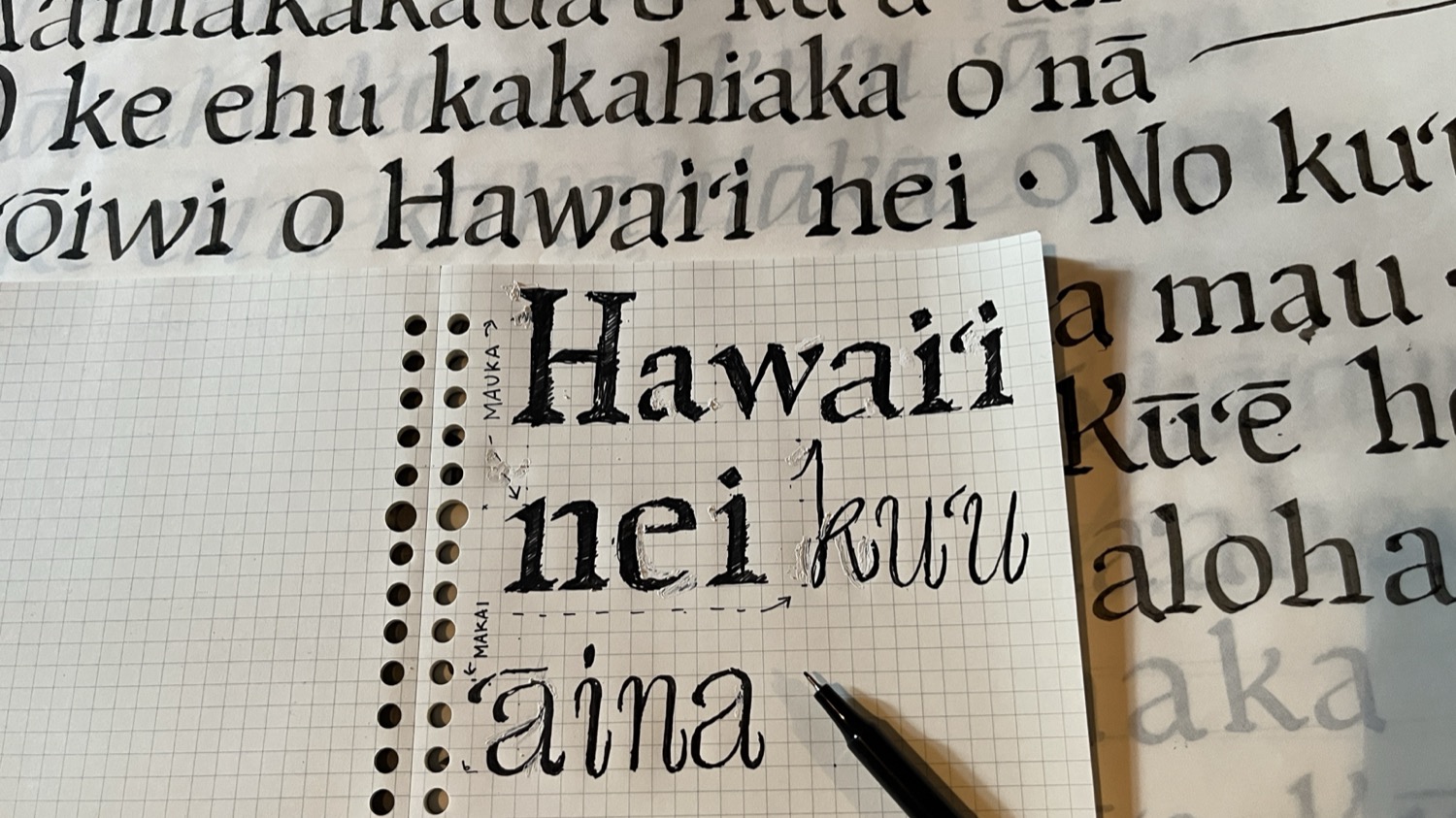
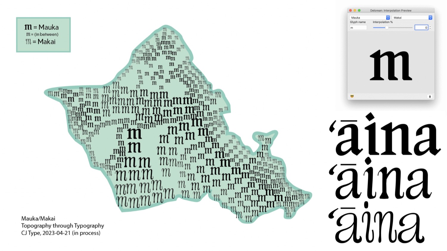
2. Mauka = “Inland, away from the ocean”
3. Makai = “Towards the ocean”
4. Ko‘olau = “Windward side of the Hawaiian Islands”
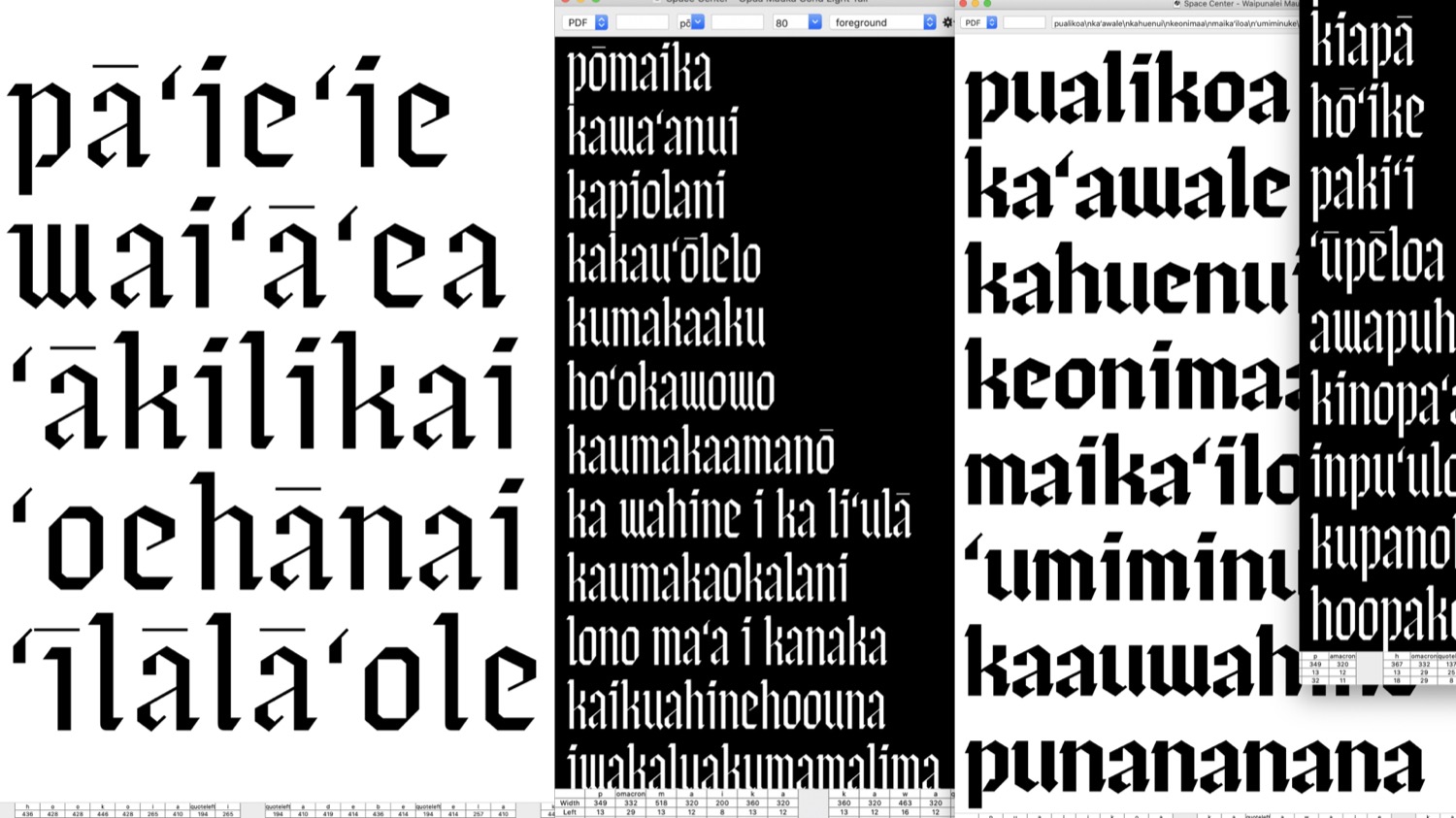
‘Ōpua Mauka
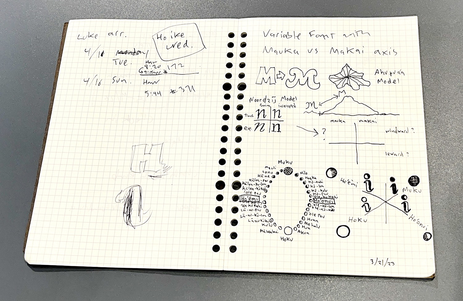
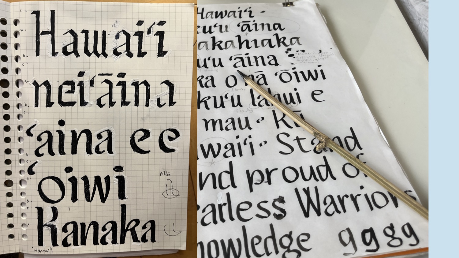
‘Ōpua Mauka is sharp, angular typeface which is informed by the uniquely powerful, jagged and unyeilding mountains of Hawaiʻi. The design is not based on a specific historical reference, but instead this typeface was designed to relate to mauka spaces and to the feelings of being in the mountains.
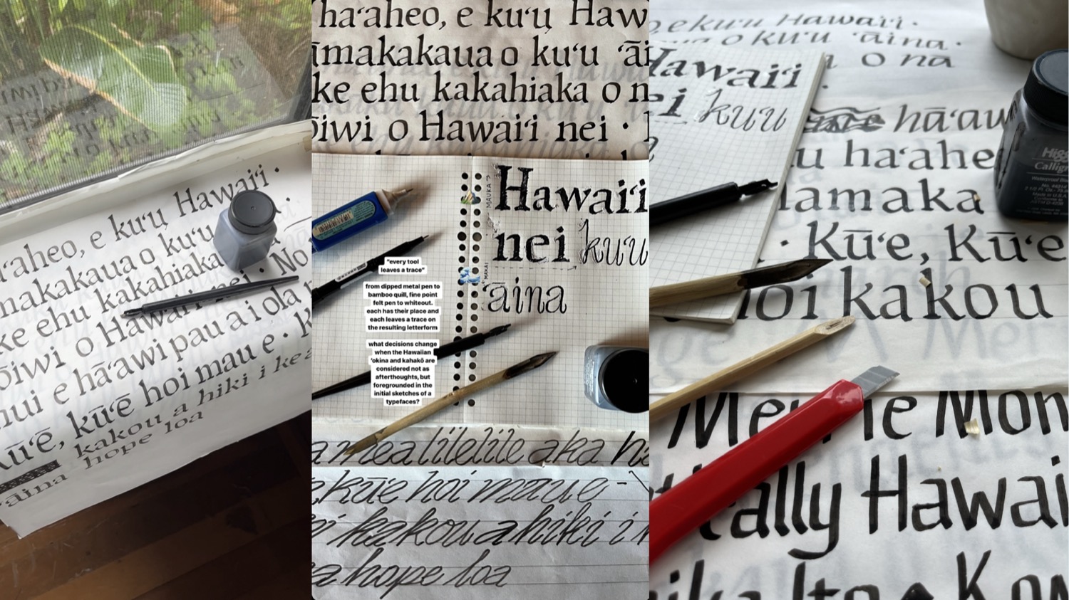
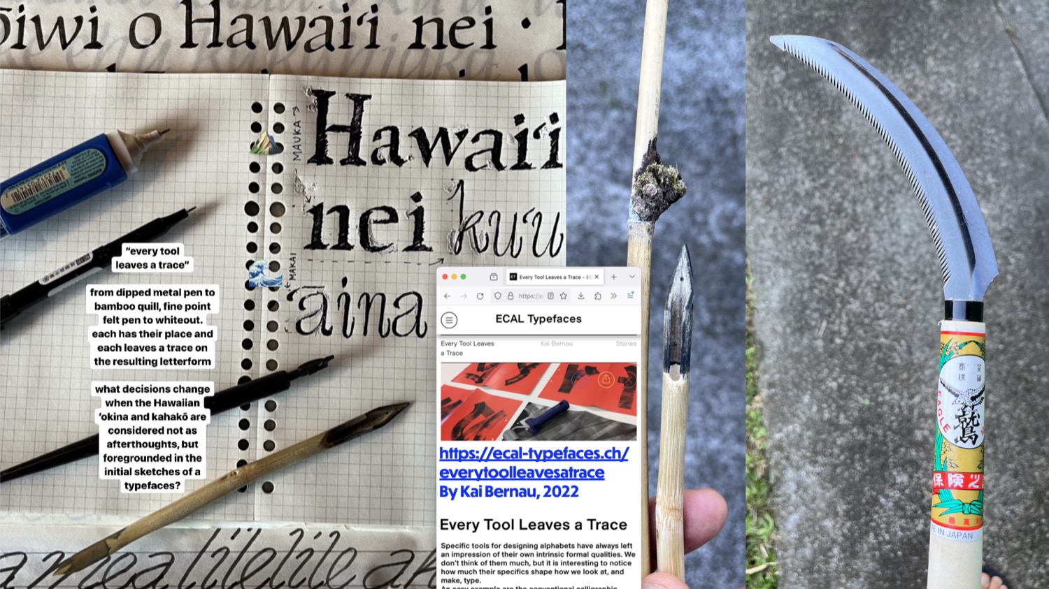
The letterforms were originally sketched using broad-edged pens dipped into ink, which are the same tools used to make blackletter calligraphy. This connection makes the letterforms feel at home in the past and current typographic landscape of Hawaiʻi which includes many blackletter or “Old English” designs. This is most likely due to the historical connections between the Hawaiian Kingdom and the British Monarchy.
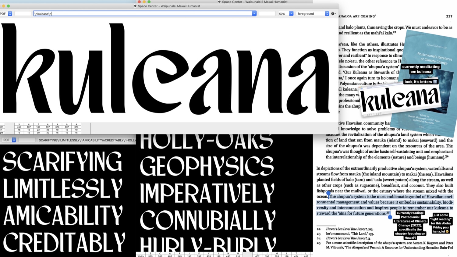
‘Ōpua Makai
‘Ōpua Makai is a flowing, wavy design informed by the coastal regions of Hawai‘i and the vast oceans surrounding them.

The letterforms were originally developed using a bamboo pen cut from a plant in my dad’s backyard, and another one cut from a plant near one of my favorite surf spots. The curve on the lowercase /f for example was inspired by my memories of surfing at Off-The-Wall, which has a very steep drop and a particularly memorable shape.

Other inspirations include the shape of pooling water on the sand, and the sharp to soft transitions found in coral reefs. Most of all, I want the typeface to reflect the Makai-based memories and associations shared with me the Hawai‘i friends I spoke to for this project.
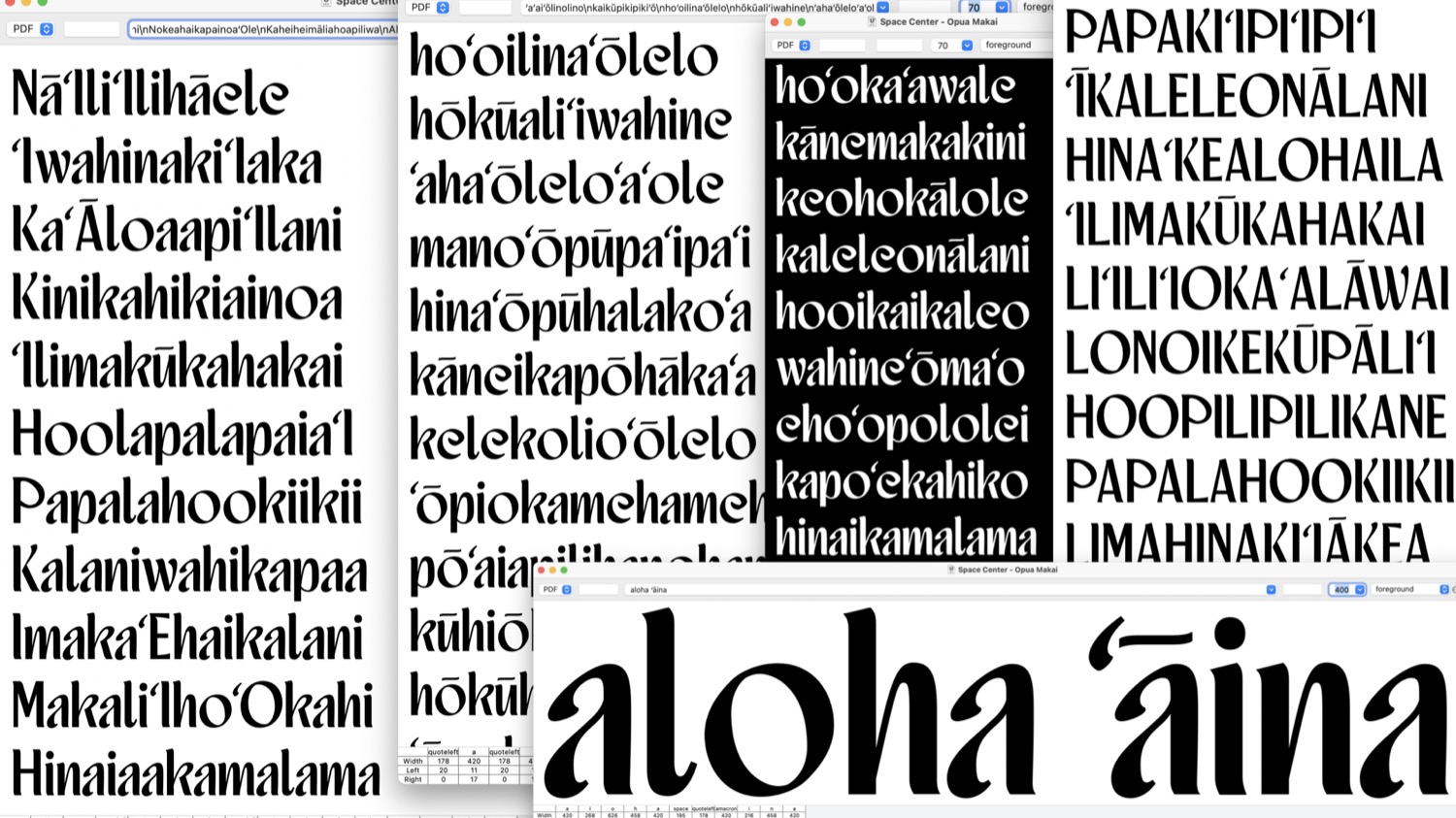
‘Ōpua Ko‘olau
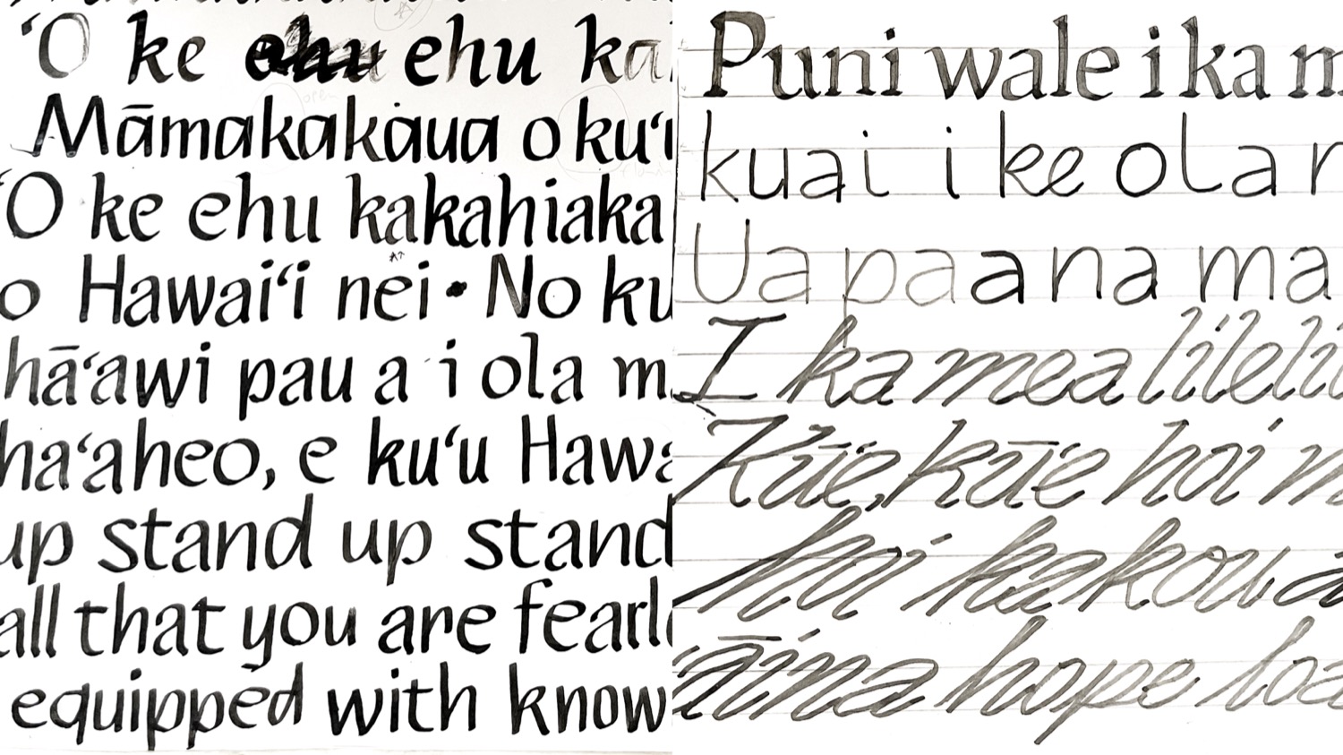
‘Ōpua Ko‘olau is a sloped, non-connecting script informed by the cool, flowing tradewinds of Hawai‘i hitting the windward side of the islands. The slope of the letterforms reminds me of leaning forward at the Nuʻuanu Pali Lookout, being held by the strenght of the wind. The strawberry guava trees on the tops of mountain ridges bent to extreme angles due to the constantly blowing breezes also capture this feeling. I mainly drew these forms with a pointed bamboo pen and tried to push the letter angle as far as the pen would let me.
When I saw the shape of the lowercase /a I could see where the design was going and it felt at once exciting and a perfectly logical way to represent the Windward side of the Hawaiian Islands.
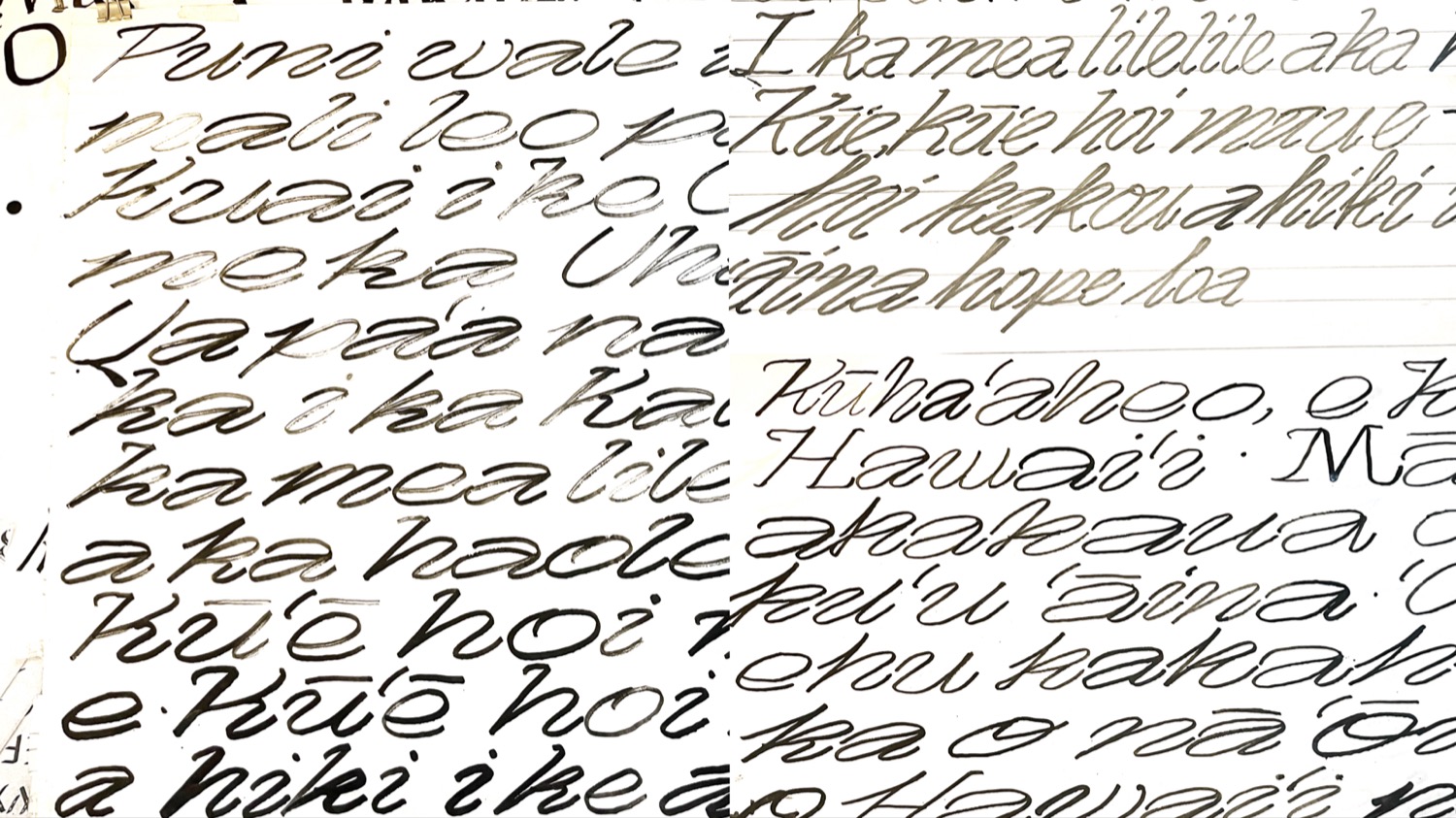
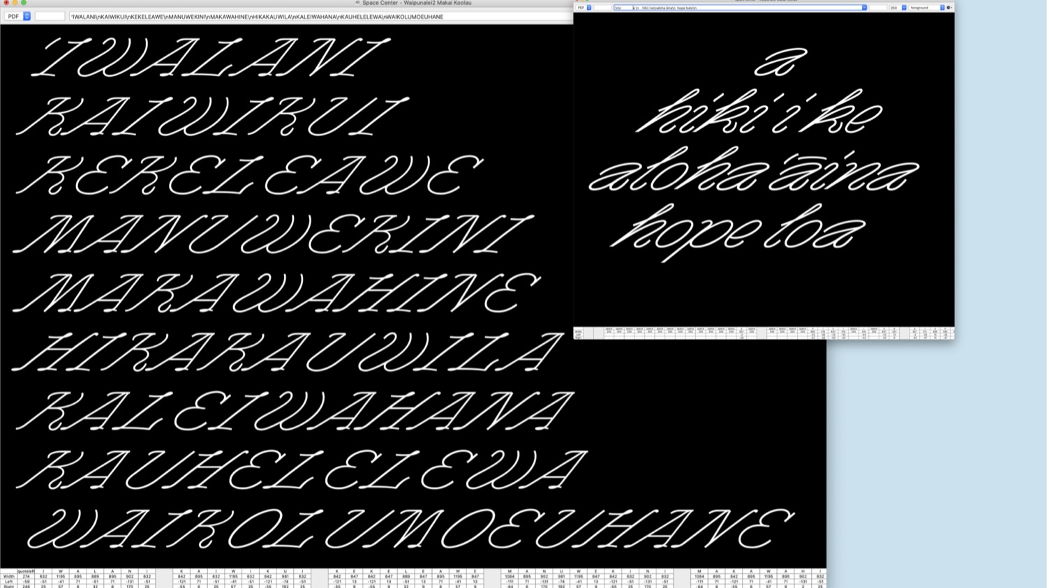
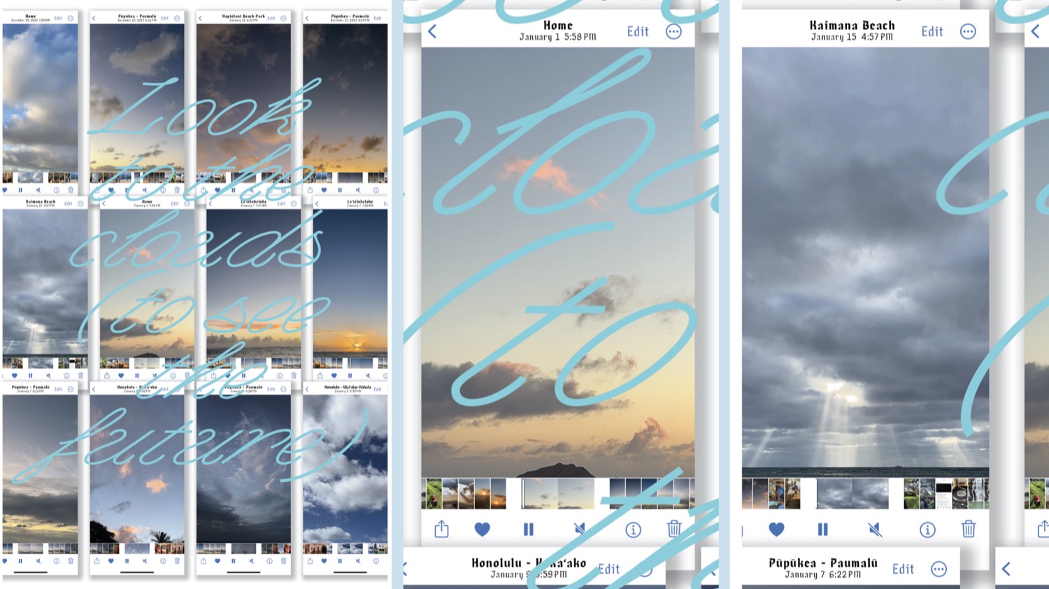

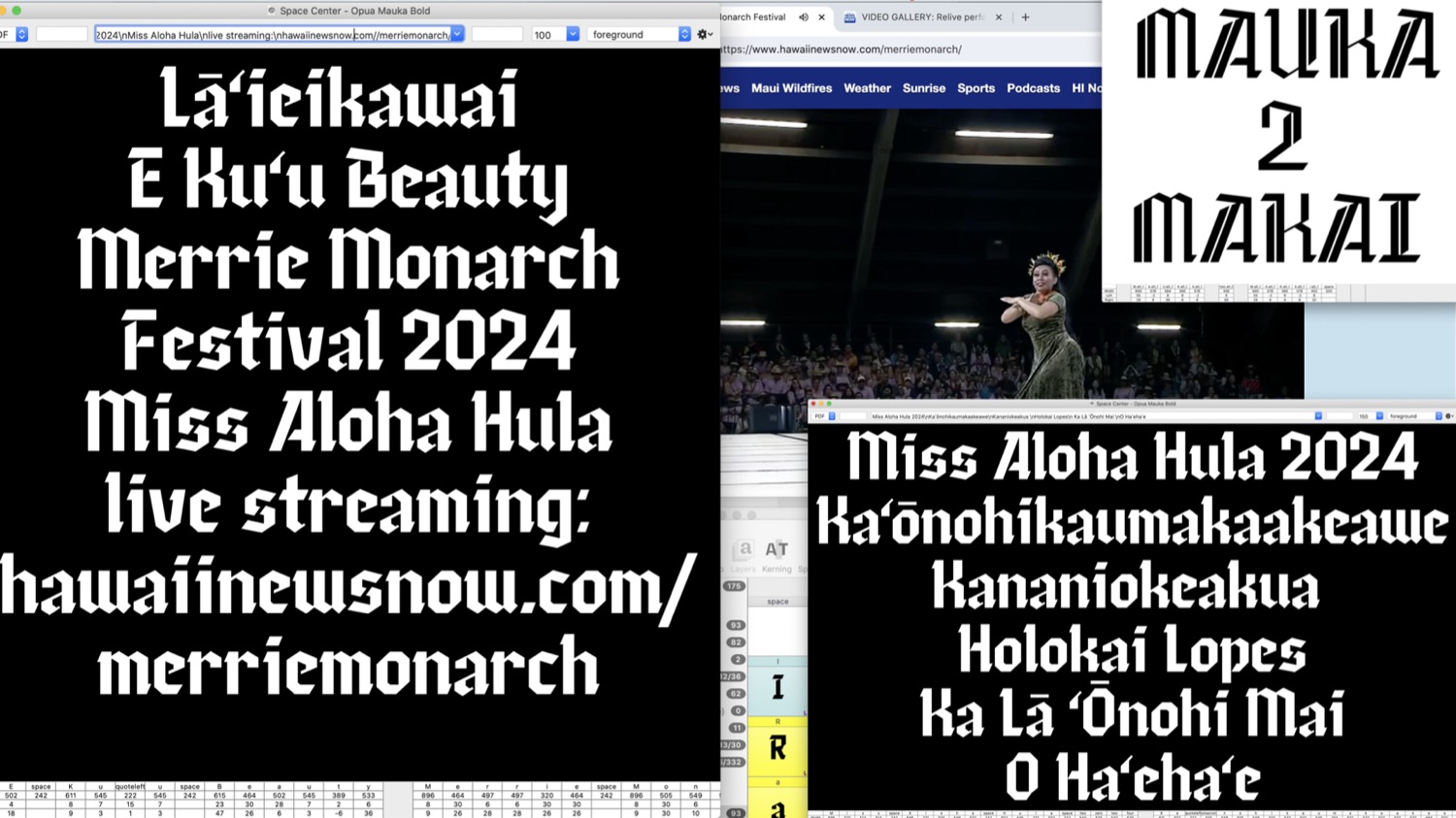
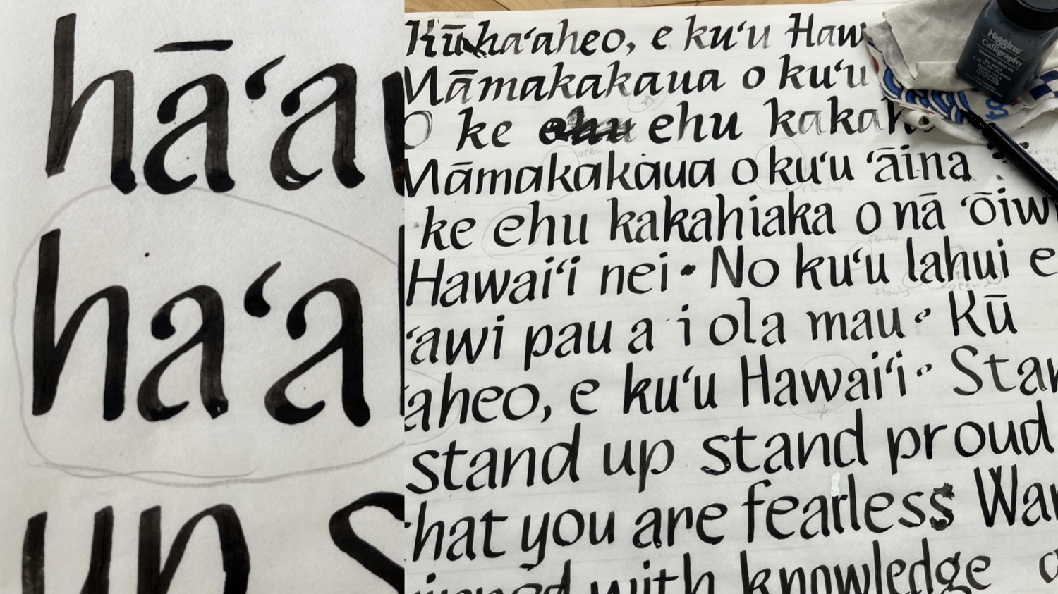
Some more process images:
ʻŌpua Typeface Collection