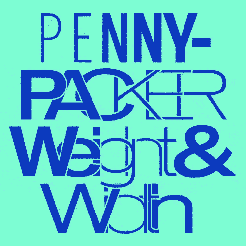
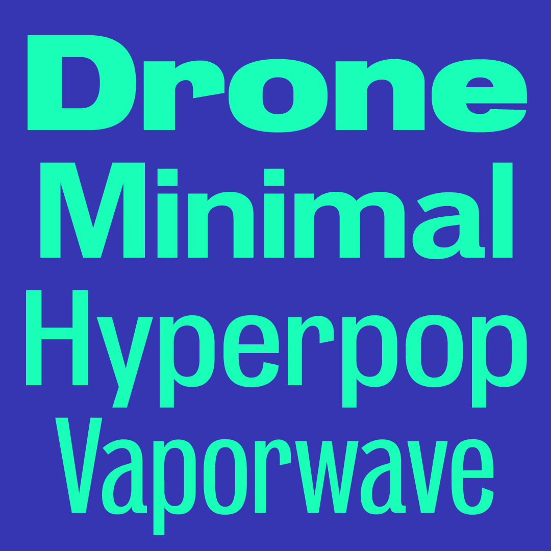
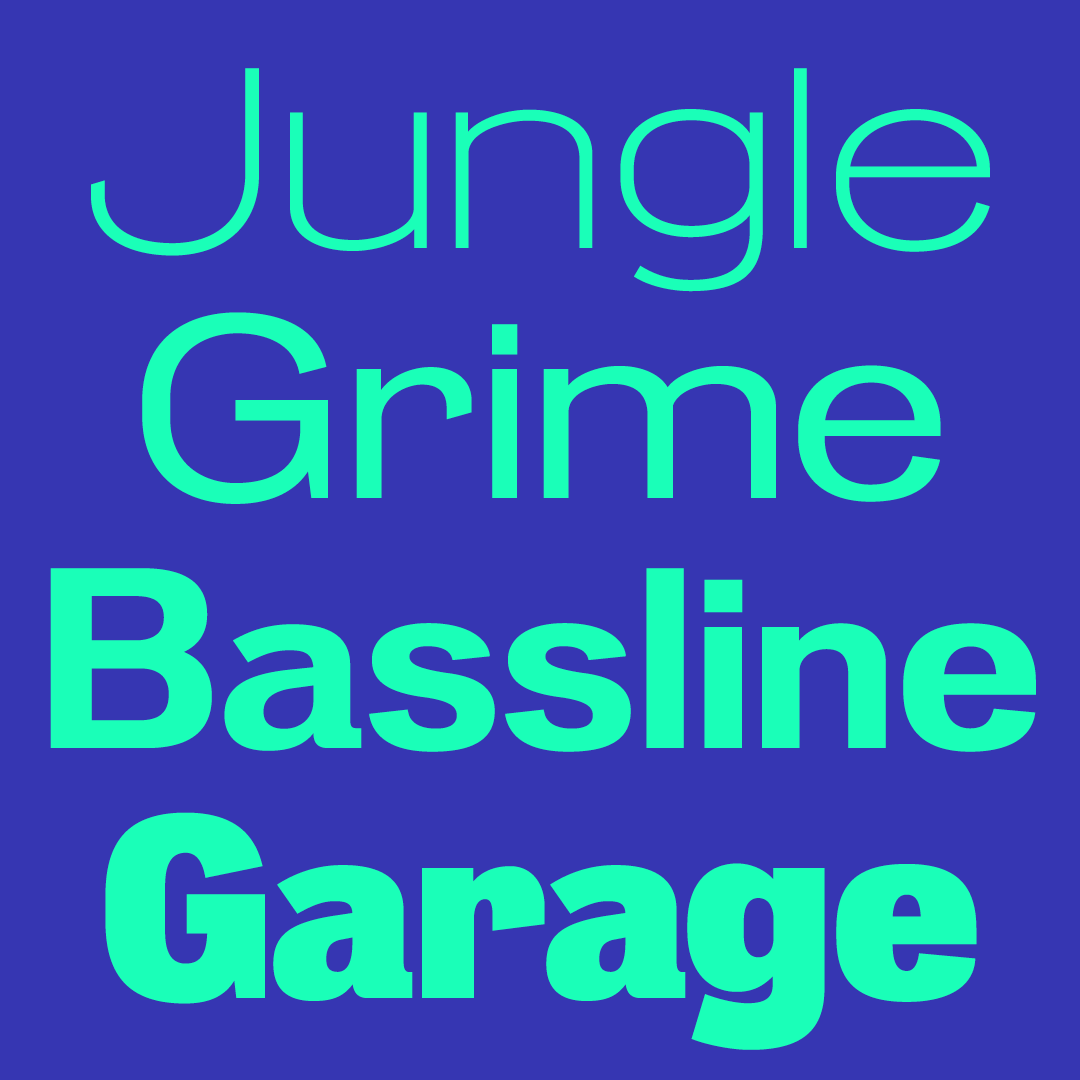
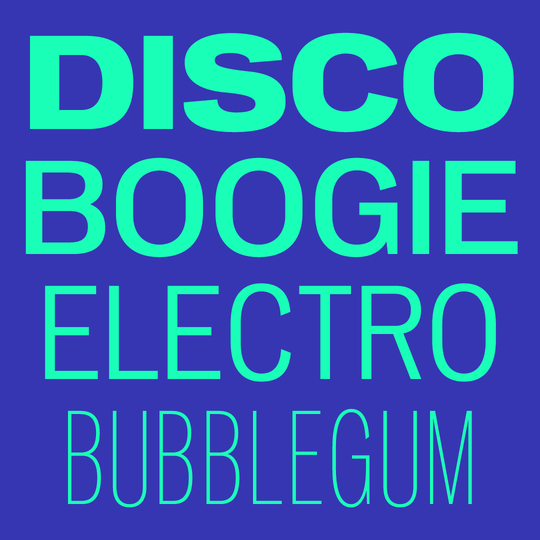
Pennypacker is a sturdy and reliable sans serif, a versatile design full of personality. As a contemporary take on the Neue Moderne Grotesk lineage of early grotesks, the design is focused on stylish functionality – equally useful for packaging and poster design as it is for mobile apps and wayfinding. With its wide range of styles, the design is also perfectly suited for use in brand identity systems and publication design. The family includes 5 widths: Compressed, Condensed, Standard, SemiWide, and Wide, and 9 weights: Hairline, Extra Light, Light, Book, Regular, Medium, Bold, Extra Bold, and Black, for a total of 45 roman styles. Pennypacker is available as a single variable font, with weight and width axes, as well as smaller variable fonts for each individual width: Wide, SemiWide, Standard, Condensed, and Compressed.
Historical background: The Neue Moderne Grotesk lineage of typefaces originates from the matricies of Wagner & Schmidt, Leipzig in 1914 (Indra Kupferschmid, 2014). Pennypacker is inspired in particular by Aurora-Grotesk and Favorit-Grotesk, but also draws from the many siblings of this style, namely Annonce, Edel-Grotesk, Normal Grotesk, Hallo, and Flachdruck-Grotesk. After extensive digging through type specimens and ephemera, especially at San Francisco’s Letterform Archive with the invaluable guidance of Stephen Coles, the resulting design in Pennypacker is a curated synthesis of these printed materials optimized for use as a cohesive series of families for contemporary typesetting. Using variable font technology, it is now possible to access a wide spectrum of variations from these historical sources all contained in a single font file, including combinations that never existed. Rather than a strict revival, Pennypacker aims to build on the “everyday design” sensibility at the core of this genre of industrial grotesks and adapt it for use today.
If you apply all-caps styling to text, an OpenType feature will change the default form of punctuation to one that better fits uppercase letters (CASE feature).
Fractions, superiors, and inferiors
Pennypacker includes OpenType features to set proper fractions (FRAC, NUMR and DNOM feature), along with superiors (SUPS feature) and inferior numerals (SINF feature).
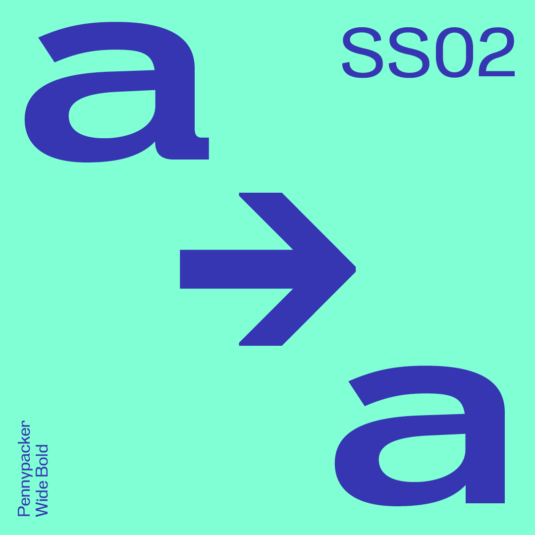
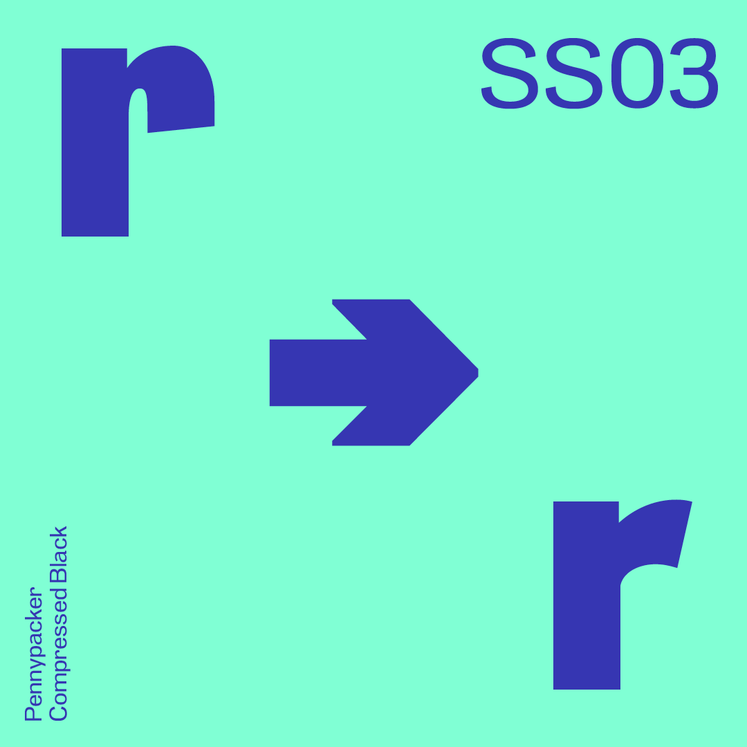
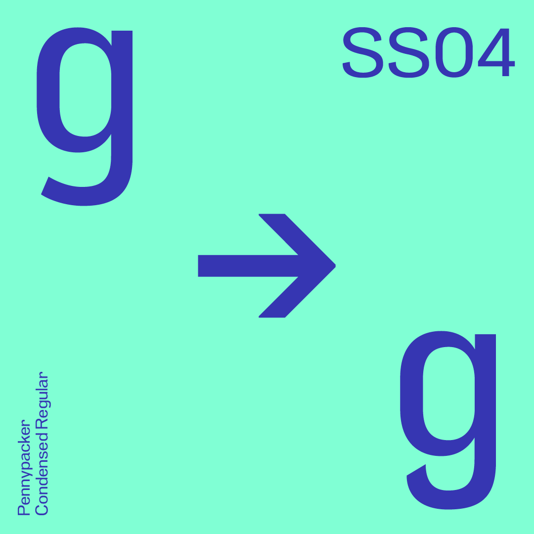
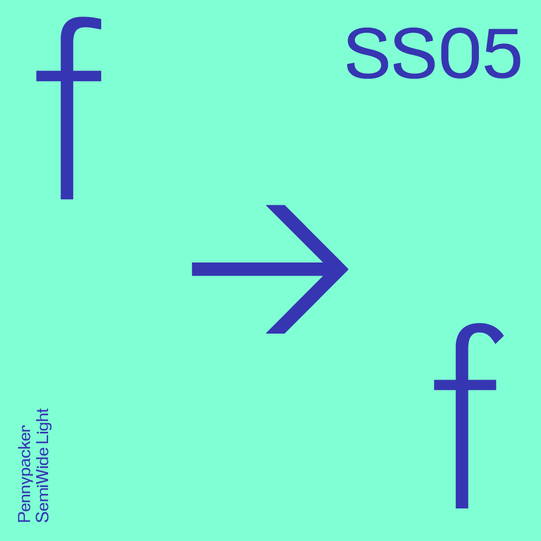
Stylistic alternates
Pennypacker includes sets with stylistic alternate glyphs for a, f, g, and r.
Pennypacker Has 5 WidthsPennypacker Has 9 WeightsUse Stylistic Set SS02 for alternate aUse Stylistic Set SS03 for alternate rUse Stylistic Set SS04 for alternate gUse Stylistic Set SS05 for alternate f
Choreographer and dancer Deborah Hay often says, as a movement directive for performers, “turn your fucking head.” It’s anatomical and literal, but it is also psychological and phenomenological. It’s about what happens to your perception of space and time when you turn your head: to get un-stuck from wherever you think front is, to experience your surroundings, to add dimensionality to your perspective, to avoid tunnel-vision or spacing out.
I think this makes a lot of sense, not just in the studio or onstage, but in the field at large. Looking to the side means not just seeing where I’m going or what’s in front of me, or being in a line of futures and pasts, but remembering to check out who’s with me. Looking to the side means remembering how much information, ideas, and wisdom my contemporaries, colleagues, and collaborators have that I don’t. As we share the same time, all these other perspectives bring what’s happening and what we are doing here into resolution, which makes the paths forward multiply, or the one I’m on feel wider and less lonely.
In the art world, people aren’t encouraged to cite one another’s work that much, as if we should all be claiming originality and individual genius. I don’t believe in either of those things. We are all perceptual sponges. Our bodies are dirty containers through which everything passes and leaves a trace. Our minds are fully populated with arbitrary and curated collections of learned behaviors, patterns, beliefs, and concepts. What falls out when we move, act, speak, and create is not one of ours but all of ours.
The people that are in and around me keep me company when I dance. Especially when I’m alone in the studio, that’s when I see and hear them the most; when I’m groping for tools and support in my practice, when I’m riffing and recognizing what’s in there, when I’m deciding where and how to start. I’m never alone in my bind (mind + body = bind) and thank goodness because it’d probably be boring and awkwardly narcissistic to look inward and find just one coherent thing I could call myself. I think dancers are often acutely aware of our own influences, as self-observation and understanding our patterns are among our most important tools. In this way, turning inward and turning our fucking heads are almost the same thing.
In all of my dances, explicitly or implicitly,
I nod to the many within and out there.
– Eleanor Bauer,
August 2019
The above data would be amply sufficient, were it not for the fact that the airplane is constantly subjected to a wind of variable direction and strength. Since winds exert considerable influence, both on the speed and direction of an aircraft, the problem consists in determining the magnitude of the variations due to these aerial currents and in deducing from them the new orientation to be adopted in order to arrive at the point B.
If the speed and direction of the wind were known, nothing would be simpler than to determine this new course. The following description of the method to be employed in this event is borrowed from Mr. Le Prieur.
The problem to be solved, as presented to the pilot or observer of an aircraft, is as follows: The aircraft starting from A must land at B, the only data being the speed of the airplane, the altitude (which can be estimated with sufficient accuracy) and the orientation D of the course.