Sans serifs were still a rather new genre of typefaces at the beginning of the 20th century. The vernacular grotesque style — occasionally crude, usually fat, often compact and with straight-sided rounds — had made them popular for advertising and other eye-catching display typography. But there were two alternative strands developing in the 1910s and ’20s. The English, spearheaded by Edward Johnston and later Eric Gill, were looking for a more readable style of grotesques based on traditional models of calligraphy (see Johnston’s alphabet for the London Underground for instance, or Gill Sans). In Germany on the other hand, modernists were calling for new letterforms that could express the feeling and style of the time and would not cite historic models as much as traditional text typefaces or the forms proposed by the English designers.
Jakob Erbar’s Erbar-Grotesk was one of the first proposals for a sans serif in the new, simplified, modern style. It is not as radically constructivist as other experiments of the time though, perhaps because Erbar already had some experience in drawing/designing typefaces as well as training in calligraphy and lettering.
Born 1878 in Düsseldorf, Jakob Erbar trained as a typesetter and worked as an educator at the Düsseldorf school of printing, and later as professor at the school of arts and crafts in Cologne. His first typeface was the innovative sans serif with stroke contrast Feder-Grotesk in 1909 — back then the first typeface in this style, which was later popularized by Lydian and has recently seen a remarkable revival. A chancery blackletter (Erbar Kanzlei, 1913) and a serif family (Erbar Mediaeval, 1914) followed before Ludwig & Mayer published Erbar’s Lichte Fette Grotesk, a striking inline display face, in 1923.
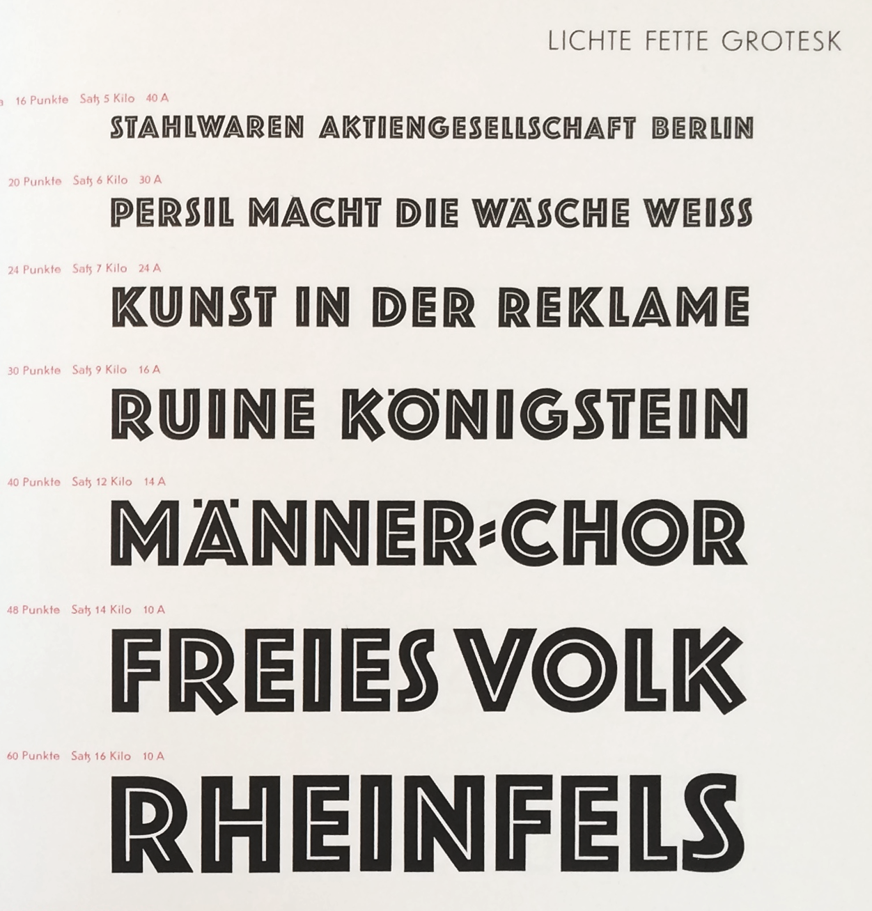
Lichte Fette Grotesk – a rather generic name translatable into Bold Inline Grotesk and known as Phosphor abroad — can be regarded as the prelude to Erbar-Grotesk. It originally consisted of capitals only. (Later, a lowercase seems to have been added somewhere along the way). As with many typefaces by Erbar, it had alternate glyphs available, in this case versions with straight or diagonal terminals for K R Y as well as an narrow alternate S. The basic forms are very similar to the later Erbar-Grotesk bold styles.
Although Erbar-Grotesk is generally dated to 1926 (some mention October 1925), Jakob Erbar claims to have worked on a modern sans serif as early as 1914, interrupted by WWI (see: Walter Tracy, Letters of Credit, p 93), definitely in the 1920s though as this sketch from 1922 suggests — thus before any of the other geometric typefaces were released.
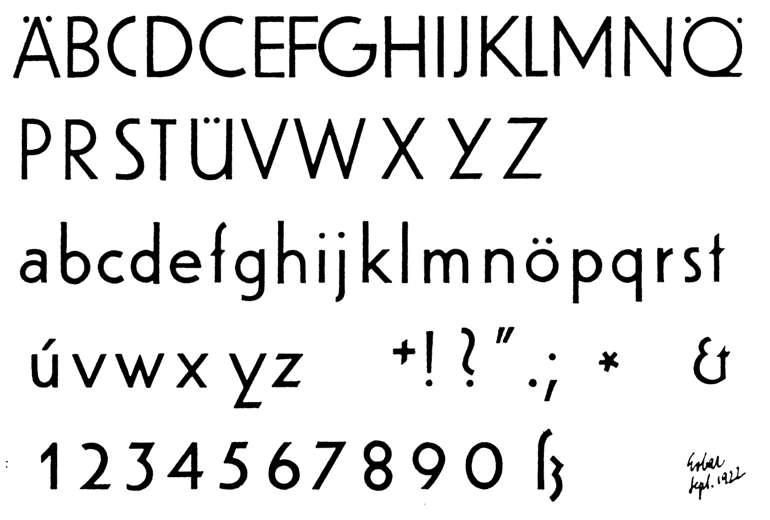
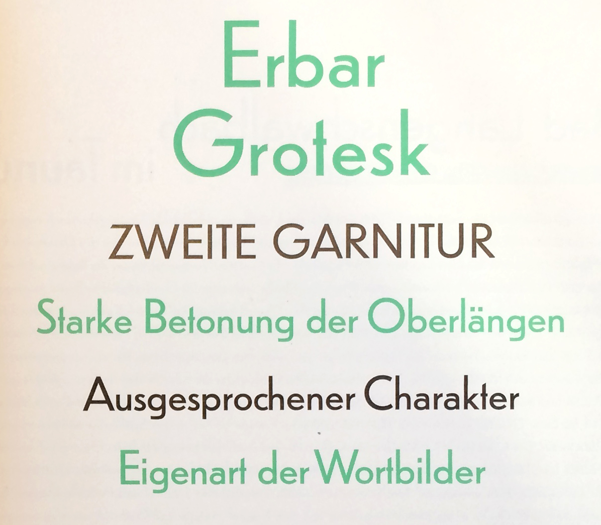
These drawings show a moderate geometric construction by someone who seems to know calligraphy and classic proportions of letterforms. After all, he was a student of Fritz Ehmcke and Anna Simons, who in turn were students of Edward Johnston. (Compare Erbar’s drawings to early sketches for Futura by Paul Renner for instance.) Much less radically constructivist than Herbert Bayer’s experiments at the Bauhaus, Erbar incorporated classical proportions of the capitals, slight optical corrections where rounds or diagonals meet straight stems, and most iconically, a two-story a where other geometric types usually preferred the single story form. This pot-belly-like a is now often referred to as ‘Erbar-a’ since it is a signature feature in almost all of his typefaces.
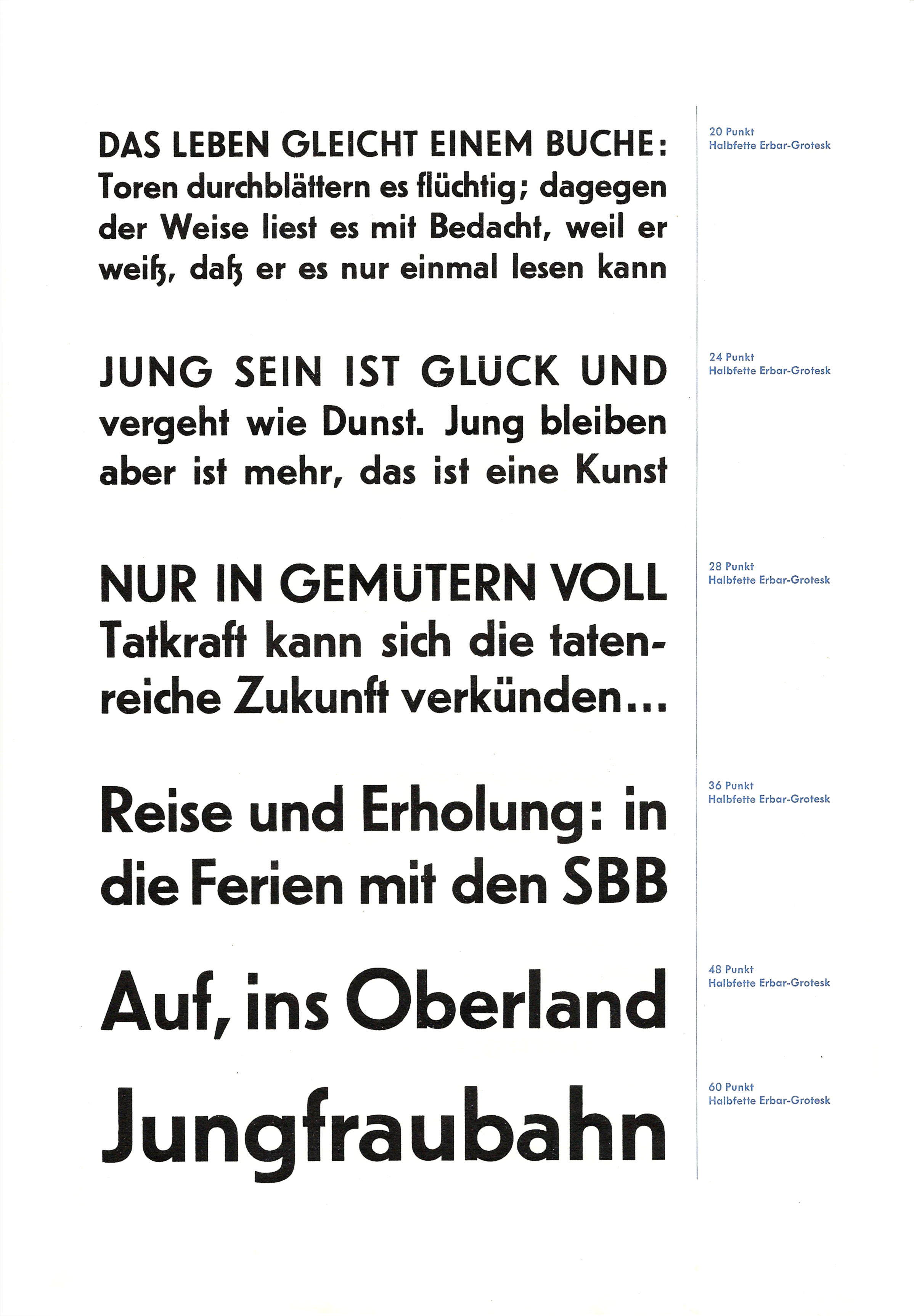
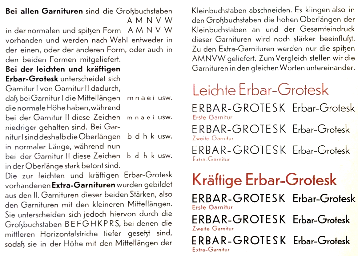
The initial release included regular and bold weights and a knocked-out all-caps display style called Lucina, followed by a light weight and italic in 1927. The comparably low x-height of Erbar-Grotesk was a common trait at that time, but Erbar and Ludwig & Mayer went even further and offered Erbar in two sets: Set I with “normal” (low) x-height, and Set II with especially low x-height. Plus, there was an Extra Set with matching caps for Set II, as well as alternate forms for capitals A M N V W with pointy apexes and vertices. (As typically for foundry type, the actual proportions differed slightly across point sizes, with comparably larger x-height for text sizes and lower x-height and tighter spacing for larger point sizes.)
Another key design feature of Erbar-Grotesk is the distinct ß. You can still find it widely on Berlin street signs for which Erbar-Grotesk was the model, slightly differently adapted in former East and Western parts of Berlin. The classic roman proportions of the caps make Erbar-Grotesk also very well suited for use in all-caps setting. Jakob Erbar designed several all-caps display variants to go with his Grotesk family: the already mentioned Lichte Fette Grotesk (bold inline style, 1923) and Lucina (knocked-out white on black with border elements, 1926), Lumina (with heavy outline, 1928) and Lux (open inline thin-thick version, 1929)
After the release of Erbar-Grotesk, and especially Bauer’s Futura in 1927, the genre became highly popular. Almost every German foundry quickly followed suit and added a geometric sans serif to their catalog. Also geometric (all-caps) display typefaces in the style of Fette Lichte Grotesk, Lumina etc. were published widely. Nevertheless, Erbar and Futura, together with Kabel, became the most popular ones and were also available abroad, increasingly popular in the US (while the UK remains a Gill-Sans-nation to this day).
By 1930 — the heydays of geometric sans — the Erbar-Grotesk family was remarkably extensive, offering four weights, two of them in three different sets, italics and a condensed variant in two weights, plus the four separate display styles. In 1931, Erbar-Grotesk also became available for the Linotype system in sizes as small as 6 pt (4 pt for hand composition!). Many characters were available in alternate forms, for instance a single-story a, a spurless u, A M N V W with pointy apexes, a M with splayed stems, or a Y with horizontal base.
Although the first of its kind and certainly popular until the 1950s, Erbar-Grotesk ended up in the shadow of Futura, especially internationally. Perhaps also because of Tschichold’s endorsement of Futura in die neue typography. Tschichold, in his influential 1928 book, mentions Erbar and Kabel as being too much of a Künstlerschrift, feeling too designed. For him Futura was the best of the new geometric sans but he still preferred the original nameless grotesques.
Swiss archivist Philipp Messner adds, that Erbar-Grotesk was quite popular in Switzerland in the 1940s and 1950s, e.g. used on many forms and documents, but fell out of favor in the 1960s and was replaced by Helvetica — a fate that most geometric sans serifs shared. Until their glorious, overarching revival in the 2010s.