A Series of Narrower Widths
Designed with both weight and x-height axes, it allows for subtle to dramatic shifts in tone—moving seamlessly between compact, dense settings and open, highly legible compositions.
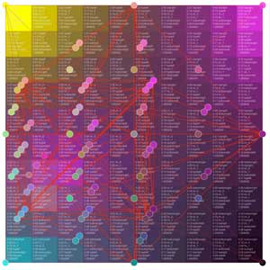
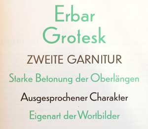
Dunbar is an exuberant geometric sans with a unique structure, including Tall and Low display versions for large sizes and a Text version for smaller sizes. Inspired by Jakob Erbar’s Erbar-Grotesk, it is not a strict revival but interprets the design for contemporary applications, rediscovering some of Erbar’s innovative ideas of alternate letterforms and proportions. With variable weight, width, x-height, and optical sizes, Dunbar stylishly fits where you need it.
Designed with both weight and x-height axes, it allows for subtle to dramatic shifts in tone—moving seamlessly between compact, dense settings and open, highly legible compositions.
With its extremely low x-height, Dunbar Low accentuates the contrast between the uppercase and lowercase letters and is arguably the most extravagant branch of Dunbar. The Low styles can take on arty or retro vibes, depending on the context. On the other end of the x-height spectrum, the maximalist Dunbar Tall has a dense presence and allows for maximum impact in tight spaces. Using Dunbar’s variable fonts, typographers can adjust the x-height axis to dial in the exact style that fits best for the project at hand.
Dunbar Low is expressive in its vertical rhythm and works well with generous vertical space on a page, such as in section openers for editorial or exhibition signage. Dunbar Tall, with its maximal x-height creates a dense line of text for a strong impact and an economical use of space. For smaller usage, Dunbar Text completes the series with less extreme proportions and more breathing space around it, while staying expressive and harmonious with the rest of the Dunbar series.
Adjusted for optical size, optimized for rhythm, proportion, and texture across changing reading conditions.
Adjusted for optical size, optimized for rhythm, proportion, and texture across changing reading conditions.
Dunbar builds on the geometric foundation of Erbar-Grotesk, where simple forms are tempered by calligraphic knowledge and optical correction. Rather than strict, mechanical construction, the geometry is moderated—curves open slightly, joins are adjusted, and proportions are refined for readability. Dunbar extends this approach into a contemporary system, allowing these geometric relationships to shift across its range of proportions while maintaining clarity and rhythm.
In Dunbar Tall, some uppercase letters needed to be optically adjusted to better harmonize with the very large x-height of the lowercase. The respective alternate forms are available in all fonts via Stylistic Set 04 (SS04).
Dunbar includes a range of stylistic alternates that extend its expressive potential without breaking the system. Alternate letterforms subtly shift tone—introducing softer or sharper details, adjusting proportions, or echoing historical references. These variations can be used sparingly for nuance or more broadly to reshape the overall voice, allowing the typeface to move between restraint and character while remaining cohesive.
Cyrillic is now available for following style:
В молчаньи ночи тайной
In the Silence of the Secret Night
Op. 4, No. 3
Сирень
Lilacs
Op. 21, No. 5
Вокализ
Vocalise
Op. 34, No. 14
Не пой, красавица
Sing Not to Me, My Beauty
Op. 4, No. 4
На холмах Грузии
On the Hills of Georgia
Op. 3, No. 4
Еврейская песня
Hebrew Song
Op. 7, No. 2
О чём в тиши ночей
Of What I Dream in the Quiet Night
Op. 40, No. 3
Не ветер вея с высоты
Not the Wind, Blowing from the Heights
Op. 43, No. 2