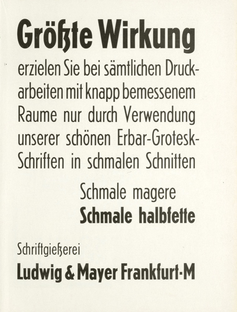
On Erbar and Early Geometric Sans Serifs

Before Helvetica and Futura defined modern typography, Jakob Erbar’s Erbar-Grotesk offered an early vision of the geometric sans serif—balancing modern clarity with subtle traces of tradition.

On Erbar and Early Geometric Sans Serifs
Beyond the Fragile Geometry of Type

“Geometry is a Metaphor. Measurement is nothing more than human’s attempt to control nature … it must therefore be fragile.”

Beyond the Fragile Geometry of Type
On Condensed Geometric Sans Serifs

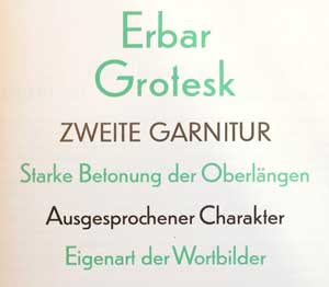
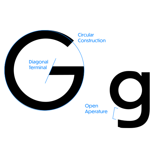
Many of the earliest serifless typefaces from the first half of the 1800s were condensed. But with the advent of the geometric sans in the late 1920s, how did designers maintain the geometric character when going narrow?
On Condensed Geometric Sans Serifs