Geometric sans serifs entered the typographic scene in the late 1920s, famously starting with Erbar-Grotesk by Ludwig & Mayer in 1926, closely followed by Bauer’s Futura and Klingspor’s Kabel in 1927. Perceived as modern and forward-looking, they were instantly met with great demand, prompting many other type foundries to work on their addition to the new genre as well. The race was on – not just to carry a geometric sans, but to offer a family of several styles that beats the competition in terms of range and versatility. Such family expansions comprised extra weights, italic variants, and display companions. Adding a condensed was another way of making the product more attractive, and arguably a central one.
Condensed type styles can be extremely useful wherever text needs to be horizontally compact but still have a certain presence and impact.
Typical fields of application include titles, headlines and subheadings, in newspapers, magazines, adverts, labels and more.
Condensed sans serifs as such were not a new thing, of course. Many of the earliest serifless typefaces from the first half of the 1800s were condensed.1 In Seemann’s Handbuch der Schriftarten – a directory of all typefaces available in German-speaking countries in 1926, just before the geometric sans emerged – more than a third of all listed grotesks have proportions that can be described as condensed or compressed. New was the question of how to retain the geometric character when going narrow. Geometric sans serifs are commonly defined by low contrast, a bare-bones design, and, crucially, a construction that’s based on elementary shapes like circle, square, and triangle. First and foremost, rounds are supposed to be more or less circular.
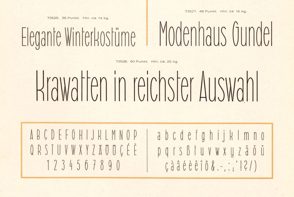
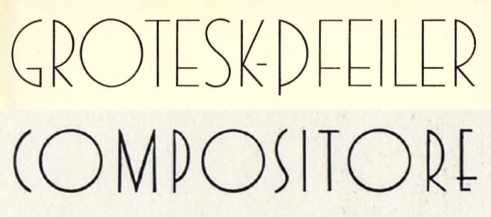
There is no such thing as a narrow circle. One could make everything narrow, but retain the full width for glyphs such as /O /G /Q. This approach leads to charming display designs like Grotesk-Pfeiler (Norddeutsche Schriftgießerei, 1927) and Triennale (Reggiani, 1933). It resurfaced in revivals of the Art Deco aesthetic, see Epic (Lettergraphics, by 1969) and Organda (VGC, 1972). It’s not an option for a typeface that needs to work in text and yield an even color, though. A few type designers chose an approach where the round glyphs are narrow, too, but have semicircles at the top and bottom. Such straight-sided shapes are known as “stadiums” or “obrounds”. However, the vast majority of condensed geometric sans serifs feature elliptical rounds. This approach is the most direct one: it stays closest to what one would get when squeezing a circle (with optical corrections). As such, it makes it easier for the narrow styles to be perceived as belonging to the family.

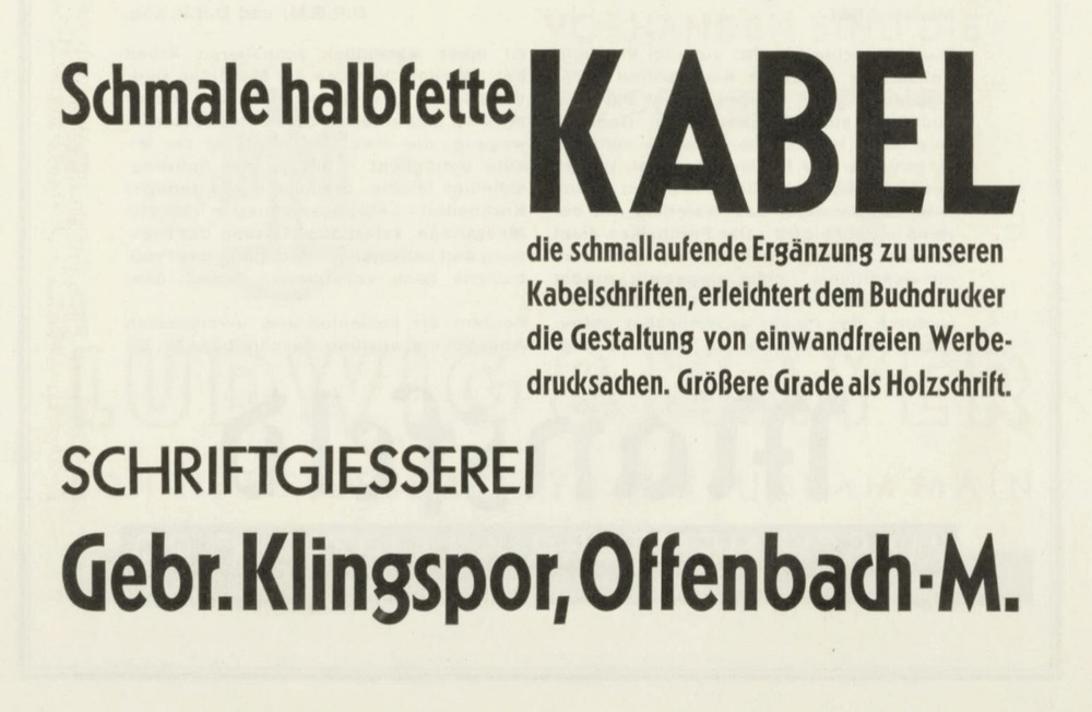
The first geometric sans to get a condensed companion was Kabel. Its schmalhalbfett arrived by early 1929. One and a half years later, Kabel had a lighter schmal, Futura a schmalfett, and Erbar-Grotesk a schmalmager and a schmalfett. Futura’s second condensed member, the schmalhalbfett, was completed in 1936, but its schmalmager arrived only after World War II, in 1950.
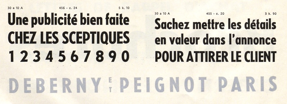
By the end of the 1930s, most of the classic geometric sans serifs from Germany2 were equipped with condensed styles, including Berthold-Grotesk (Berthold, 1932–1935; schmal, schmalhalbfett, schmalfett), Super-Grotesk (Schriftguss, 1933; schmalmager, schmalhalbfett, schmalfett), Friedrich-Bauer-Grotesk (Trennert, 1934; schmalhalbfett), and Neuzeit-Grotesk (Stempel, 1939; schmalhalbfett, schmalfett). Foundries in other European countries got busy around this time as well, adding condensed styles to Nobel (Amsterdam, by 1935) and Semplicità (Nebiolo, 1935). Deberny & Peignot is an interesting case. It illustrates the pressure that foundries felt to quickly bring out condensed variants of the popular geometric sans. The French company struck a deal with Bauer to cast and sell Futura under the name Europe. For some reason, this didn’t extend to the schmalfett. So in order to provide their customers with a condensed as well, Deberny & Peignot acquired the condensed style of a different German geometric sans, Kristall-Grotesk by Wagner & Schmidt, and integrated it into the family as Europe gras étroit, despite obvious design differences.
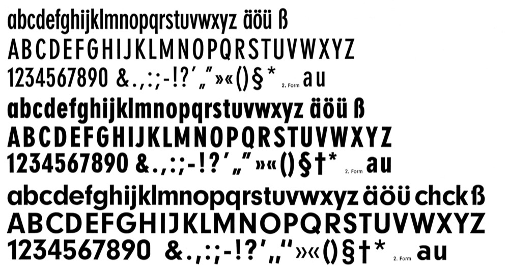
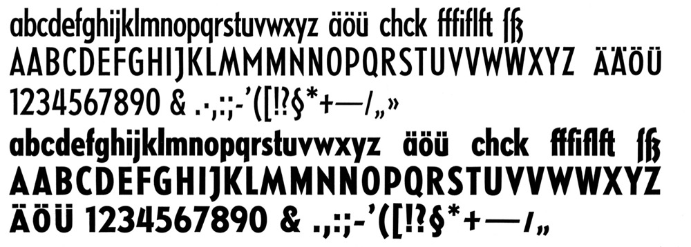
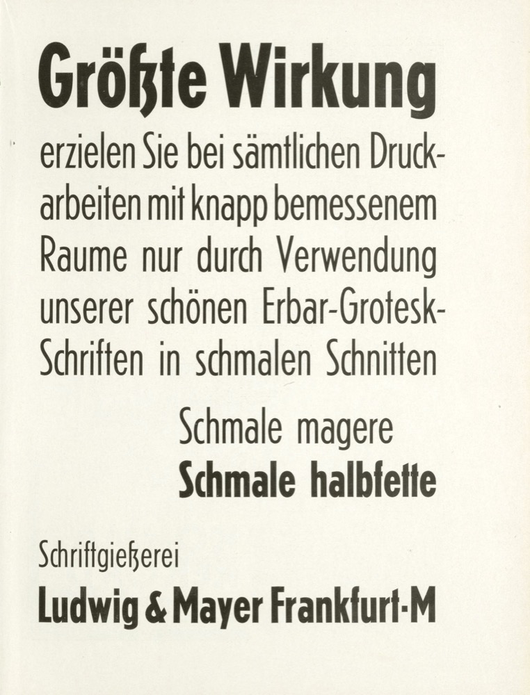
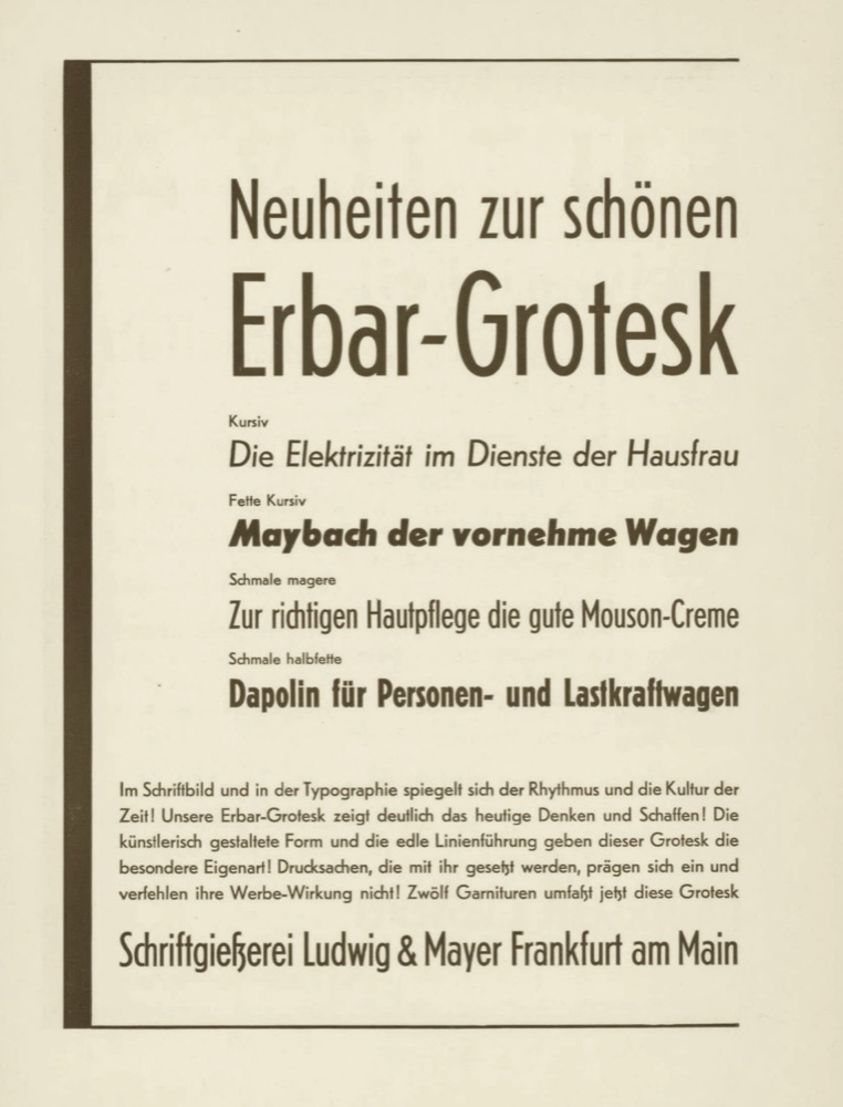
On the other side of the Atlantic, Linotype issued Metro in 1930–1932, making it the first American geometric sans. While this design by W.A. Dwiggins didn’t come with a proper Condensed, its medium weight, Metromedium, is a good deal narrower than Metrolite and Metroblack. Ludlow’s geometric sans is called Tempo. It got a Bold Condensed in 1931 and a Medium Condensed by 1936. The family eventually had four condensed weights, three of them also in italic variants. Intertype introduced a first condensed style for their Vogue in 1936. By 1946, the series featured no less than five condensed styles, including one italic.
For the most part, Spartan by Linotype and ATF as well as Twentieth Century by Monotype are copies of Futura. Their extension with condensed styles didn’t always follow Bauer’s original, though, neither in terms of design, style count, nor timeline. Spartan offered five condensed weights, two of which came with italics. The first four were available in 1952, at a time when Bauer had just added their third and final condensed weight. Also, Spartan Medium Condensed is wider than Futura’s schmalhalbfett. Intertype’s Futura is an adaptation of several styles of Futura for machine typesetting, including the two condensed styles that Bauer released in the 1930s. In the 1950s, Intertype added an Extra Bold Condensed (with Oblique) that’s much bolder than what was available as foundry type. It’s a similar story for Sans Serif, Monotype’s generically named follower of Kabel: while Klingspor’s original had two condensed weights, Sans Serif offered three.
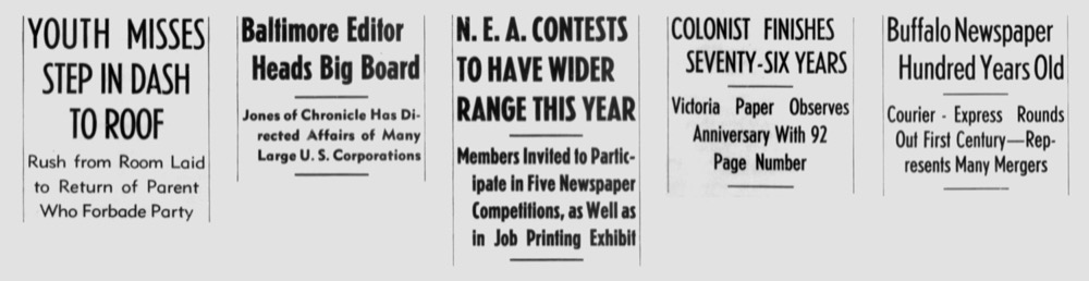
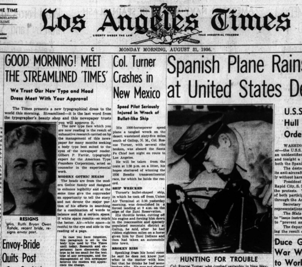
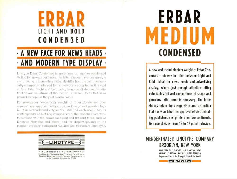
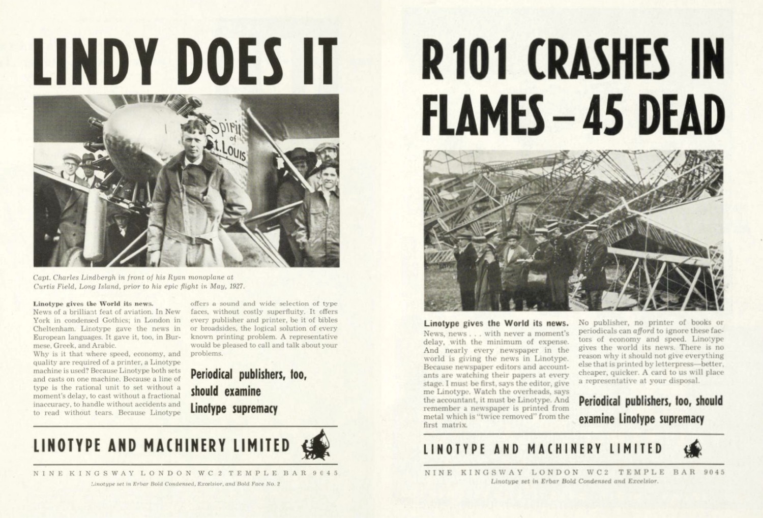
Next to Metro and Spartan, Linotype also produced an adaptation of Erbar-Grotesk for machine typesetting. Three of the four styles of Linotype Erbar are condensed: Bold (1933), Light (1934), and the newly added intermediate Medium (1937). According to C.H. Griffith, then in charge of typographic development, it “is an excellent face for newspaper heads, is an effective advertising face, and can be used for many kinds of commercial printing.” One prominent example of a newspaper opting for Linotype Erbar is the Los Angeles Times, which introduced the Light Condensed in August 1936.
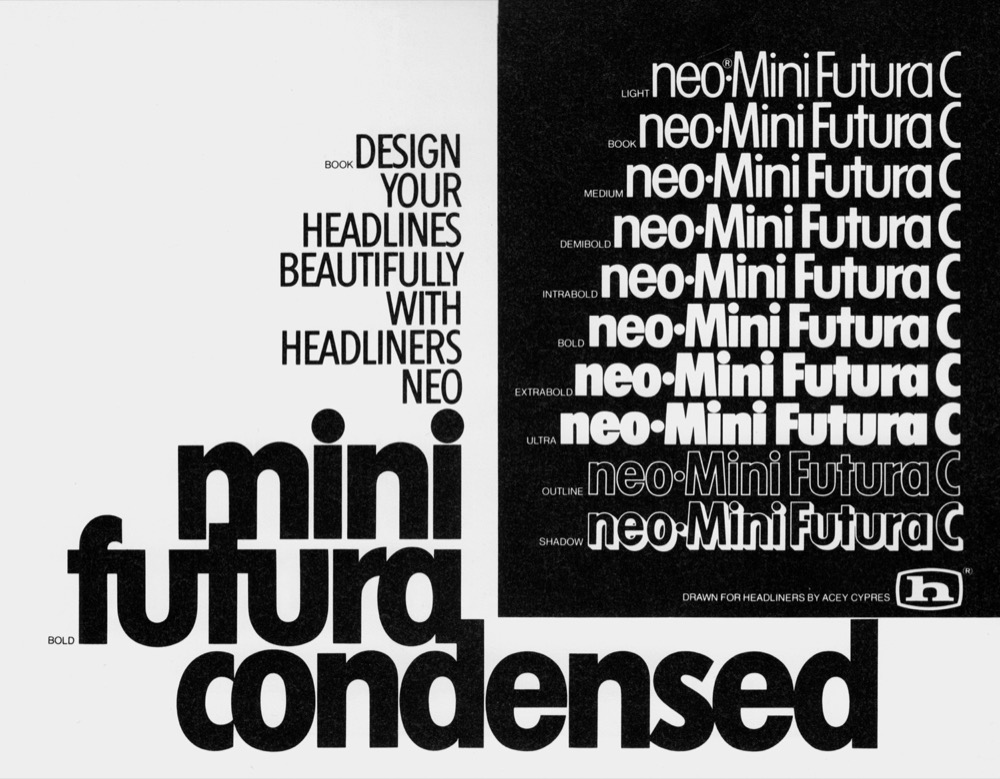
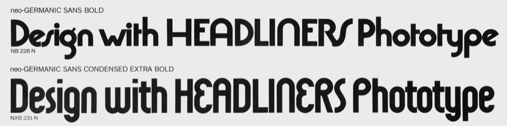
Geometric sans serifs remained popular throughout the 1940s and 1950s and were subsequently superseded by Helvetica, Univers and co. The release of ITC Avant Garde Gothic in 1970 marked a new chapter in the history of the genre. The design by Herb Lubalin and Tom Carnase is distinguished by its very tall x-height, and although it often was used for text, it’s effectively a display typeface. In 1974, ITC followed up with condensed styles. Drawn by Ed Benguiat, these are not particularly narrow. In the bolder weights, stems intersect the elliptical counters. Other providers of phototype jumped on the trend of a raised x-height. Mini Futura (Headliners, 1972) is one such example. Acey Cypres added condensed styles to this series some time after 1978. Freed from the limitations of manufacturing physical type, these families came in a wide range of weights. Germanic Sans, another design by Cypres, belongs to the wave of ultrageometric display faces with spurless glyphs that reference the “universal” alphabet created by Herbert Bayer at the Bauhaus. Issued by Headliners in 1970–1971, Germanic Sans is one of the few members of this subgenre to feature condensed styles. It’s also a prime example for a condensed with stadium-shaped rounds.
When Adrian Frutiger set out to revisit the geometric sans and make it suitable for text use, he explored narrow variants as well. These weren’t implemented for Linotype’s release of Avenir in 1988. Akira Kobayashi deemed the addition of condensed weights crucial for making Avenir an all-purpose typeface. They were issued in 2004 as part of his Avenir Next revision. The long timespan between the release of standard and condensed widths is emblematic for the secondary role of the latter. Even with digital typeface designs, it’s still the rule that condensed styles get made only after the core design has proven to be viable. Users of FF Mark (FontFont, 2013/2016) and Cera (TypeMates, 2015/2018) had to manage without narrow styles for three years. For other typefaces like GT Walsheim (Grilli Type, 2009/2017) and LL Brown (Lineto, 2011/2022), the waiting time was much longer. And for many recent geometric sans serifs – like LL Supreme (Lineto, 2020), The Future (Klim, 2022), Polymath (OH no, 2024), and Futura 100 (TypeTogether, 2025), to name just a few examples – a condensed is still nowhere in sight.
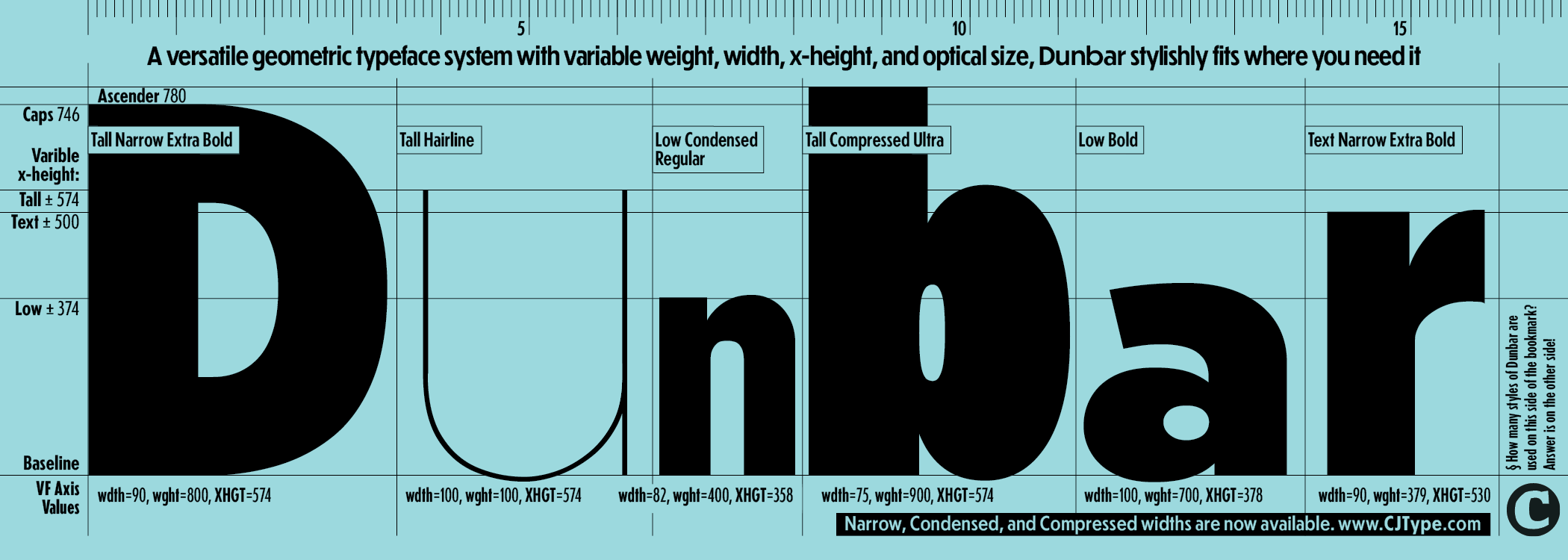
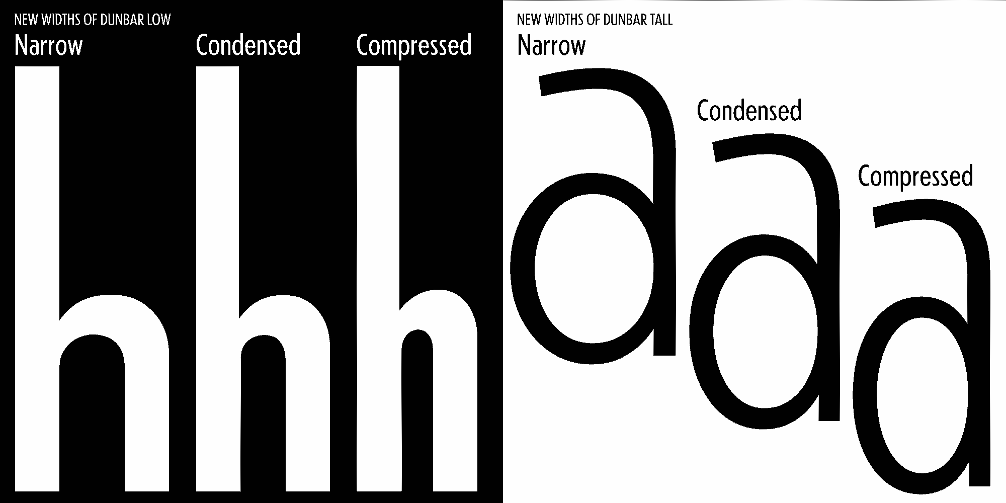
Space-saving styles for CJ Type’s Dunbar arrived in 2026, ten years after the initial release in 2016. They add no less than three new widths: in addition to Dunbar Condensed, there is the moderately condensed Dunbar Narrow and the more extreme Compressed. Furthermore, they cover all the three existing subfamilies distinguished by x-height: Tall, Low, and Text. Dunbar is optionally available as variable font, with axes not only for weight, but also for x-height and width. This allows typographers to dial in the exact style that fits best for the project at hand. Design-wise, Dunbar remains rooted in the tradition of early geometric sans-serif typefaces. In regard to the technical implementation, it’s very much cutting edge – and in terms of style range, it might even be unprecedented in its genre.
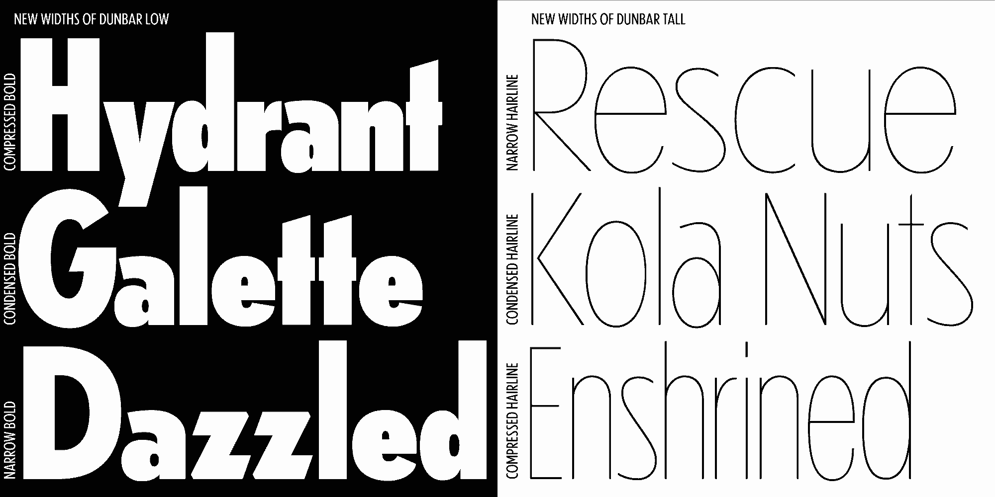
Dunbar goes beyond the conventional concept of a typeface family and is indeed better described as a “typeface system”. Users can adjust it to fit their typographic needs.
For example, the Text Narrow styles come in handy for small- to medium-sized text that needs to be a tad more compact than normal, as in synopses, marginalia, or chart labels. With its prominent lowercase, Dunbar Tall Compressed makes for neat bands of text in mixed-case headlines. It’s also a great choice when the task is about cramming as many characters as possible into the available space – think ingredient lists and other legally required information – while maintaining a decent level of legibility. Dunbar Low, with the accentuated contrast between cap height and x-height, is arguably the most extravagant branch, especially in the narrower widths. It excels in eye-catching display applications, be it magazine features, book titles, or website headers. Depending on the context, Dunbar Low can take on arty or retro vibes. It is particularly charming in settings where the relatively short lowercase letters are the exception – or, conversely, where only a few letters with tall ascenders stand out. Complex editorial projects will benefit from having access to a whole system of coordinated styles.
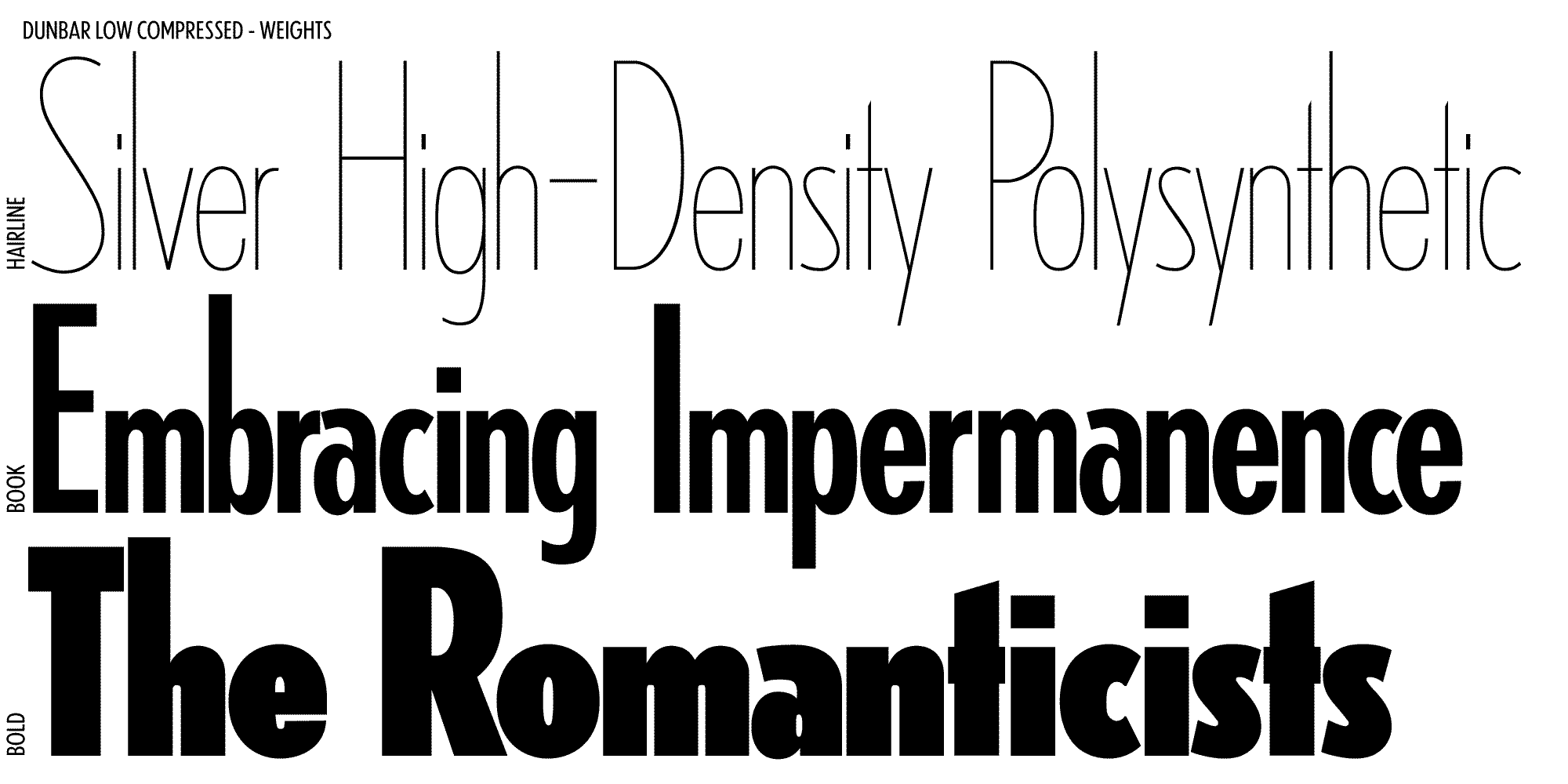
Adding condensed styles to a geometric sans family can greatly increase the utility of the typeface and show off its unique character. Beyond the space-saving functionality, pushing a typeface to the extremes of the designspace can reveal the more interesting aspects of the design, for example in the weights of Dunbar Low Compressed. From the earliest condensed examples in metal type to contemporary multi-axis variable fonts, the process of making condensed styles is not as straightforward as one might think. Each foundry, designer, and typeface can have a different approach, especially with the constraints of a geometric design, and each approach can give a deeper insight into the design philosophy of the typeface. Next time you are choosing which typeface style to use for a project, take a closer look at the narrow, condensed, and compressed styles.
See for example Specimen of Printing Types by Henry Caslon from 1841. ↩︎
One exception of note is Elegant-Grotesk, for which Stempel didn’t produce any condensed styles. ↩︎