Within the first few weeks of the design process for Dunbar, I had the idea to explore different x-heights, and I immediately started using Superpolator for this exploration. Additionally, Erik‘s MutatorMath and designspace format were crucial to the development of variable fonts. If not for multiple conversations with Erik at AtypI Warsaw in 2016, I don’t think I would have been able to release Dunbar as a variable font so quickly after the announcement of the OpenType 1.8 format. I’ve been fortunate enough to talk with Erik in person over the years about these topics, and it’s always fascinating. As I looked back on the development of Dunbar and a decade of variable fonts for the Dunbar Design Repository, it occurred to me that it would be a wonderful opportunity to have a more in-depth discussion with Erik. The interview has been lightly edited and condensed. Enjoy!
Thanks for taking the time to meet with me today, Erik. Today is May 10th, and on May 10, 2016, exactly ten years ago today, we were both at TypoLabs in Berlin. And that was when the first presentation of “OpenType GX” fonts [later named variable fonts] happened. I was using Superpolator for my upcoming typeface Dunbar and I had some questions for you about nonaligning masters after you presented on Responsive Lettering, MutatorMath, and Designspaces. And you took the time to sit down with me and draw some sketches of how things affect each other when masters are not aligning, and it was super helpful. I’m still looking at similar issues and I feel like you showed me some similar sketches recently at the Fontstand conference in Berlin. It’s been an ongoing conversation. So thank you for always being generous and sharing these insights. I’m hoping to dig into some of that today. To start off, though, I first wanted to go back into some older history and ask you about your first interactions with interpolation and type design. I have an understanding that this idea of interpolation in type design started with Peter Karrow at URW for their Ikarus software. But how did you first encounter this idea of interpolation?
Well I guess indirectly when my brother Petr was at URW experimenting with their Ikarus interpolations. But I only saw some results. I was not involved with the technical side of that. But Petr was asked by Gerrit Noordzij to digitize that /e. That became two squares in one of the publications. And then later became a cube. And that was all done on Ikarus.
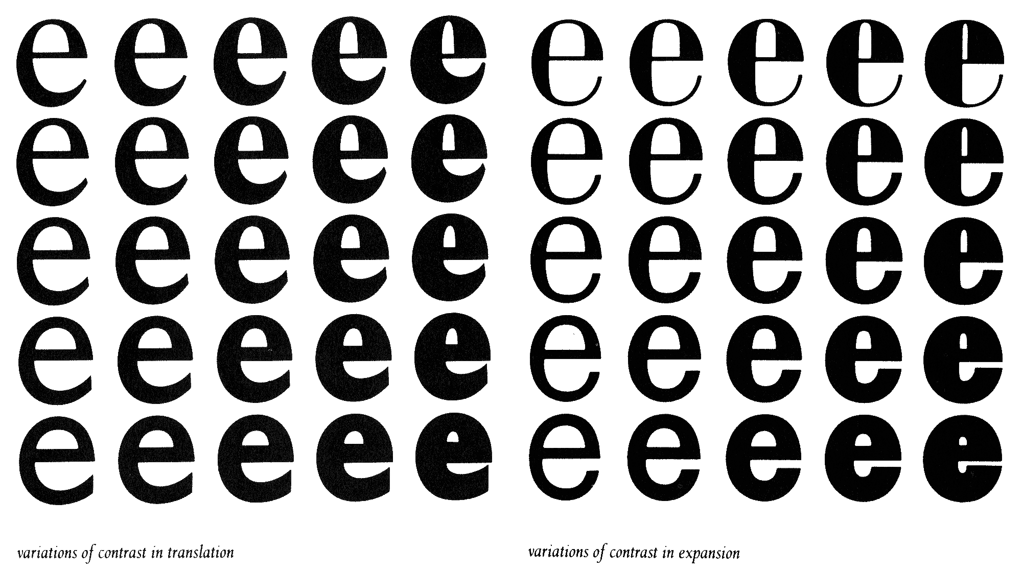
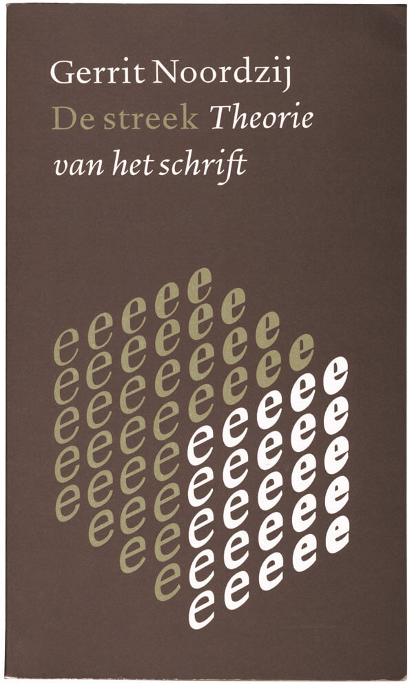
And it happened at URW because they were the only people who had numbers, who had the splines, who knew how to do digital type. Later for me I guess it was Fontographer. It offered a very basic interpolation. And then I think soon after, Adobe tried MultipleMaster. I remember seeing interesting presentations of it but I think also it never really worked. I think the ideas were much further ahead than the printing and the digital publishing technology at that time. They kept crashing and Courier kept coming out of printers. I think a lot of people were very afraid of using it. In an answer to that I think Apple then created GX. I think it was a variation on, sort of a follow-up to, their hinting technology. It’s Mike Reed and Tom Rickner who were inventing hinting. Do you know Tom? He worked with Font Bureau afterwards. He’s a Monotype person now. TrueType had this technique where they could move points around and then they very quickly discovered that they could also make a Bold and a Condensed and make some variations that way. Then that rolled into a product called GX, “Graphics Extended” I think. That also involved Unicode, and transparency, and CMYK, and color models. And that was all ready to go. And that was also the time when Steve Jobs returned to Apple. And he decided to cancel the whole thing. There were big reasons, nothing to do with the technology, but political reasons, and that resulted in Apple not having Unicode until OS 10. That was maybe another five or six years. But I had done some work with the Apple tools. There was a workshop called the Font Safari. And we went to Cupertino and played around and made some fonts. Played around with their tools. And that was interesting because that’s why I first learned their interpolation model, which is very different from Adobe’s interpolation model. And GX didn’t go anywhere. But this idea stuck in my mind. And when Petr [van Blokland] and Just [van Rossum] were writing RoboFog, that became a thing to try. They said, “Can we figure out more ways of doing interpolation?”
That’s something I wanted to ask you about. Because I always felt like your implementation of interpolation, MutatorMath underneath the Superpolator interface, had a specific feel to it. I think when I first encountered it I thought, This is just how interpolation works. The numbers just have a certain kind of output. But as I’ve dug deeper into this stuff, and encountered things like varLib and other approaches for how things like nonaligning masters or extrapolation can work, I realized how each of these models has its own specific flavor. And I appreciated that your implementation had a particularly typographically helpful flavor to it. Like, something that, more often than not, for myself ends up yielding a result that’s useful. So I was curious: Once you had experience seeing the MultipleMaster and TrueType GX ideas of interpolation, what was your process for developing MutatorMath? How much trial and error did you go through with things like extrapolation? And were there certain kinds of targets you were aiming for? Or other kinds of examples you wanted to replicate?
Sure. It’s interesting that you mentioned that there are “flavors” in these things. And this is something I’ve been very much aware of. There’s not one single way of doing an interpolation. But if you grow up using a particular application and say, “Well, this is interpolation,” you think, “Okay, this is all there is to it. That’s all we can do with it.” Then you think this is the only way interpolation works. And this is not true. Because you find the factors, and you put some stuff in, and you find a way of calculating how much each of these things plays a role, then you add it all up. So the nonaligning masters I think was definitely a thing. FontLab had a very strict implementation of MultipleMaster. So it’s like: It’s two masters, four or eight or even sixteen, and that was the way of thinking. And at that time, it was 2003 or 2004, at Type and Media we had a student who wanted to do like four masters and one in the middle. So it’s sort of a five-master thing. And I thought, “This is an interesting question. How would you do this?” And I did a lot of experimenting on models. And trying to find out, well, what is the right way? And really what you do there is, you don’t really discover that there’s a mathematically proper way of doing it. You find Which way is closest to my expectations? And those expectations are very typographic, so if I do this then I kind of want to expect that. And this worked for building models. So you have a default, and you start adding axes, and it’s not complete, so you have these open ends. That was really useful during design. So you have a thing that goes from Regular to Condensed. You have a thing that goes from Regular to Bold. And then you can see what the Condensed Bold combinations look like. Even though they might not be useful in themselves, you can pick something and then start editing it. So having a designspace very much became part of the design process. It’s not a thing you do afterwards when you’re done. It’s something you do when you draw your second letter, basically. And then you already start experimenting and thinking about that.
Yeah.
MutatorMath also solves extrapolation in a really nice way. I really wanted that to be a very rich area to explore because I know that the boundaries are never exactly where you want them. So you draw something, but you’re also interested in what happens when it becomes bolder. Or what happens when it becomes narrower. So I thought for exploration, the extrapolation had to be really good. I spent about a year messing around with that code and not finding it.
This is a presentation from very early on. In 2004 I was trying to sell this at Linotype.
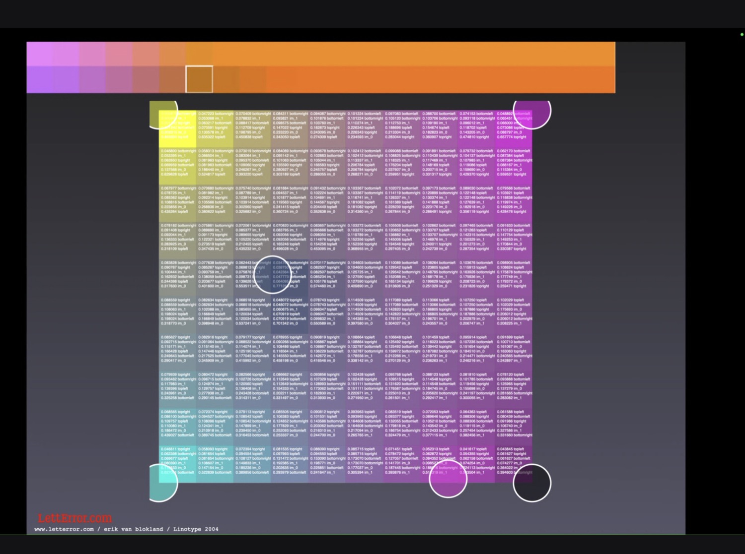
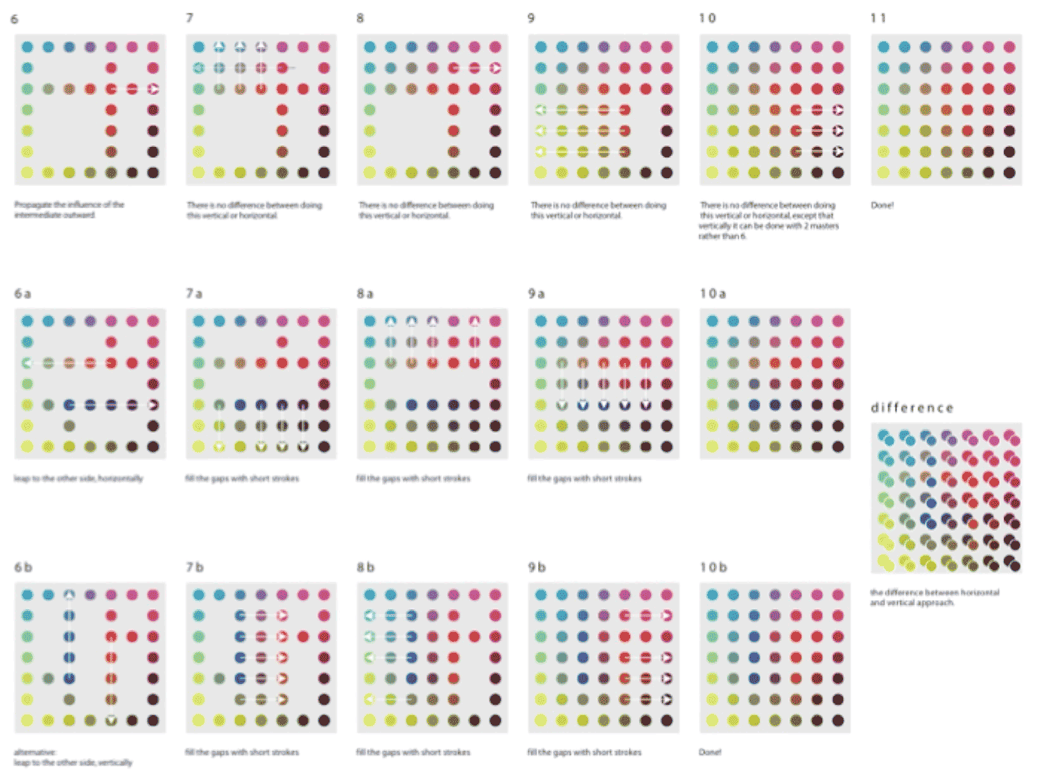
So this is me trying to figure out if you have four masters and a thing in the middle, just through a series of linear interpolations, how to then get a reasonable-looking field. And I also noticed that if you do it in different ways, you get different outcomes. There’s a difference. It’s on the bottom right there. That told me that the method you use has an influence, that not a single truth of this is the absolute interpolation. It’s really just what method is acceptable and close to your expectation, and that should be it. I ended up making things like this, that align and almost align, just trying to get through these fields. I ended up doing what you see in this image.
This shows the differences between different methods. And the reason to solve this is that each of these dots then represents a font, a master. So this can be a couple of characters, but it can also be a full glyph set representing months of work. So you don’t want to come up with a system where work is then ignored, or work is masked or removed. This was a thing with radio stations, sort of: “How much can you receive if you’re at one particular place?” That wasn’t it.
This is a method called kriging, which is used in geology for finding oil, also not the thing.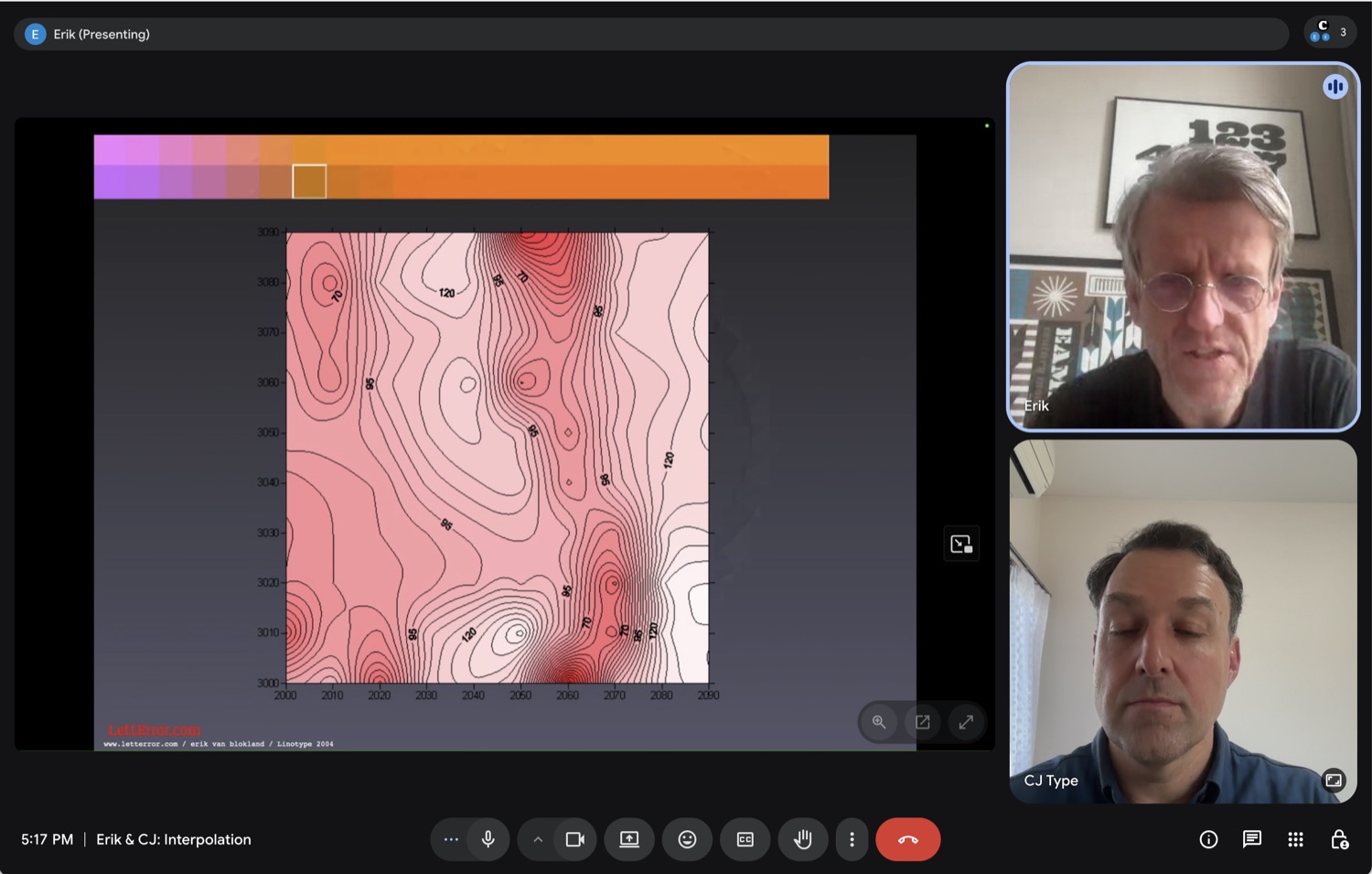
And then at some point it worked. At some point I found a right way. And this is all me trying to remember how the Mutator application [by Mike Reed, Apple] on the GX tools worked.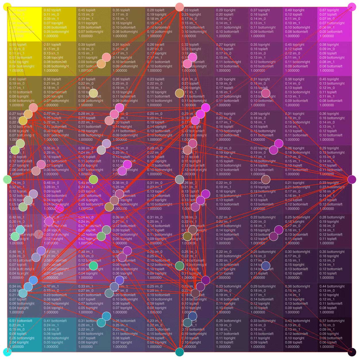
So does that mean you found what the Mutator tools were doing to be pretty typographically useful? That was kind of a target you were going for, it sounds like?
I was trying to recreate what I remembered of how it works. But also I had not seen everything. And also there were unsolved issues in the original Mutator app. I was not sure whether I had properly understood their problems and recreated them. Or whether I had made my own problems. Or whether I was completely off the mark. So at some point I tracked down Mike Reed I asked him about this issue with these nonaligning masters. And he said, “Oh, yeah, that’s an interesting question, we never solved that either.” And then I was at least happy that it was a genuine problem, not my mistake. I was boasting a bit when I said that Superpolator could have these masters everywhere. In a way it could. But when you have two nonaligned masters in a space, you need to decide on what you expect, and how that works, and Mutator did not really have a good answer for all of it. And then [with the development of] variable fonts, like varLib… when Behdad Esfahbod started rewriting the actual GX specification, he was also looking at MutatorMath and he was also sort of making up his own mind. And he formalized a way in which the masters are added to the calculation which makes it reproducible and deterministic. But it also did not offer a real answer to dealing with fractured spaces.
These color fields were my way of figuring out what the masters were doing. You can see the influence of various things. But you could also see the extrapolation. So that green dot at the bottom is [the result of] how those masters are at the top. 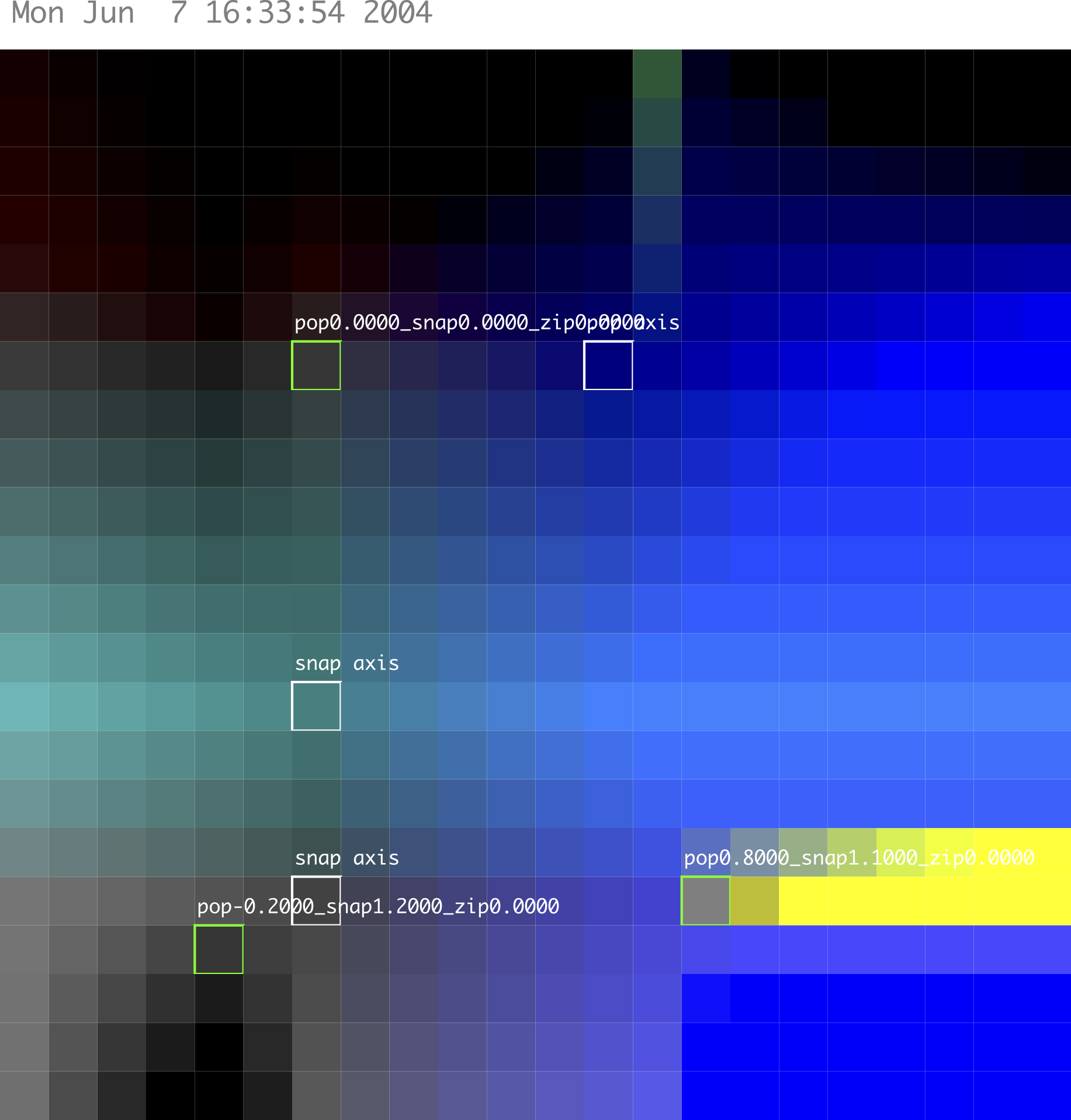
So when you’re looking at those colors you have an idea of what you’re expecting to see as the product of two nonaligning masters, right? Do you look for something that looks smooth? What are you looking for?
These are mostly to discover extrapolations, so if there’s a rectangle, there are four masters here. Somewhere on the snap and pop axis. And then there are some things in the middle. And I’m looking to see that the effects of each are limited by the other masters.
I see, I see.
So I know that the effects are stopped if there’s something else, but also that over the edge it will project. So here the black thing at the bottom center projects to the left and it creates another extrapolation. And that’s the thing that varLib never went into. Really, this is also my idea of what extrapolation should be. I see this as a way for designers to, how to say this, extract more value. To see more what the results of their thinking and drawing are. And if these combinations offer something remotely useful we should be able to see it. And then for varLib and for variable fonts this was never interesting. Because they don’t want to do extrapolations. Variable fonts are very much limited: This is the extreme of the axis and that’s the world where it happens. And there’s no outside. I think that also makes sense. I think they probably want to protect civilians from crazy extrapolations that are useless. I understand this. But for type designers it was a shame to lose it. So if we now have a tool that perfectly simulates a variable font, you will also not see the extrapolations again. So we’re back to what FontLab was doing.
If you’re too close to the output format you will not see things that are interesting, or things that you need to see as a designer.
I’m curious: When you were working out MutatorMath, were there changes between the different versions of Superpolator? Versions one, two, and three? Or was it kind of a thing that you determined, and then it more or less stayed the same? I only used Superpolator versions two and three, I don’t know what version one was like.
Those were mainly changes in the interface. This was using pyObjective C, the bridge [between Python and Apple’s Objective C ], and written in Python. And written using Vanilla, the [Apple] interface library at the time. And fontMath was super important. This is a thing that I think Just and I started to sketch out in the beginning. And then Tal [Leming] really thoroughly reengineered it and made it a fantastic tool. And I think this is one of the very most powerful ideas, maybe next to the pen protocol. But this is one of the really powerful ideas that came out of the RoboFab development. That you can make the glyph objects have attributes that allow them to behave like numbers. So you can take a glyph and then take another glyph and subtract them. So you really say /A minus /B. And then you get a new glyph in which all of the coordinates, each with its matching friend, have been subtracted. But it allows the notation to collapse. The interpolation formula is literally A plus F times B minus A. And that interpolates the whole glyph. It’s like all of the dealing with coordinates, and the various attributes that have to be dealt with separately, all of that has been abstracted away. And that allowed MutatorMath, but also Superpolator the application, to be written. It was all-consuming. I think there were fewer than two hundred people using it at the time. Whenever there was an Apple update, a macOS update, subtle things broke. And I would have to rebuild the interface. There were some very complex things that were tricky for me. The mathematics themselves, they worked fine. It was mostly the interface, and keeping it running, at some point I gave up. Apple really raised the bar. And they have reasons to do so. I’m also not a very good engineer when it comes to running a project that is so complex. Frederik [Berlaen] and Just and Tal have developed their skills in that direction and I’m just too scatterbrained. I could not maintain it for the number of users that were using it. So then I ditched Superpolator and I wrote Skateboard.
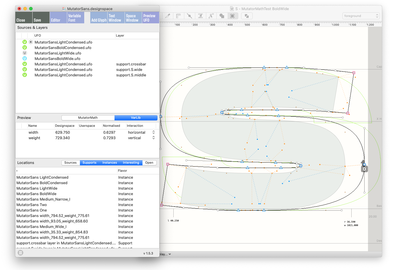
That was visualization and designspaces inside RoboFont. So Superpolator was outside RoboFont. It could work with other programs. And as Skateboard became an extension that just ran in RoboFont, I wanted to integrate it, to get the visualization in the glyph editor. I didn’t want it to be a separate application. Then it was rewritten. That became, with a lot of help from Fredrik, he sort of took over the DesignspaceEditor RoboFont extension. That was necessary. I think RoboFont had to normalize variable fonts and designspaces. And it needed to be carried by more people than just me.
Yeah.
You know everybody’s making variable fonts, everybody’s using designspaces. And it should not just be limited by how much I can think of. So there’s a reason why Superpolator died. And then there was a reason why Skateboard died. And now there’s Longboard and DesignspaceEditor RoboFont extensions, and I think for now it seems reasonably stable. But yes. And there’s the question: Do we accept variable fonts as the medium in which we want to work? The medium in which we want to think in terms of interpolation? There are quite a few foundries that use interpolating systems to design their fonts, but in the end they make static fonts. And they don’t release variable fonts. Then we’re back at the beginning, saying, Okay, well, if we don’t use this, if we don’t use the designspaces to prepare a variable font, then the designspaces can also work differently. We are not bound by the limitations of variable fonts.
Yeah, that’s another thing I wanted to ask you about. There are all these amazing things variable fonts can do, but also there’s a downside to relying on variable fonts as a final delivery format. Not all things need to be variable. What do you think are common pitfalls that you see when designers are maybe forcing their typeface design to be contained as a variable font? Or, something I think about a lot is: What type of extra work is required to make a design work in a variable format? And when is it not worth making certain compromises for the variable format? How do you think about these kinds of things?
That’s a good question. This is a photo of Behdad’s notepad. 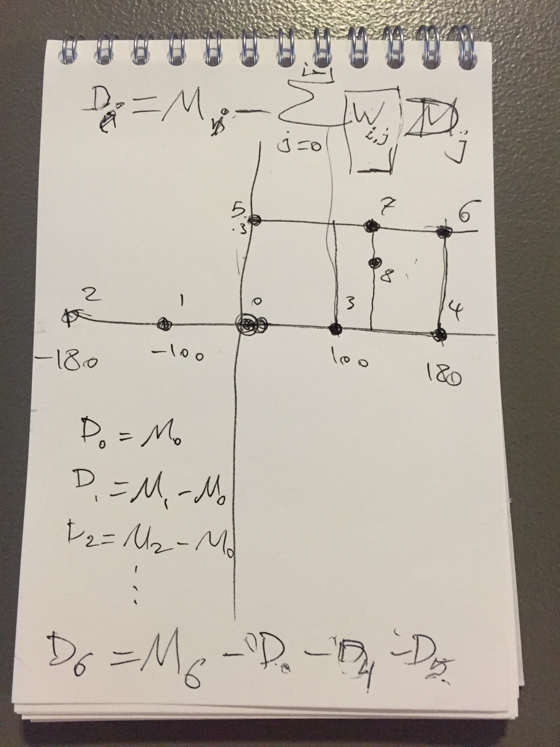
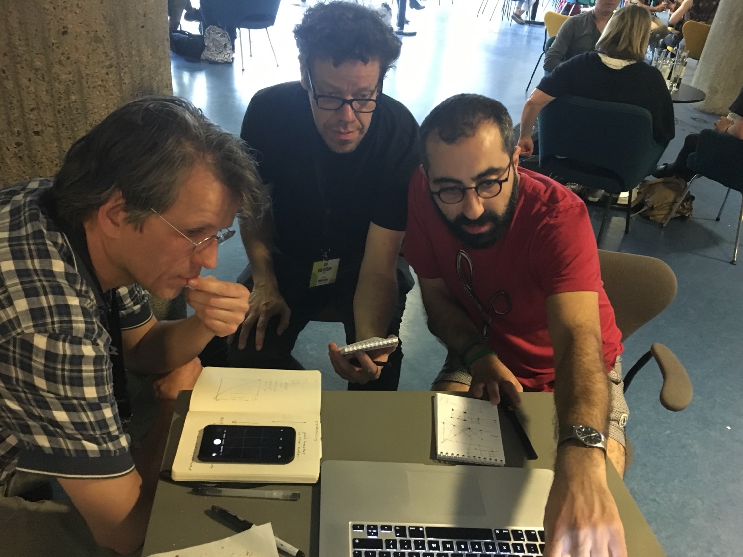
This is what we were looking at in Berlin. He is looking at the order in which the masters are added to the designspace.
Nice.
This particular note raises, again, really really tricky problems. If you add a master later in the design process… So the diagonals are a bit weak, and we need to fix this, and you add this thing… And then it could be that in that half, the designspace no longer sees your earlier masters. Now, by adding something you actually remove the influence of something you added before. And this is something I’ve recognized from having worked with the Mutator app in 1993. It’s sort of a whack-a-mole problem. You see bits sticking out; you try to sort of tuck a thing in. And then by doing that, something else pops out again. And in the end you cannot really solve it anymore.
That’s something I wanted to ask you about.
But there’s a better answer to your question. And this is something I’m sure you’re well familiar with. If you make a normal design, and you start very early on, and you start with a Regular and you add a Bold and you sort of extrapolate and have a Thin and you’re experimenting with the widths and all these things… If you are searching for the right weight and the right styles, it is nice to use interpolation to sort of see that it should be a little bit darker, a little bit brighter, whatever. But the need to keep things compatible then becomes an ongoing concern. “I think this shape needs an extra point here.” But oh… “so then also I have to add it to these three, four, five, six, seven other places that maybe don’t want that point necessarily.” Or you haven’t thought about this yet. And that means that your editing becomes…
There’s a reward for not breaking things, which means that there’s a reward for making changes where you just move points.
And not necessarily changes where you cut the contour and add a thing, and you reconstruct something. So your thinking is very much, “Oh, just just noodle around and make changes and make small things.” Whereas all those points basically go into a Brownian motion, where they’re all moving but none of them are finding their optimal place. And it becomes a huge time sink. And this is something that we explore with the Crayon extension between me and Frederik Berlaen and Ryan Bugden. You can take a shape from Robofont, put it on an iPad, and just draw on it and then get it back in there and have it match at exactly the right scale, the right coordinates. And I noticed that a lot of times when I’m stuck with a shape, the gesture will actually show me how it needs to be. And then it turns out I only need to make two cuts and move one point and change the outline a little bit. So the edits themselves don’t take much time, but I would have never found them just by moving points around.
And that means that the workflow, the way in which we handle our data, pushes us to think in a particular way, and that way is not necessarily the right way to find the right shapes.
Which is difficult, because, you know, interpolation is really useful and variable fonts are really useful. And it then requires a tax. You have to pay attention to how these things behave together. And in the beginning it can be distracting. And later on it can be a lot of work. But you also have to do it. So now if you first finish the Regular, and then you start drawing the Bold, it’s too late. Because you need to make changes in the Regular to solve problems in the Bold. Or the other way around. You cannot really ever finish one thing until you’ve looked at the whole thing. And then designing for interpolation is just a lot more work. Because, I mean, you can make a good Regular, you can make a good Bold, but the interpolation is crap. If you want to make sure that the stuff in the middle looks good, really, you have to look at it while you are still fiddling with the Regular and the Bold, while you are designing it. Which is why I made an effort to get these extensions to work in the [font] editor. I think that is the right way.
I think it is possible to make nice things. It is possible to make animating things. Things that unfold that have a certain dynamic quality. These things are all possible. But it requires attention, right? So, DJRgave a talk at the Fontstand Conference in Porto. He was talking about his experiences with drawing for interpolating systems. And if I remember correctly, he was arguing for smaller systems that have more behavior and really well-integrated interpolations. He said the number of poles you put on your circus tent can just be one thing.
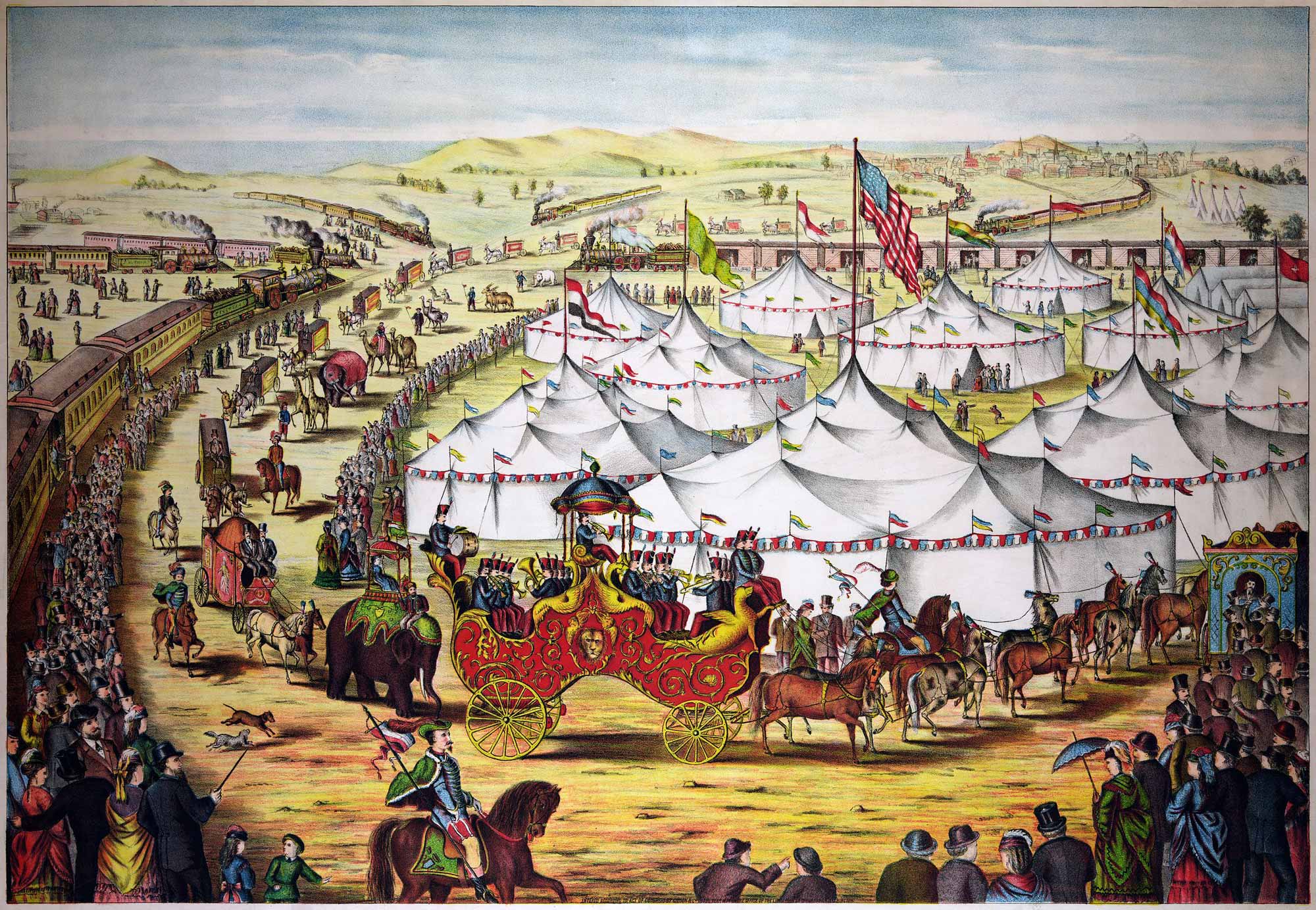
You can have one axis that does something really nice rather than go for weight and width and optical and and and… Every time you say, “Yes, this is also nice,” the number of things doubles. And if they should also have italics, the number of things doubles again. I see this with my students. They think that they have to do this. They think that they have to do interpolation. And then they discover “Oh, actually it’s a lot of work” and “How to go about this?” And I think maybe this is why our colleagues and the rest of the type industry are also reluctant about variable fonts. I don’t know. It makes me think, You know, type design does not get technical improvements like this very often. Now it’s variable fonts in 2016. And then we have to go back to 1997 when we got OpenType and Unicode. And then it’s straight back to 1986 where we have Postscript Type 1 fonts from Adobe. It does not happen very often. So when these things happen, I think, for our own sake, we have to make sure that we understand every single bit of this technology and every single bit of the math. And we also have to show that we can make new things with it. Now I know variable fonts exist because Google Fonts has to ship billions and billions of binaries every day because they want to run surveillance on everybody. That’s where their money is coming from, that’s how they pay for it. Okay, now that’s their business. The side effect is that you can make really nice animations. And I think that is amazing. So now there’s a younger generation of type designers who make fantastic weird animated unfolding things, and overlapping things—that’s fantastic, right? It’s not what it was meant for, but it is using the technology to make things that we want to see.
That reminds me: Leading up to the variable font announcement, I remember you telling me that there were some meetings happening in California with these big companies. And you were able to attend, right? I’m just curious about the history of how that all happened. How did you know that was happening? Was there anyone in those meetings besides yourself that was not an employee of Google, Apple, Microsoft, or Adobe? Also, I just want to say I’m so thankful that someone with your understanding of type technology, interpolation, and how letterforms should work was there to at least be aware of what was going on with all of that happening. So how did that come to pass?
Well it was before that, so I think it was in 2015 or 2014 that Behdad came to The Hague and he wanted to talk to me about MutatorMath. And that made me really nervous because he’s an extremely good programmer. And his work on HarfBuzz… He is also an extremely good mathematician. So I sort of felt like he was going to check my homework. He came over and we talked about this [MutatorMath]. Before that, I was already talking to him, and I knew that Google was interested in doing this. And basically, what he was trying to achieve was that all of these companies then had a stake in variable fonts. And that they could do something with it. And this was a meeting at Microsoft. 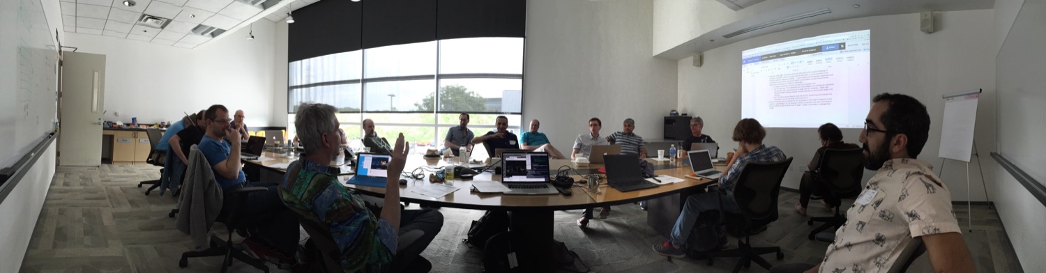
It was this weird building somewhere in the San Francisco area, no longer in use, Microsoft had moved out. Empty offices everywhere. It was dark. There was one security guard. There were people from Microsoft and from Adobe and Google and some other companies… Apple was there. John Hudson too. And basically they all brought their own wishes. So Apple said, “Okay, we can participate in this as long as, byte for byte, our demo fonts from 1993 will work.” So this is Matthew Carter’s Skia, for instance, and a couple of other ones, and also my silly Jam font. 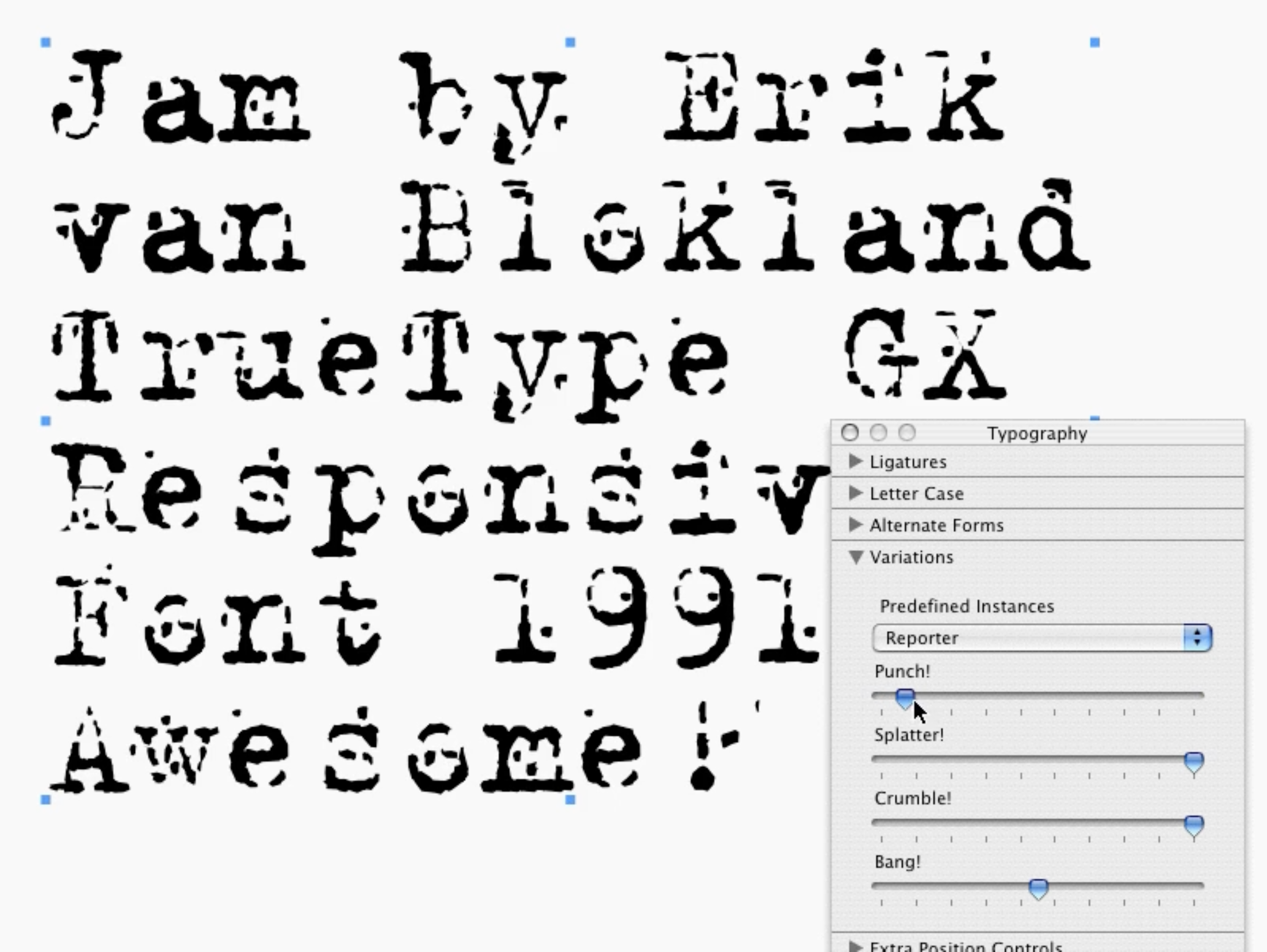
Google wanted to do this [make variable fonts], but only if the fonts were actually smaller. Microsoft wanted to do this, but only if they could find a way of integrating it into their Office applications. That’s where the STAT table comes from. Adobe wanted to do this, but only if they could include CFF. So they’ll bring their own thing. And all of this requires mutual attention. My interpretation was that each of these companies wanted something that the other companies would have to respect, and spend some engineering time on. Behdad really brought that together and made sure that everybody figured out what the other ones wanted. And then they got this to work. 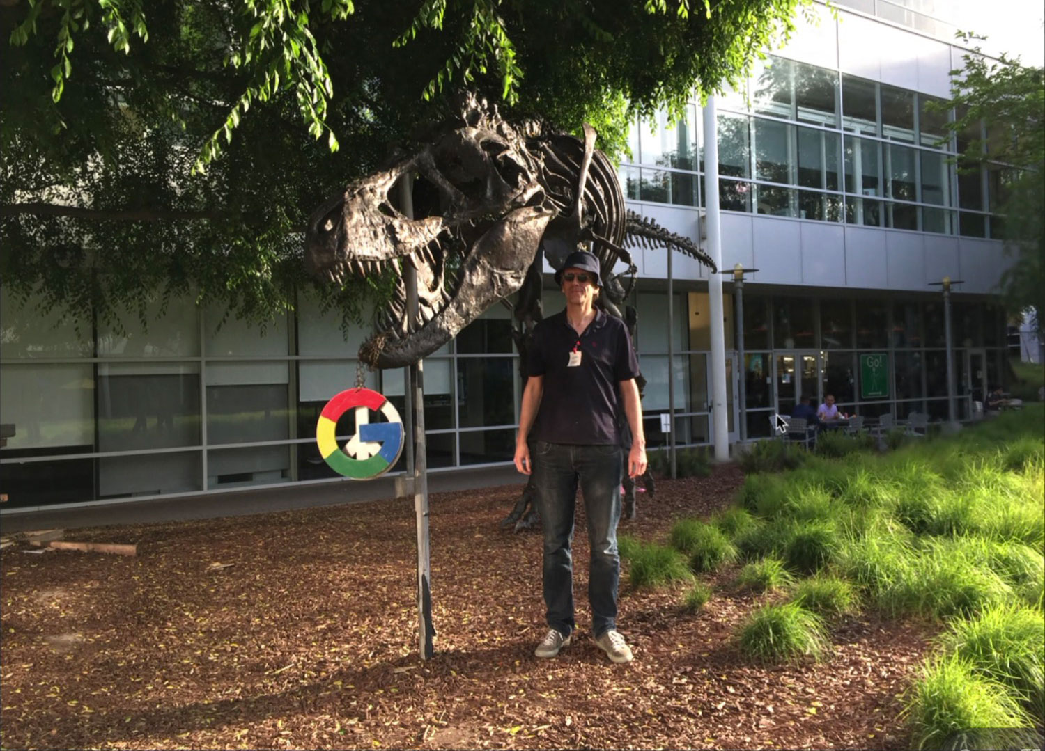
And then we visited the Google campus, which is the old Silicon Graphics campus. The T. rex is from when Silicon Graphics made the first Jurassic Park. It’s got nothing to do with Google. But that also showed how flighty these companies are. Silicon Graphics, for a while, was the big dinosaur… They were making machines that everybody was using. And now nobody’s heard of them anymore. 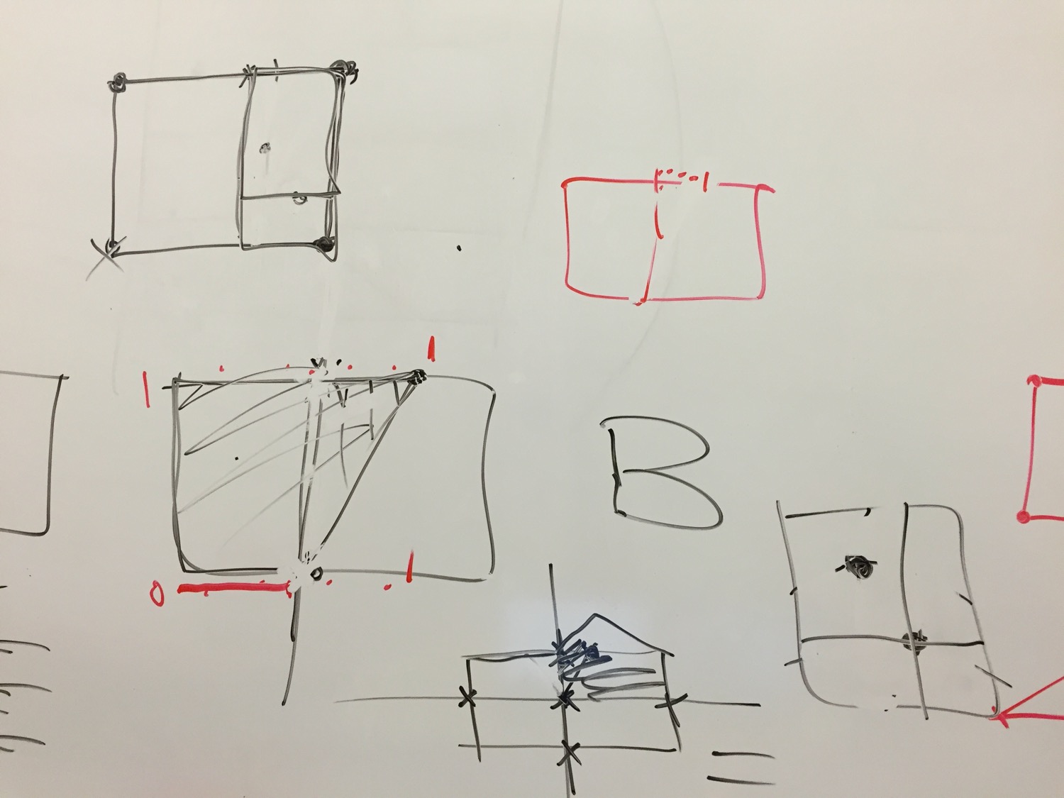
And then they had things like this on their board. Particularly what happens when things are not aligning [in designspaces]. It was nice to be there and talk to them about this. And to at least know that they were aware of the limits. That was at the Google office. And then at Adobe we had that one which was basically the same thing. 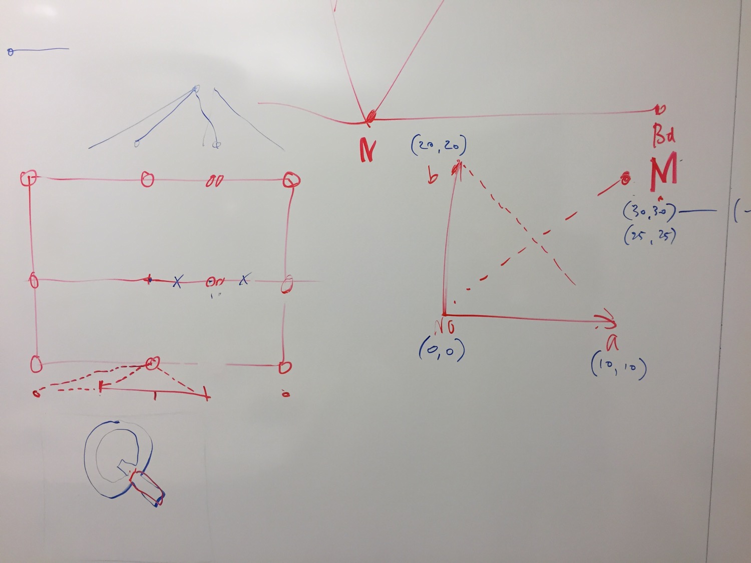
So they were figuring out the same stuff. And I saw that all of these Silicon Valley companies have these rooms without windows that are just covered in whiteboards and then you spend a whole day in it.
So, did you only go out there that one time?
I was only there that one time. They did not ask me to be there. I just invited myself and I was curious because I wanted to see how that was going [the development of the variable font spec]. But it was nice to see. [Note: John Hudson was there too. There were more type designers.]
I’m glad that there was someone there to represent type designers. That there was someone who was not a direct employee of those big companies, for whatever that’s worth. I felt good hearing that you made the effort to go and check out what was going on. As you said, these things don’t happen often, so it’s a big deal. I was also remembering the actual variable font announcement in Warsaw… I remember right after hearing the announcement tracking you down and asking you how these can be built. And you were able to show me how to download the Fontmake application and run the necessary lines of code. So thank you for sharing that with me. Maybe a month later, I was planning to release my typeface Dunbar, and that’s how I was able to generate it as a variable font, which was very exciting for me. All because of your help right there in Warsaw. Thanks for that.
Cheers.
I was curious, looking back on that variable font announcement, how do you feel that it went? I know that there were lots of people kind of doubting whether this format would catch on. They thought, “Oh we’ve seen MultipleMaster have a big announcement and then it just went away.” Ten years later, do you have any kind of reflections on the success of variable fonts and their adoption?
Well, I think what it may have accelerated, or it may have caused to happen, is that currently web browsers—all of them—have better support for OpenType and other important typographic functions than many important graphic design applications do. I mean the [design application] interfaces are nicer, so Illustrator does a good job, maybe even a better job than InDesign. Illustrator certainly is a lot smoother when it comes to variable fonts. InDesign is very clunky and has some bugs. And yet at the same time, as a group effort, over all their applications, now you you’re wondering, Why did they make such an effort to keep CFF in? Why is CFF2 a thing? And why is one mathematical representation of that space then translated to yet another mathematical representation of the space? Behdad at some point suggested that the TrueType format could be extended with a cubic off-curve point. So that you could express cubics, beziers that we love to draw, in the TrueType format. And then we can have variable fonts and do regular normal bezier variable fonts and not have to translate them back into CFF. This is a political thing. I think maybe Adobe also does not want to be dependent on Google when it comes to the rasterizer. Because they probably see it as a core thing to their technology. Which is also understandable.
How has it been going since then? Browsers now are very good. I proof my new fonts, I proof my development work in browsers. I just finished a typeface all proofed on screen. On phones and iPads and all my computer displays. I made a print of the thing a year after I started drawing it. And that was by accident.
I’m worried about how reluctant type designers are to look at new things. How uncurious many of our colleagues are. They will just accept it and say, “This is just how the program does it.” And I’m worried about how type design applications supposedly have to be easy. Some of this material is complex. And it’s not complex because nobody was paying attention. It’s complex because language and typography are complex.
And then to make tools that summarize it and make it quick and easy… There’s a lot of stuff that gets hidden from designers. But maybe making things seem simpler than they are is a way of gatekeeping. Saying “Oh, don’t you worry about this, we got this.” And then, why is the type industry so focused on getting a solid flow of young people who will work hard for little money?
It is okay to become good at something. It’s okay to be curious, and experiment, and ask why things are a particular way. And it’s okay to write scripts for that. It’s okay to try. It’s okay to not always understand it.
But that’s also a nice connection into people using AI to write their font scripts. Students would rather pay money to ask a robot to write it than to ask me or Just or Frederik or Tal or anybody else, literally, in the community how to do this. I find that baffling.
I think any development where you outsource your curiosity and that makes money by making you feel insecure is questionable.
Did we not spend twenty years proving that everybody can do this, to some extent? Of course some people will be better at it. And some people will have more work, and they don’t have so much time for it. This is all understandable. But you know, scripting RoboFont is one of the easiest things there is. Scripting DrawBot is one of the nicest things there is because you can do 90 percent of what you can do in InDesign and Illustrator. The lack of curiosity bothers me. Anyway, what do you think about AI?
It’s funny, I purposely was not going to ask about AI because it can quickly derails a conversation, but it inevitably comes up. I was more curious about your thoughts on newer font technologies. Things like variable color fonts, font streaming (a.k.a. incremental font transfer), AVAR2, variable components… Are any of those anything that you’ve been interested in? Does anything else besides those interest you?
Variable components are good. Frederik and I actually wrote a system for a big foundry, roughly right before Behdad and Just worked on that. So our implementation is different, but our interface is really nice. So you could define a single UFO as a component, and then based on the glyph names it would build a tiny designspace and it would have full MutatorMath extrapolation. So you could use three masters, and have all of these open-ended things, and that was a super-interesting interface for it. So you load the components and then you get all the axes. So you could just pull a box with handles and it would interpolate. It would find the points to make it wider, it would find the points to make it taller, and it was super intuitive to work with. And I think for that it makes a lot of sense. I’ve seen it work for Hangeul and Japanese. And absolutely I think that’s the way to go. I don’t think that the designspaces for the components need to be bound by variable font rules necessarily. But if it’s going to live inside font technology, then yeah, it needs these frameworks and limitations. And ours didn’t, because we just needed to make outlines that would end up aesthetic outlines in the font.
AVAR2 and maybe also AVAR is tricky. I understand why it exists. But I can never find the right moment to build these things in a design process. Either my weights are already at the right number, or there is a reason why they are not at that number. Like, to force the weight to be 700… This is Google imposing their view of CSS weight 700 for bold, because it’s easier and it’s because most of the users will think it’s that way. So sure. It’s a way to deal with old libraries. Then AVAR2 is a more sophisticated way to deal with old libraries. But for new designs it creates so many headaches. With AVAR, at least there was a point-to-point mesh, so you could sort of stretch things. But if you had the userspace coordinate, you could always find the designspace (or the “source space,” as some people call it). And there was a one-to-one match. In AVAR2, you can take two points and move them to one point. So you don’t know which part of the two designspace coordinates it came from. Why would you do that? It adds a level of complication that I don’t need, from a design point of view.
What do you think is missing from font technology? Or what do you imagine needing? Because you are saying that some things maybe you haven’t found a need for in your design process. Are there some things that you have found a need for recently, but which have not been answered?
Um, that’s a good question. I’ve been experimenting with triangular spaces. And I find that very interesting. Have you seen those?
I think you’ve shown me sketches. But I’m curious to know how the triangular spaces relate to the output for the font user. How do those manifest as a font in a layout?
Triangular spaces will not make any difference in how people use the fonts. Variable fonts do have a usability issue. The fact that it is one file rather than two or fifteen files is a fact that means something to the person running a web server who’s keeping an eye on the stats. But this person is not making any typographic decisions or buying fonts. But that’s a different segue into pricing variable fonts. It’s a different thing. Color fonts are interesting. You’ve done some really interesting work with them.
Thank you!
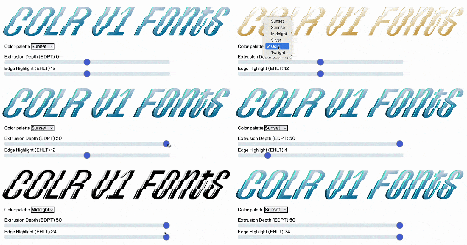
It’s mostly Google pushing color fonts. Well, that’s not true. Each of the platforms had their own thing because they needed emoji to be colorful. There’s a reason for that. And nobody was talking to each other because they’re in a big hurry. So they all have their own implementation.
In fact, I remember a meeting at TypeCon in Portland [2013] and there was someone from each of those same camps, and they were each making their case. The Adobe person explained why SVG has to be the one color font format, and Microsoft was pushing for CPAL, etc. Each one had their own kind of thing that they wanted. And that’s a case where it didn’t work. Unlike with variable fonts, where amazingly they did come together with one kind of variable font idea. But in the case of color fonts, I heard those kinds of discussions in the TypeCon meeting, and then I saw that they just all did not come together. [That’s why we have so many different color font formats: COLR/CPAL (Microsoft), sbix(Apple), SVG (Adobe), CBDT (Google).] So it’s interesting to see the counterexample. They talked about color fonts and they decided, “Nope, we’re not coming together on that one!”
Probably they were seeing the emoji set as such a big thing that I don’t think they would expect people to design fonts for them. No, we just take them from the system. And the system has to find a way to make images appear in the line of text. And that is such a low-level thing that I think they probably thought nobody’s gonna touch this anyway. And that was probably a good business case to be quick, because you wanted a phone with smileys and dinosaurs. And if that’s an Apple phone, that’s the one you get, and if it’s a Google phone, that’s the one you get. So they were not interested in standardizing. Now variable color fonts, you have experience with that. 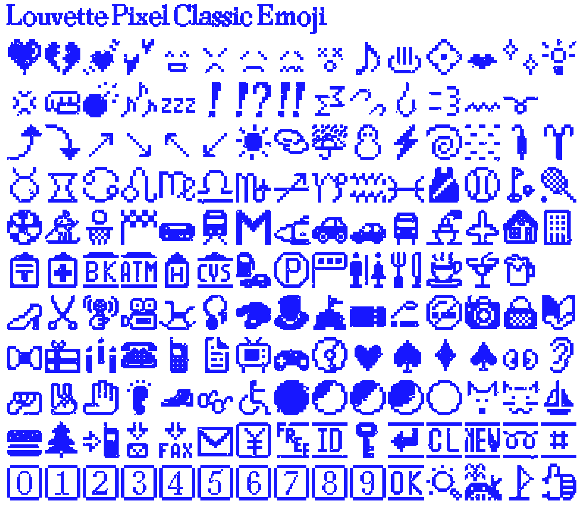
Yes.
I see it as a combination of two things that are already almost outside of my reach.
Well, recently there was some app support added in Affinity software for variable color fonts, for seeing the separate color palettes. There has interestingly been some movement here. I was kind of pessimistic about any kind of additional support or whatever. But just in the last few weeks this support was added. So it’s interesting—we’ll see!
We had a small app for the Federal shading layers back in 1996. 
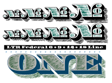
A thing called “Layer Player,” a very small python app that worked. And you could select different combinations and different color palettes. And there was the “fire truck federal” and there was the “money federal” and there was the “steel federal” and those kinds of things. But you get to a point where the type designer is, maybe not overstepping their responsibility, but it’s very close to the line. Saying, you know, “Here are the colors I think should be interesting for using this font.” These are the colors that I find interesting, but people buy these things, they have their own words, and they need to have their own message. Clearly there are other ways of thinking about this. But personally I would say I find this reluctance to say, “Now you can only use this in red.” But then variable color fonts… I mean fantastic stuff is happening. I like Velzyland. 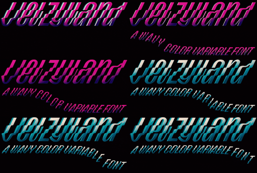
I like the animated ones from Artur Reinders Folmer that are really complicated.
Yeah, me too. I love Artur’s work.
That’s such a fantastic font, but then to have to wait for support… Or there’s only one version of one browser and it’s only Chrome that supports it, and basically the only place where it can live is in the presentation when you talk about this. That is also… It’s a choice. It’s a very small field to work for. You probably have more and better metrics of how those fonts sell. And what is interesting in them. I see my brother Petr with his Bitcount [typeface]. And that, by itself, is a simple premise. But it became a complicated thing with interpolating gradients. And then it takes hours to compile. It’s like, oh, you know, what’s the point? Google sees these things as a way to push their technology. I can show you a little bit about triangle spaces if you find it interesting.
Yeah, please!
It is so remote, and so far removed from actual font technology. This goes back to the idea of if we’re not making variable fonts, and we’re using [a designspace] to interpolate things, then maybe we can also come up with designspaces that are different. 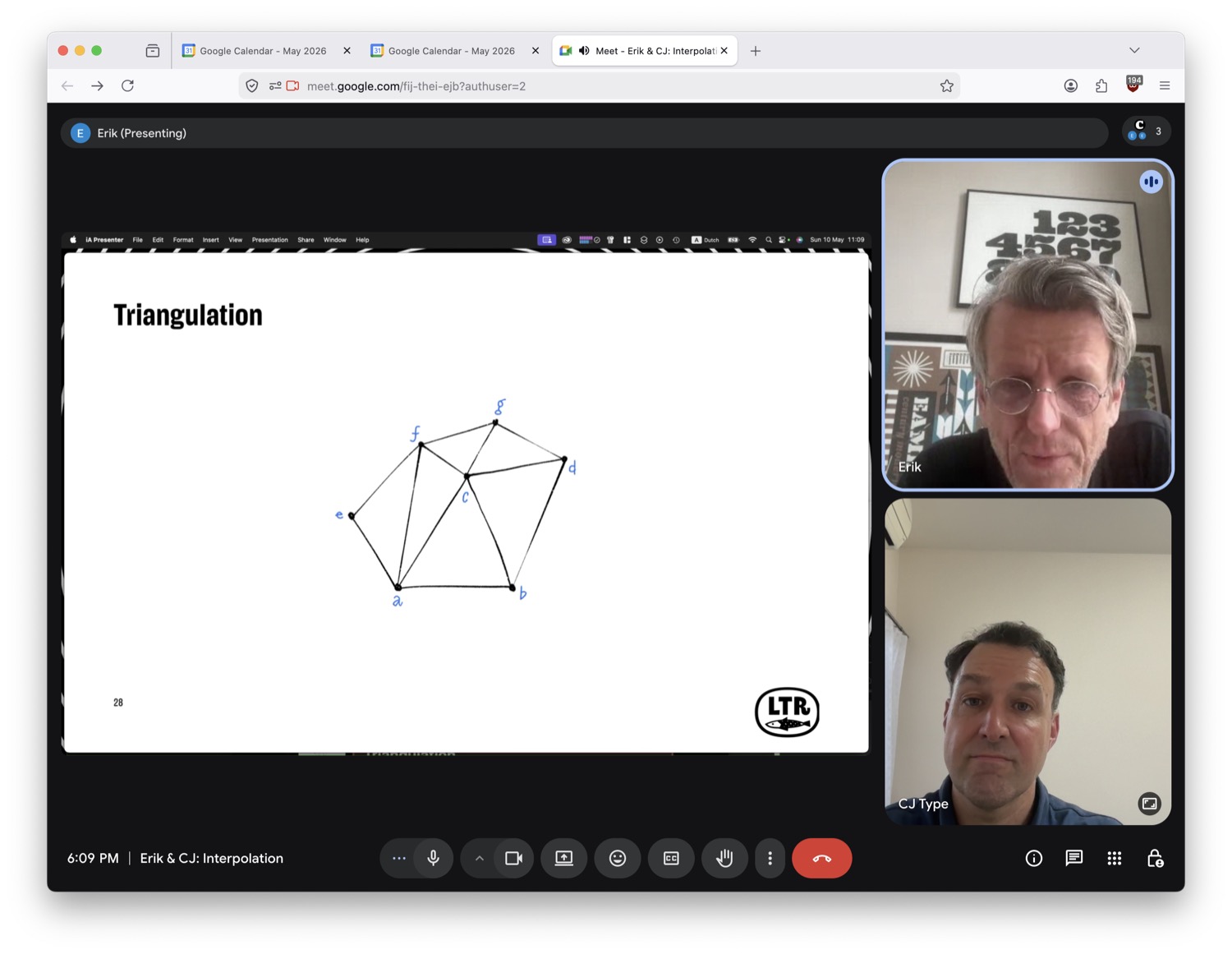
This is an old idea. My oldest son, Lars, did his master’s degree in Geomatics. Spatial things, mapping buildings, architecture. It’s very broad. But in his textbooks I found so many different ways of doing interpolation. If you have something that comes out of a satellite, or something that is measured from a boat, or something… It really depends on the source data. It really brought home the idea that there is not one single way of interpolating. It’s just, “What do you expect it to do?” This math of triangulation is very solid. All 3D computation uses it. You have a couple of points. And then you make a set of triangles. The points are called vertices. And the connections between them are edges. So a certain number of points, and a certain number of connections, and then interpolating, finding intermediate values, is easy. Because you just find out which triangle you’re in. So for this point, we’re in a triangle BCD. And not in any of the others.
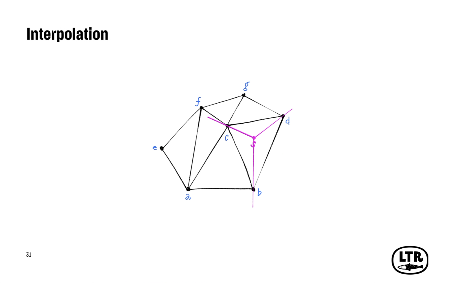
And then there’s a simple method of finding out what the values are. There is no logical way to deal with extrapolation. This is me trying to deal with it. Sort of trying to build up a narrative: What happens if you go to the top here? What do you expect when you’re here? It’s all possible. 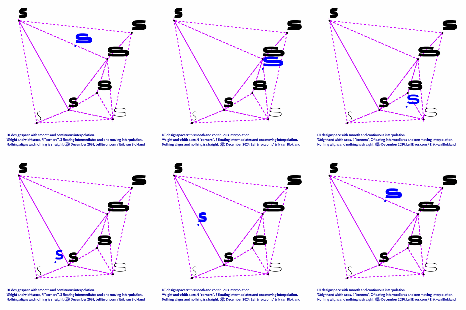
But really, then, it allows me to do this, where you sprinkle your masters out in a way that does not align anywhere. And there is a coherent, understandable, deterministic bit. A shape for every point in the designspace. And I thought, “This is amazing!” So this is the answer to intermediate masters, the mathematical way of solving it. There are triangles. And each triangle has a very predictable way in which it interpolates.
A typographic explanation for this might be this system in which you have an optical axis, and a weight axis, and at the bottom is the Small optical size. And then in the Small optical size, it cannot be too narrow, it cannot be too thin, it cannot be too bold, because your counters disappear, your strokes will disappear. So at the bottom you need two masters. And then at the top we don’t have that. So for a bigger optical size master, you could actually say, “Okay, it might be nice if it actually goes to a Thin weight, it might be nice to actually go to a Black weight. But if those masters are farther apart, I also want intermediate weights in the middle.” And this configuration works. 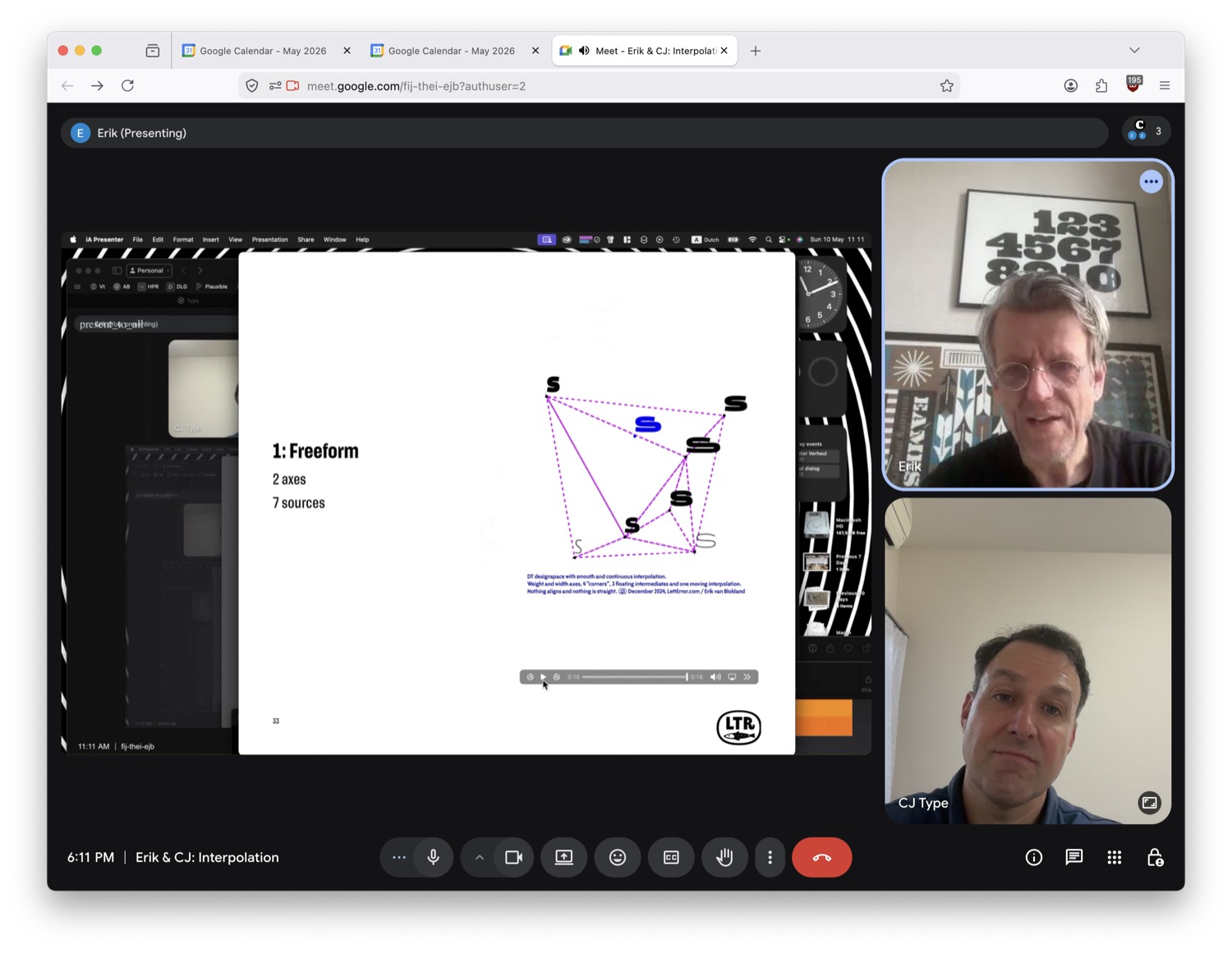
At the top we have three masters, at the bottom we have two masters, and there’s an inverted trapezoid. There are three triangles. And basically at any point in this field, I can come up with a coherent answer to what that interpolation should look like. And then, “So how do you build those triangles?” Here it has a straight line between the Regular Small and the Regular Big styles. But there are other ways in which these lines could go. But that’s a design decision. Which of those shapes do you prioritize? What do you think needs to be seen? So then, rather than have one method where you say, “Okay, well, you have a two-axis system, this is what you get,” you say, “Okay, for this particular design, I think this is the way that these shapes should evolve and express themselves.” So you have much more say about this. But it’s a different thing, right, there’s a different result.
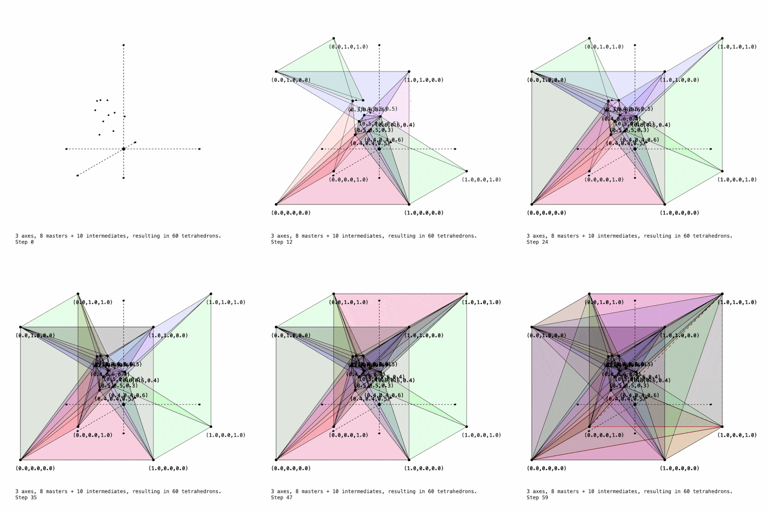
The other limitation is that for three axes there are no triangles, but there are tetrahedrons. So that’s a four-point shape. It can split a three-dimensional shape into a set of tetrahedrons to fit it.
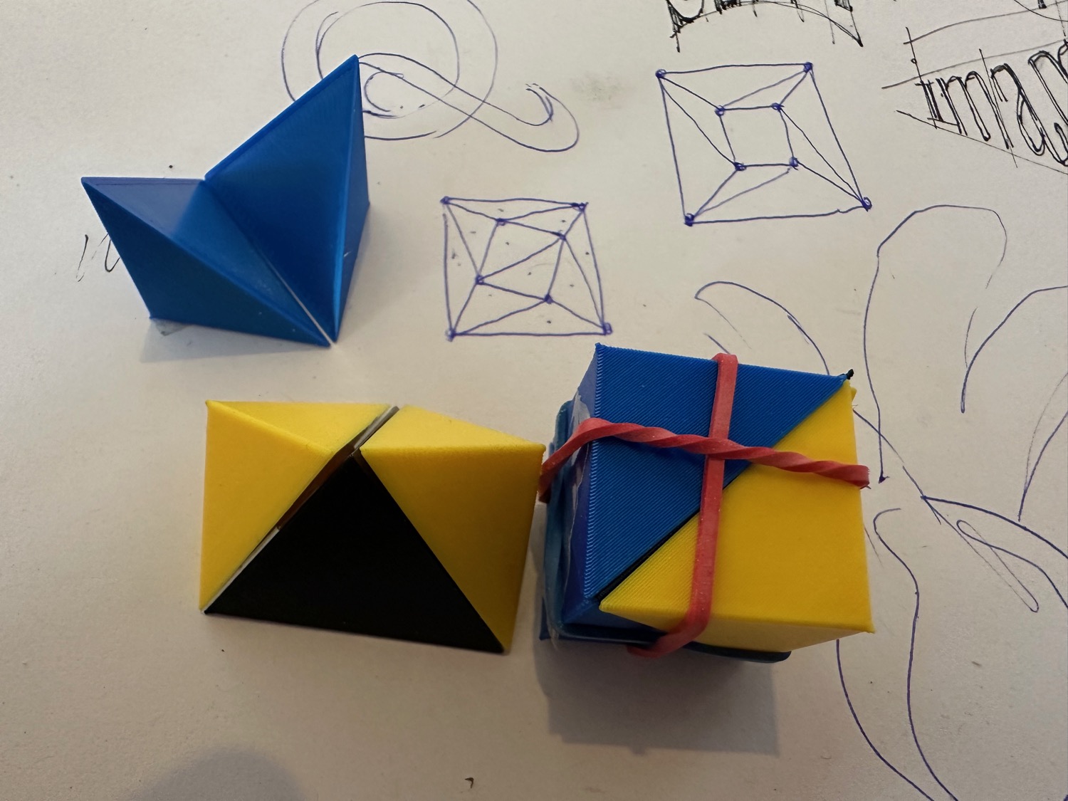
The diagram is showing a cube, so there are eight corners and there’s one point in the middle. And that, then, turns into twelve tetrahedrons. So there’s one point. But so this is a working three-axis plus nonaligned intermediate designspace with predictable, understandable results. If you travel from any of the corners toward the point in the middle, it will start looking like the thing in the middle. And at any other point, depending on how close you are to the thing in the middle, it will look more like that. Or it will look more like the two other corners that you’re close to.
And here you’ve made some decisions about which triangles to prioritize, right? That’s part of this model. You say, “This is the triangle to prioritize.” In certain areas you have to pick between triangles, right?
Yes. For instance, you could go from the Regular Small to the Display Black and make that a direct line. The thing is that in a triangle, only the three masters on the triangle matter. And there’s no knowledge of stuff on the outside. Which is different from having a rectangle, and then all four masters at the same time influence it. Even if, in a regular model, you’re very close to a corner, the other three still matter. And here this is not the case. If you pass the diagonal (so where the blue end is now), it is interpolating between the Regular Big, the Black Big, and the Bold Small. And the Regular Small no longer plays a role in it.
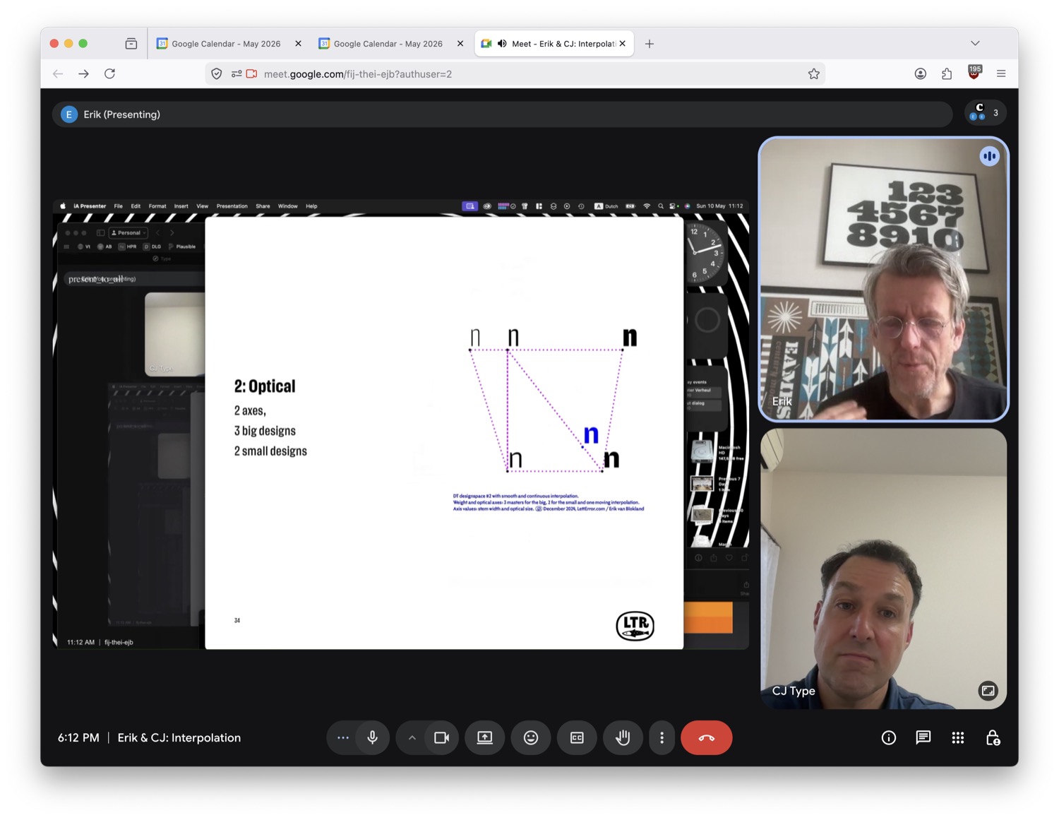
Right. I’m dealing with these exact issues right now, so it is really nice to see a solution for this. Because currently I have to make a separate designspace, and then delete some masters, and then generate the corner master or something. Because I don’t want to see the influence of the Ultra Bold on the Hairline weight, or something like that. It’s interesting to see it visualized this way because this is answering some current questions that I have. And I’m having to do this in very circuitous ways. But I like the simplicity of being able to define a designspace with triangles. It simplifies the designspace way more. And it is also similar to my comment before about MutatorMath. This is so much closer to what would be typographically useful to me. Instead of having to do these roundabout ways of inserting extra masters, and all this stuff… And even this second diagram—that’s actually pretty similar to what I was asking you about in 2016. I’m sure you have no memory from ten years ago of my specific designspace. But my designspace looked very similar to that for Dunbar, with the Low masters having a maximum weight, which needs to be lighter than the Tall masters.
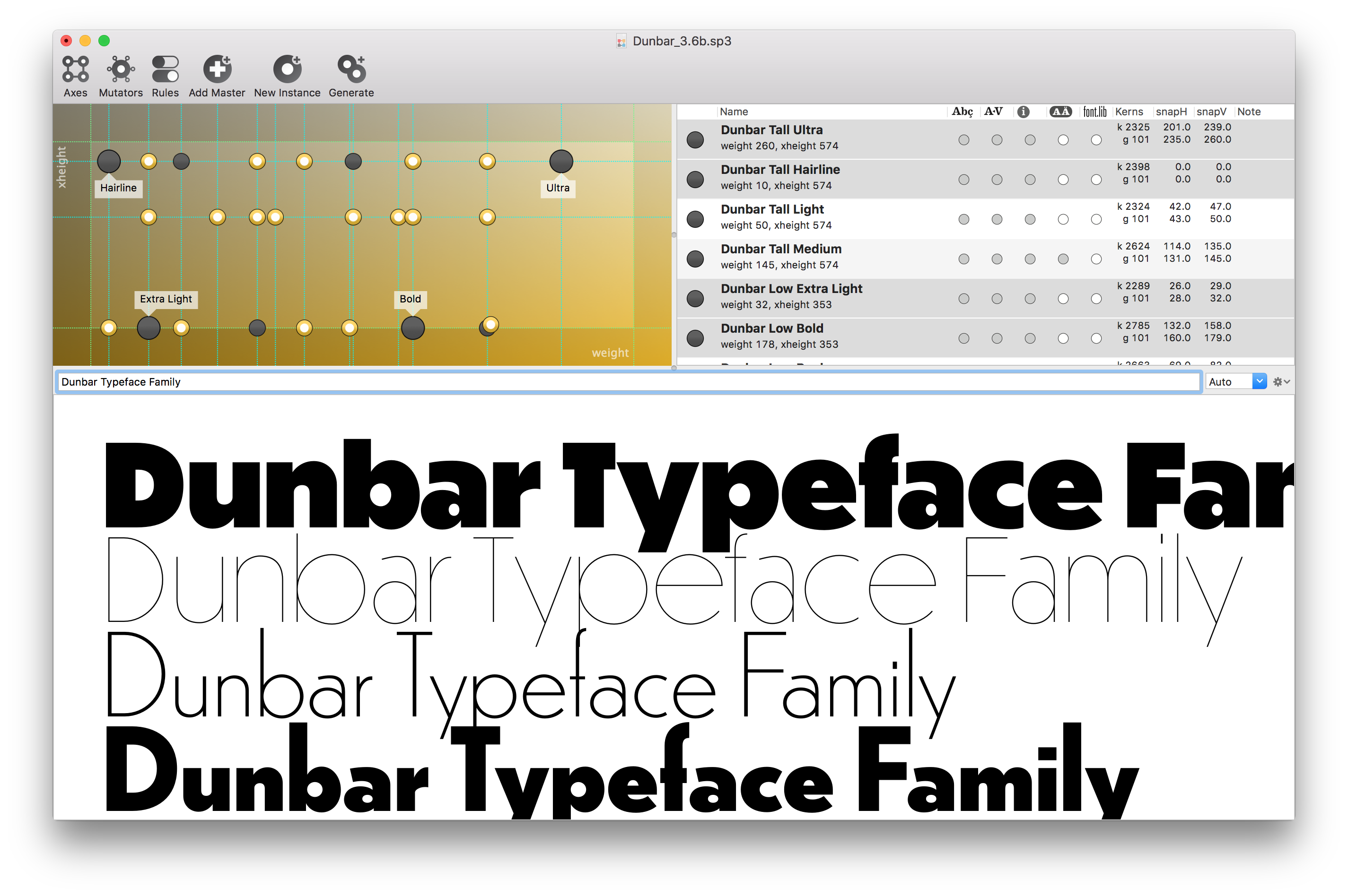
Because with a taller x-height, there’s more room to get even bolder. And then I have a Text optical size that I was limiting in between the Low and Tall x-heights. So in the end I had a three-part script that was generating three designspaces, one chunk at a time. It used the resulting UFOs from the first script, then, to generate UFOs in the second script. And then used those resulting UFOs in the third script. But that’s what had to be done. But I think that in the Superpolator window there was an open corner interpolation that was actually working quite nicely. And once I had to conform to what fontmake was doing with varLib, I had to add these extra pieces [UFO masters]. But from a design perspective, I felt like it was nicely defined with a smaller set of masters, in a similar way to what you’re doing with the triangular designspaces. So it’s really nice to see these are current and ongoing problems that you’re looking at. And that they are connected to stuff that I was dealing with ten years ago. And that I’m also dealing with this week. I love to see these new solutions. And right now, are you using these triangular designspaces in your projects? Is this something that you have a model for outputting? You know, defining triangles and then outputting a UFO or something with these results?
I presented this in ANRT in 2025. I was fishing to see if anybody would be interested in supporting this research. And the response was “Oh, we would love to see the results.” And then I realized, Okay, well, that’s also information. Because nobody said, “Oh, here’s some money, go spend a month.” So I keep working on this very slowly. There’s now a way to store such coordinates in a designspace. I’m not sure whether I want to build a complicated interface for it, because that would be the most effort. I know there are no existing designspaces that use this. So it could be anything.
The EZUI library might not have all of the right components to this. It becomes more and more complicated. And it’s for a way of designing things that has not stabilized yet. But you cannot make something that fits everything.
Has this been useful in your upcoming release [Action Grotesque] or something like that? Have you implemented this kind of stuff?
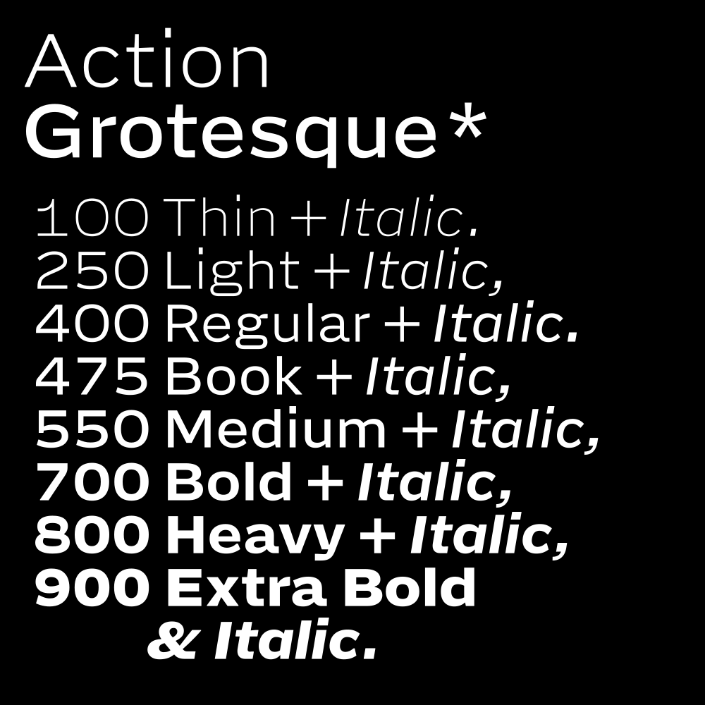
No. I’m looking for it currently. I’m going to experiment with this particular model. But I just ended up doing the bottom line [of the trapezoidal designspaces]. So rather than invent a new model, that then cannot be expressed as a variable font, and then draw three more masters, actually six more masters… And then come up with a very obscure story of why it exists… Just drawing a bottom axis from it, actually, it became three masters. It was easier to draw optical sizes for a couple of characters, where the scale really mattered, than to make a full new optical size. This was part of the research. I really wanted to make something that would work well at 7pt, and 8pt, on screen. Not that I think that this is a comfortable size to read stuff on screen, but I wanted to have a very well-established solid bottom line. So as a design method I was really drawing for the small stuff. Did I show you that?
I think so, but yeah I would like to see where it’s at right now. Thanks for sharing. I also think the realization that not every idea has to turn into a fully fledged tool, with interfaces that any designer could use, is an important one. Doing these things, and learning from them, and then taking from them what is useful for you at that point in time I think is something that’s good for designers to keep in mind. It’s easy for a small thing to seem like it needs to be a huge application suite, when perhaps the time is not now. Or, you know, it doesn’t have to be all things to all people. I like it when a tool is more focused.
For this new design I did not use any of that. There’s just a weight axis. But three masters along the weight axis. And then there’s an optical size but basically just to deal with the /registered (®) glyph and the /trademark (™) glyph. So this works at eight points and seven points. And this works at bigger sizes. I thought, “We’ll see, maybe that’s enough.”
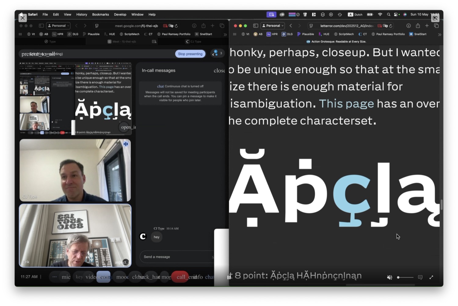
Yeah. I like that. Oh wow, that’s a cool approach to the accents too, the cedilla…
They are solid and they need distance. So because of the accent height… The proportions are really meant to push the x-height on the body. But then, I don’t want to smoosh the accents into “accent Oreo cookies.” Because they need to be visible. So I can tell the difference between a “dot below” and the “c cedilla” and the “comma accent” because they are all different. Then the shape becomes a little weird. Sort of a slipper bobsled cedilla. But, you know, the shape does what it needs to do to have a result at that small size. And for this project, this is interesting. I don’t need to define what all cedillas look like everywhere. I just want to make a shape that works well at the size I want to read it at. That created a lot of freedom. There’s some Vietnamese, which is, I admit, my first attempt. And there’s some configurations where they need to be closer. We will see.
Oh very cool, that’s exciting. Thanks so much for sharing all this with me. Also, I just wanted to let you know about all the fond memories I have from Robothon over the years. Do you think we’ll see another Robothon at some point in the future? I also want to say thanks. I know how much went into all of those amazing experiences that we had at Robothon. From the students, who were studying during that time, and from the faculty… I know it’s a big undertaking. So if not, I understand, but I’m curious to hear your thoughts right now about any future developments for Robothon.
Thanks. They were nice conferences. The structure at the school [KABK] is that the Robothon conferences were always piggybacking on a bigger effort for the Gerrit Noordzij Prize. And those were not easy to organize. I think for those earlier years we had a lot of decisions to make. And it was nice to get the group together. And we could decide about UFO 2 and UFO 3. And show some things about how coding was done. That had expanded. And then we got sold out in less than an hour because the auditorium at the academy is kind of small. We looked for other venues, but then we would have to rent a space. And then it became more expensive. And you have to get a sponsor. They need more people, more equipment… And it just keeps expanding. And then at some point you’re looking at a thing that requires 50,000 euros just to get going. And really what we wanted to do was get twenty people in a room to talk about UFO 4. So it’s not for lack of trying. But it’s hard to find good solutions for it. I think in terms of social get-togethers, something like the Fontstand Conference has been good. I think for technical things it’s maybe not the same audience. But yeah, I mean, every now and then we think about if we should do this. But I think people’s expectations are all also this memory of what Robothon was. And then you make a new thing… I don’t know. What do you think we should do?
That’s a good question. Well, I also think it’s okay to just let it be what it was. And perhaps it will either come back as Robothon, or in a new form. Or maybe it will happen in different places. It was nice when it was focused and everyone was coming to the same place. But I just want to say I’m thankful for all the work that went into it. I really enjoyed Robothon, being someone who cares about font technology, and new developments, and people with interesting ideas of how to make fonts. It was just a really nice experience. So thank you so much for making that happen the years that you did.
You’re welcome.
Thanks, Erik. I don’t want to use up any more of your time. But I really appreciate you taking the time to talk. I hope to see you again soon.
It was really nice talking to you!