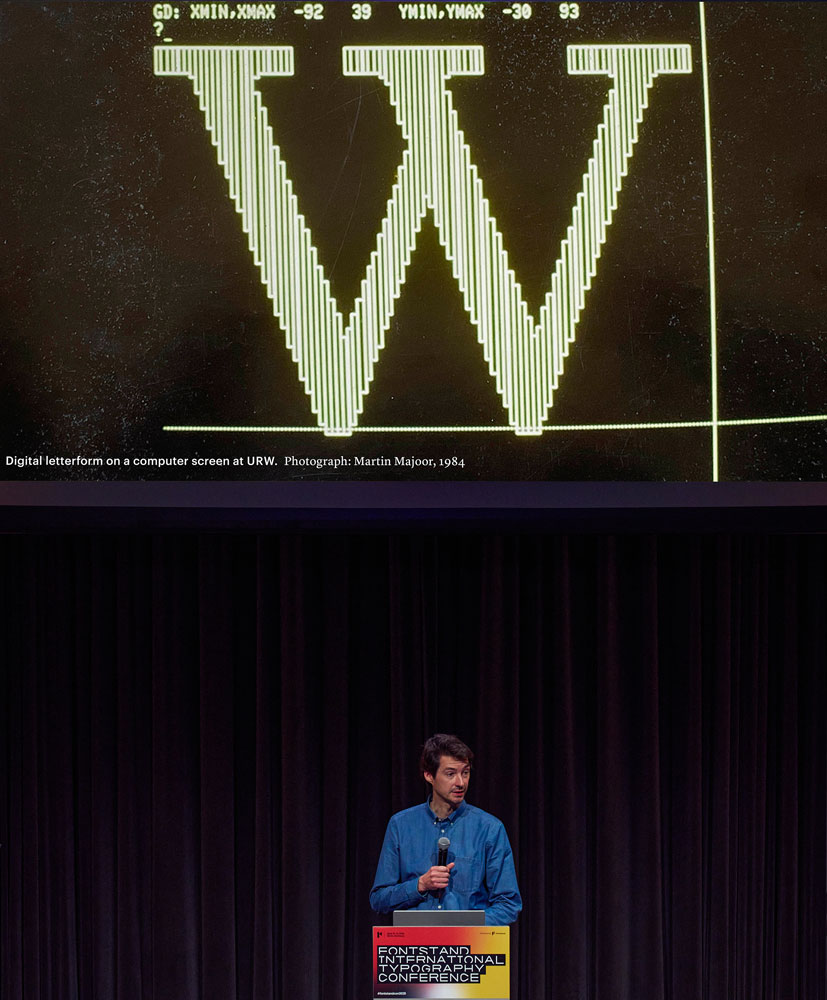
So the background for this interview is, I heard Ferdinand speak at the Fontstand Conference about early digital type and Dan asked a question about what designers working now could do to archive their work since things are mostly not happening in physical form. And I thought that was just the perfect question, because I’m dealing with exactly that issue right now. Maybe I mentioned to you both that I’m currently looking back at 10 years of my typeface Dunbar and I’m going to be releasing some new styles of Dunbar, but as part of that process I wanted to archive the original design and related materials. Especially because there are less physical artifacts from the typeface design process these days. And suddenly certain file formats wont open anymore and things degrade.
I’m trying to deal with those issues right now and consider the digital archiving process for typeface design. So I would love to hear from you both, since you both have experience going through historical archives of type and, in different time periods.
What can a typeface designer like me can learn from all of your experience in archives?
Dan, I know you’ve spent a lot of time researching metal type from the late 1800s and early 1900s. And I’m curious what type of artifacts you’ve come across which you think perhaps type designers, either then or now, wouldn’t realize would be so useful but ended up being particularly useful in your research?
Well, surviving correspondence from this period is pretty rare, so all the letters between people involved in the various steps of the process is very helpful. Those have always been good to read. I mean, there are some letters from type designers to foundries, which explain problems, or give light to one of the process elements, etc. For instance, I found a letter from a German type designer to the Reichsdruckerei, which is the Imperial German Printing House, and he [Otto Hupp] was sort of apologizing for the state of his drawings. He wrote, “Unfortunately, I’m not a calligrapher like all those other type designers. They can write the letters from their designs at actual size, but I have to send you enlarged drawings instead.” This was helpful because of the statement, “I’m not a calligrapher.” If you look at his work, you would think, “Well, this person must write all the time, because they clearly have such an understanding of how the broad nib works.” But it’s all fake, so to speak.
Right.
So things like that are helpful. For instance, process drawings are very rare for German foundry type. So are other intermediary steps, which would show what the type designer didn’t contribute themselves. Things like that. The Klingspor Museum, fortunately, has some “test” prints of the typeface development from Gebr. Klingspor, but it is nowhere close to a complete record of the foundry’s development. In the last few years, I’ve been looking through a lot of phototype items from the H. Berthold AG archive. Günter Gerhard Lange and Bernd Möllenstädt’s papers are almost finished being catalogued, too. I helped a little bit with the cataloging, and they have an awful lot more correspondence.
Once you get into the 1970s and the 1980s, with people who didn’t throw things away, you can find things which are not necessarily helpful in terms of understanding how individual type designs were developed, but offer more details about relationship between different people.
I read one letter from 1985 that Wolfgang Weingart in Basel sent to Günter Gerhard Lange in Munich, for example. Lange’s letter to Weingart isn’t in his papers, of course. It might also exist in Weingart’s papers. Anyway, Lange had invited him to speak at the TGM in Munich, which is an organization that still has monthly events. And Weingart wrote back with two interesting things. The first was, “Well, I haven’t been invited to an event in Munich for a long time because Philipp Luidl doesn’t like me.” And then the second thing was, “All right, I’ll come to Munich, but I’m taking you, Mr. famous type designer, to the Apple Center in Munich because you need to see the Macintosh.” Weingart already had one in Basel, you know, and Berthold was using Ikarus for digitization. I don’t think they ever seriously worked with the Apple products, at least not before the early 1990s, when it was probably too late, but with this letter, you can sort of see a suggestion like “maybe this could have been adopted sooner, and perhaps it might have done the company some good.”
Ferdinand, that’s maybe a good transition into your research. You have looked at this period of phototype transitioning into Ikarus and other digital systems. Same question, were there certain things that were unexpectedly useful in your research that maybe people at the time wouldn’t have expected? I’m also curious if you noticed a transition in correspondence. As Dan was saying, there was less correspondence earlier on. Then later through the maybe the ’70s, there was more. Did you notice the reverse in your research? That physical correspondence became less as things maybe were happening in other formats?
Probably not as much as you might expect during that period. In fact, I have a very fresh memory of the collection of Donald Knuth that is held at Stanford University, because I just returned from the ATypI conference there last week. I was very fortunate — this was a dream come true — to conduct a workshop for a group of attendees to engage with primary source materials related to Donald Knuth and Richard Southall at Stanford’s Special Collections.
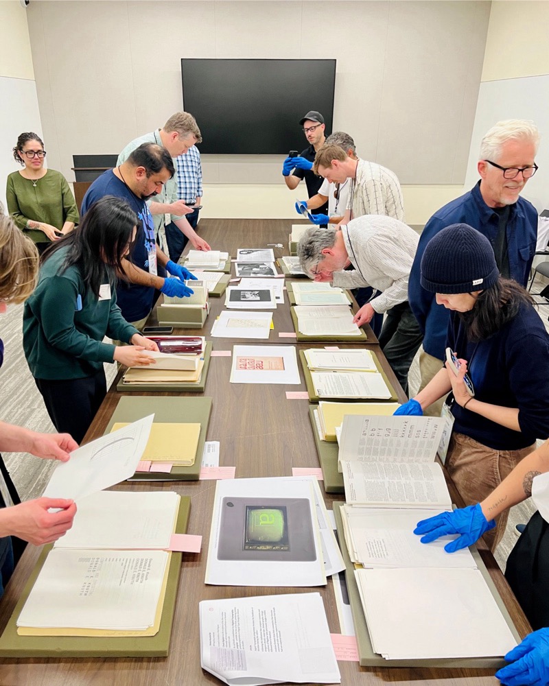
Many of the Knuth materials are related to Metafont, a so-called digital type system that he had developed since 1978, so this part of the collection begins in the late 1970s. Built around Metafont, Knuth established an academic framework, a graduate course in digital type design that he co-founded with Chuck Bigelow at Stanford in 1982. Eventually, he invited Richard Southall, a typography lecturer from the University of Reading, as a visiting scholar. While Southall’s Metafont-related materials are available at the Stanford, his main collection is held at Reading. What is really fascinating about conducting research in both places is that you begin to make these cross-references. This is when research gets really interesting, because rarely our research results are only based on one collection or one set of sources.
With Metafont, Knuth developed a system that merely relies on a keyboard as an input mechanism, while a lot of other digital type systems at the time utilize another device that you can use to trace and then digitize letters, for example. Metafont is purely based on coding and operating it required the skill of programming from a mental image. Richard Southall has been placed at the intersection of type design and computer science. There’s a particular item that the participants of my workshop appreciated among other selected materials: Southall’s analog sketches on graph paper of what Metafont letters would look like if they were immediately visualized. These drawings emphasize the spine of a letterform. They illustrate the fact that these letters are not based primarily on an outline, but on a skeleton that sits at the center of a shape. These are extremely valuable. And on the other side, there is a folder filled with laser-printed code by Donald Knuth, because naturally that was his way of describing letterforms.
Another exciting folder documents their correspondence that led to this collaboration. In that sense I can completely relate to Dan, because this reference reveals many of the details. While some materials are pictures of things, it is the written sources that help us understand the relationship between key figures, how they made plans across the Atlantic and why they got together to engage in teaching. All of this is really fascinating. With regard to what Dan says about missing letters, in some cases of archival research you may discover a response, but not the initial letter. During my PhD research, I spent many hours going through ATypI-related materials that are held at Reading’s typography department, much of which contains correspondence between committee and board members. Because so many members were copied to these letters, there were typically a lot of carbon copies floating around.
So, while the letterforms that Knuth had worked on during the late ’70s or early ’80s, had been largely dematerialized in a way — they merely consisted of ones and zeros —, it is the primary source material that visualizes these “invisible letters”.
Right. Another thing that I was thinking about is the importance of context. Especially as letterforms get represented by code in different formats. I wonder if there were some missing pieces in terms of being able to understand those bits of code. Did you have any challenges there? Were you able to recreate what they would have rendered as? I don’t know how accessible MetaFont systems are these days. But did most examples have a corresponding visualization with them? Or was there a lot of code that was “orphaned” so to speak? Like, not interpretable without someone like Donald Knuth to be able to read it? Did you find anything like that?
What I found extremely helpful as a researcher were Donald Knuth’s comments typed in between the lines of code. Those comments provide context: what is it that we’re looking at on this particular page?
There must be hundreds of pages printed, not least because Knuth had one of the earlier laser printers at his disposal. Some comments are extremely insightful. I just recalled a page where he describes early attempts of describing letterforms using TeX, the digital document system for mathematical typesetting that he had developed before Metafont. In these comments, Knuth describes early letterform description directly in TeX, but this didn’t go very far, so then he decided to develop another system. There are still large communities working with Metafont, so perhaps they would be able to just read and process this code.
Yeah. A really good point to consider for folks working now is how important the comments are. In my work, and for lots of people, we have different Python scripts that we write for different parts of the design process. Some of them are just kind of one-off scripts. And some of them are things that you reuse. But yeah, taking the time to go in and comment scripts, or naming files in descriptive ways or things like that, seems to be a really good takeaway for us. Because it’s very easy to be in the moment and just think, “Oh, I’m just going to use this one time.” But then maybe it ends up being something that you use over and over. And later on, you can come back to it and want to be able to understand the code.
Even for myself, if I don’t write comments for myself I don’t always know what a script does. I can imagine for someone’s future archive how important it will be to take the time now and add comments to a python script.
Actually another topic I wanted to ask about is, Ferdinand, you write about this idea of the “sustainability” of different models of encoding, storing, archiving, early digital type. And I think the concept of sustainability is really interesting to me in this way, especially in regards to folks working today as our work becomes more dematerialized. But I’m curious, had you heard of anyone else using this framing of “sustainability” in regards to type, or type formats, before? Or was that something that you came up with?
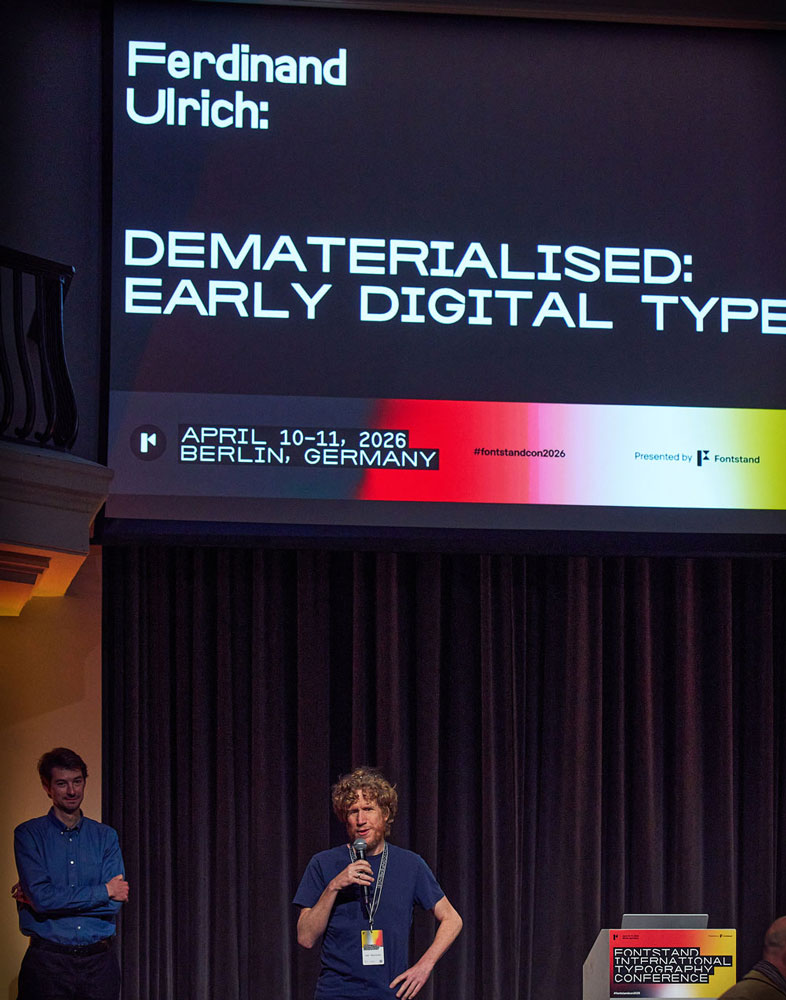
This terminology is informed by conversations with my doctoral supervisor Gerry Leonidas and I’m pretty sure he used it before me. I began to apply the concept of “sustainability” in my investigation of different models of encoding, more specifically to five digital type systems from the pre-PostScript era. Rather than focusing on chronology, my analysis is based on different environments such as academia or industry, on circumstances and context. In German “sustainable” is nachhaltig from the verb nachhalten for something that persists or remains for an extended period, in its original sense. In that sense, Metafont is sustainable in its own environment to this day, although it has not been applied to create those digital fonts that most people around the world use. As Dan just mentioned, Berthold were working with Ikarus during the 1980s — the original Ikarus. Towards the end of the 1980s, a Macintosh-compatible version of Ikarus became available, developed by Petr van Blokland. So, what would have happened if they had made that transition? I’m not sure whether they did …
There’s a copy of Mac Ikarus, like the box, in Bernd Möllenstädt’s papers, which are held by the Deutsches Technikmuseum in Berlin, the same museum that has Berthold’s archive and Lange’s papers. There’s probably a date on the box. So that might say something. But I don’t know. I don’t have… there probably is one somewhere, but I haven’t found a letter or a note saying, “We switched to Mac Ikarus” or “We started using Mac Ikarus on such and such a date.” The 1980s and ’90s software in boxes, at least in this one instance, are all still on a shelf in the basement of the Technikmuseum . So you could get some kind of information out of that.
Yeah, Dan makes a really important point. I like to emphasize that finding a piece of boxed software, for example, may be proof that something existed, but it does not yet tell us whether it was actually used, let alone in a specific context.
Dan, I’m curious about your perspective. You have spent a bunch of time looking at metal type. And now you’re also looking at phototype, which is much more fragile in terms of how it holds up over time, it seems. And I’m curious if you’ve noticed any efforts that have been made to preserve certain archives in terms of the strips that expose the phototype. The stories I’ve heard are that phototype material is just falling apart very rapidly. But I’m curious, what kinds of things have been done to save it?
I think it depends on the manufacturer. Because I’ve looked at phototype, but mostly only that from Berthold. The Berthold company started as a brass rule manufacturer in the mid 19th century and it took a few decades more before it started casting type. So it was a pre-existing printing manufacturing company that moved into typefounding. And then it made the transition into phototypesetting in the ’50s. And its phototype, like the physical formats, are all very robust, as long as you don’t throw them down on the floor, or something. There were several formats using glass discs and plates of various sizes and then there were plastic strips, too. And these are all still in relatively good condition. So when Berthold went bankrupt in 1993, a great deal of what was on the premise in their Berlin and Taufkirchen buildings more or less moved to the Technikmuseum. Over the last 15 years or so, the staff there has been working with it. So the fonts that they have, in the various formats, are being photographed. Well, there’s a caveat to that. The physical formats… they don’t have a complete collection. But what they do have are the drawings for all the typefaces.
Although there were probably at least a half a dozen different formats of physical delivery, there’s only two kinds of master drawings that Berthold made during its phototype font development. So, these drawings survive. Now, unfortunately, the drawings and the notes about the production of each typeface were not stored in the same location.
The drawings were sorted into boxes, by typeface, and most of the other production information, correspondence, etc., were kept in typeface-specific folders. And these folders must have been sent back and forth between to different parts of the country. As a result, not everything in terms of, you know, all the information about what eventually ended up in the final drawings, well… a lot of that doesn’t exist anymore. But the drawings do exist. And they’re drawn on what is essentially photo paper. So, on one side, there is a rough surface, I think. And on the other side, the paper has a finished surface, and the drawings are made on that.
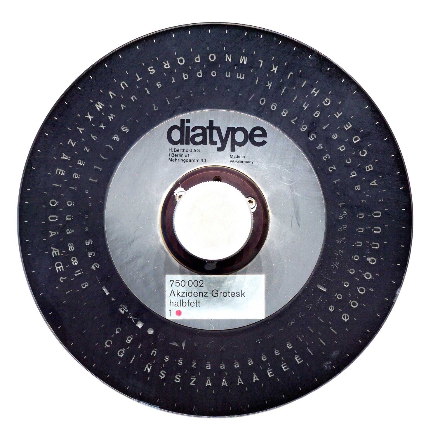
They’re kept in boxes in cabinets, so they will last for at least 100 more years or more, unless something terrible happens. That’s all pretty good. And the glass discs are in good shape, too. Berthold shipped them in protective cardboard cases. And with the larger glass Diatype discs… they’re three dimensional. They are made up of a glass disc. And then on either side, there’s metal parts that allow them to be installed in the machine. The discs were put in foam and then placed in cardboard boxes. For the discs in our collection at the university in Mainz, foam protecting the elements are all disintegrated. But that doesn’t have a negative effect on the boxes or on the discs themselves. It’s just kind of a mess when you take the disc out. You have to throw away the foam.
That’s great. Much better than some of the other stories I’ve heard of emulsion separating and things just, you know, falling apart. I’m curious if either of you have dealt with contemporary digital files, say things made within the last 20 or 30 years, where you had difficulty accessing materials due to older storage formats. It’s older, but it sounds like for the MetaFont materials, thankfully there are still active communities. Sometimes these digital file formats change and become inaccessible. Have either of you had experiences with digital archives that did not work out so well? Where you were trying to access something and it was difficult to find a machine or a drive that could read the format?
As I recall, more recently an early PostScript Type 1 font format stopped being supported by Adobe products. I have heard of colleagues who are using tools to convert some of that data. I occasionally engage in type design myself, but being a typographic designer primarily, I remember opening QuarkXPress files maybe 15 years ago that may have been produced in the late ’90s or early 2000s. I was surprised how well I was able to access and still work with them, even preserving some of the grid in the background as well as style sheets. So, there seems to have be a certain compatibility. When you look at something as old as Metafont, much of the source code from the late ’70s might still be compatible today. Meanwhile, the interface has certainly changed. Maybe Dan, you have something?
Yeah, this is probably all gone now because of Monotype. When I worked at Linotype, I had several colleagues who had started their careers at Stempel in the late ’70s or early ’80s. And Stempel had been owned by German Linotype, when German Linotype was still a subsidiary of the American company, before the German Linotype bought the American and British Linotype firms around 1987, 1988. When Stempel was still in business, so until about 1985, 1986, German Linotype was essentially a sales operation. German Linotype had Stempel employees work together with Adobe to digitize the phototype fonts from Linotype into the PostScript format. Of course, first they must have already had them in Ikarus format. Anyway, around 2005 or 2006, right after FontLab Studio 5 came out—I mean, I guess that came out in 2004, but you know, slightly after FontLab Studio 5 came out—Linotype still had all of its Ikarus files from the late 70s and 80s… maybe even very early 1990s.
I don’t know what physical format the files were stored on, but it had been transferred onto a hard drive or server somehow. I don’t know, maybe Linotype probably paid someone to do this. And then, FontLab Studio 5 could open Ikarus files. The conversion was not great, ’cause Ikarus files were saved at 10,000 UPM and had way more control points, so the conversion after you open it in FontLab, was difficult, because the glyphs were a mess. So like they’re not instantly reusable. We did a few experiments trying to make them usable. And essentially we decided that it wasn’t worth it. Because it would probably have taken just as much work to clean the glyphs up as to redraw them from scans. But that, I mean, that was kind of great. It must have been possible to re-use Ikarus files before FontLab Studio 5, by taking them through several other programs, but now FontLab Studio could just open the Ikarus files directly. It was kind of fantastic, even though it proved pointless in the end.
Yeah, but that’s still amazing. And maybe, I don’t know, maybe that data doesn’t exist anymore, but I could imagine that being an interesting research project, to actually look at the exact Ikarus data.
I bet FontLab could still do it.
Yeah, that’s interesting. I’m also curious if you all have seen any foundries making attempts to make their archives or collections more future-proof, or in formats that are more accessible. Or if you know of any particularly successful examples of this, making things accessible for the future researchers like yourselves. Have you encountered anything like this?
This is a bit of a generational issue and it is’s only just beginning, because there are actually not many foundries around that have a history older than early ’90s or late ’80s. In fact, just two weeks ago I met Rudy VanderLans and Zuzana Licko, who are a prime example of people who have made their entire collection available to the Letterform Archive in San Francisco only a few years ago — a phenomenal resource. This collection holds all of Emigre’s type design projects, including the earliest sketches. This is quite fascinating, particularly at the example of some of their early bitmap work including Lo-Res, sketched out on simple grid-line paper — a brilliant connection that is made as part of the design process and that you may rarely see these days when people work on a typeface of that kind of digital magnitude.
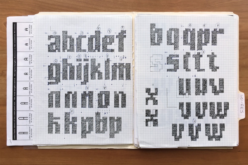
The Emigre collection is a prime example, because rarely these kinds of materials are available publicly today. Usually they remain in sort of a private domain. They might be accessible in some way, but it also means there’s still a certain degree of privilege involved to access them. You need to reach out to these collections and be in a position to travel there, but for the sake of research, of course, Dan and I would both prefer to have these sources available publicly.
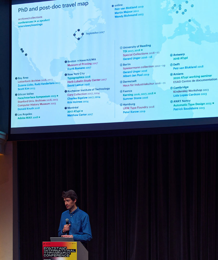
Yeah, that’s a great example. I’ve been following along with what Emigre and Letterform Archive have been doing. That’s very interesting. That kind of leads into the next thing I wanted to talk about. From what I’ve seen from the Emigre archive, there was a lot of work happening on paper on printouts with notes written in the margins and things. In your thesis, you talk about this idea of “dematerialization.” I’ve largely seen that as well. I know what you mean by this, how so many people are working purely digitally on type design projects. I mean, when I was a student at Type@Cooper in 2010, we were printing things out and marking up proofs. But a lot of the same people who were teaching me to do that are now just going purely digitally. I interviewed Erik van Blokland a few weeks ago about this recent release of his Action Grotesque. When I was talking to him about it, his comment was “I think I printed it out once, but that was by accident.” I mean his whole goal was making something for the screen first, and proofing in-browser and stuff like that. I think it’s a challenge for archives as things go forward.
Perhaps instead of thinking about things purely as dematerialized, should we instead think about what kind of new digital material is now being created?
Like in my work I have a Git repository with commit messages, which acts kind of like a journal or a diary of my process. And I have my Python scripts and .designspace files and .UFO files in addition to just the output formats (eg .otf, .ttf, .woff2) that are licensed. So I’m curious, what do you think about the digital materiality of workflows now? Maybe there’s some things that should be included in a type designer’s archive, some digital materials that maybe we also are not considering. I think you mentioned correspondence. Maybe there’s email or social media or perhaps Discord or Slack… What would be useful to someone like yourself looking back to this period right now, say with, Erik van Blokland’s recent release or something? What would you want to know about that?
I worry most about the proprietary things. So, like, email is like a pretty great format. Like, if they survive, you know. The attachments won’t be there and images probably won’t be there either. But there could be some value in plain text or lightly styled text. But things like Slack and probably Discord, those are all going to be gone. I have worked with several organizations where we used the trial version of Slack. We had the free tier, or cheapest option, whatever that was. After a certain amount of time, everything was deleted, because we didn’t have enough space available according to our plan, or we couldn’t keep things for more than six months without paying, whatever the deal must have been. And it was kind of fine. We didn’t lose anything important this way. But it worries me.
I think that files, as in Glyphs files, and RoboFont files—well, I’m pretty sure that the community is going to make sure that .UFOs will be maintained in a way over several decades, so that you’ll be able to open old files. But what about Glyphs and FontLab, or older formats? When you have access to these application files, you can see how designs developed. I’m sure that—well, I don’t know, I mean, this is just a guess—but I am sure that Tobias Frere-Jones kept all versions of Mallory going back to like the first time he opened up a font editor and started drawing. So I’m sure he also has other things that would help, say, in 50 years, to tell the story of Mallory. That might be Git, I have no idea. But if a foundry does all of its internal communication on Slack, and the typed communication includes details about new typeface development, then futures historians won’t be able to reconstruct those processes, unless foundries start backing up those records, too.
I would like to make a very simple case for screenshots. They come in a file format that has been around for a couple of decades and we might assume that they’ll be around for a little more. Going back to Metafont, a remarkable portion of the Richard Southall Collection at Reading consists of several folders of Dia slides. Some of them are early “screenshots”, actual analog photographs captured off a screen. I recall a particular set of photographs from this Dia collection — perhaps we can illustrate it in this piece — where you can see a Metafont letterform developing over a sequence of ten or so shots on screen, step by step.
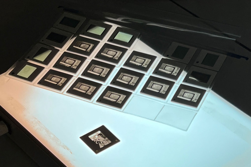
Perhaps this is a very simple yet reasonable way to document a design process: take screenshots while you work. When we consider the research period that Dan is exploring in metal type, we have a typical separation of type design and font production, where a set of character drawings might therefore serve as a reference to its production in metal. While this separation is vanishing in the digital era, screenshots might serve as a way to preserve stages without having to rely on a specific format.
Right. Yeah, I think that’s a great suggestion. As you mentioned a lot of times it’s the interfaces for digital things that don’t survive. The code behind it is pretty hardy, but the interfaces not so much. That also came up in my talk with Erik, you know, just about Superpolator. There was just a huge overhead as a solo developer to keep making the interface side of it compatible. And that’s partly why there isn’t a current version of Superpolator. That’s something (Superpolator) that I used extensively in designing Dunbar. And I’m using other forms of interpolation now, but I luckily have some screenshots from Superpolator. I can see exactly what I was looking at. Right now I’ve been thinking about trying to open up some of my files to take screenshots, but I’d have to go back to some old laptops. Hopefully those are still running. And even for something from 10 years ago, it’s actually quite tricky. But yeah, screenshots, that’s an excellent suggestion.
This is kind of a side question I was curious about– Dan, in some of your work you’ve talked about the shift from a solo punchcutter doing type design to type getting more industrialized, when there was now more separation between design and production. I was reflecting on how, as tools become more accessible, that it is easier to have a one-person shop these days. And I’m curious— So before this industrialization that you looked at, do you think that one design was often made by just a single punchcutter? Is that generally how type design was happening?
Yeah, yeah, yeah, yeah.
So we’re kind of— it’s interesting to see that full circle kind of situation.
We even have— I mean, there’s a caveat there. We even have famous (punchcutters), in the late 19th and early 20th centuries, like Edward Prince. He taught himself everything. I mean, in the beginning, he was apprenticed to a good punchcutter at the time. But like, once Prince became his own person, while he might have been working off of references that Morris or Walker gave him, and he would give strikes to someone else, because he didn’t cast fonts, he didn’t have like an assistant, or anything. And he worked from home, et cetera. So it was just him, doing all that great work on his own, occasionally checking in with his clients. But I don’t think type foundries were ever just a single person, like physical type foundries. Even someone like Walbaum, eventually his son worked with him, and he must have had some other assistants who were doing, not punchcutting, but the casting. I can’t imagine that he stood at the oven—you know, at that point it was still an oven—casting all of the letters for the orders himself. Because it’s such a waste of time if you’re a punchcutter, to be putting all of your time into that, instead of developing new products.
Well, one question I was thinking of— As things got industrialized there was now a necessity for communication about the design, about intention, because it needs to be communicated to someone else to carry out another part of the process. Is it hard to find documentation about the process before industrialization without this necessity? Or is it partially because it was just further in the past and maybe things didn’t survive?
I don’t think we have anything except specimens and in some cases, like matrices and punches. There’s some correspondence between Plantin and punchcutters, I think, but I don’t think they are— I mean, I haven’t read any of them recently, but I don’t think they’re like philosophizing over designs. It’s more of like, “I need this, please do this, send me that,” more than like talking about like the design details of things.
As the tools for type design are more democratized now, there’s a lower barrier to entry for type designers, more people can be involved, which I think is generally an amazing, wonderful thing. But then I’m also wondering if there’s something that gets lost in terms of the craft that is required. What gets lost? What can be done to learn from the craft of the past? Though on the whole I certainly think it’s a good thing.
I think typefaces today are much, much better than they were before.
Fair, okay.
Like obviously there are “not good” typefaces that are on the market, you know. But there were always bad typefaces on the market.
That’s a good perspective to be reminded of. I think that’s the thing. It’s easy to romanticize things from the past because they’re in these old books and they kind of look romantic. But actually, I think folks like you have looked closer and it is good to be reminded that there are things that were not so well-made also back then. So that’s not unique to now. Well, Ferdinand, you brought up this idea in your thesis which I loved about the “the outline as a visual statement”, showing the “digitalness”, showing the process. Specimen covers showing this with digitization marks and things like that. And I think now the most common example of this I see is indication of a Bezier point with handles on a letterform to show that it was made digitally. I wonder if there’s perhaps a better approach to show this kind of thing. What does that idea do in communication? Or like, is there a richer way to communicate the fact that something was made digitally? I wonder what’s behind that motivation, since you’ve looked into this a bit.
You wouldn’t have seen handles before 1985 because the Ikarus outline-description format didn’t have off-curve points. So, that is a visualization specific to digital letterforms before ’85 and yes, I refer to illustrations of the digital outline as a “visual statement” or as “visualizing a phenomenon”. In addition to those I also have a collection of similar examples of bitmaps. There are also indirect historic references for both formats, for example a pattern serves as an early representation of an outline — I’m thinking of the centennial anniversary publication of Berthold, which has a big outline B on the cover. It almost looks like a big pattern.
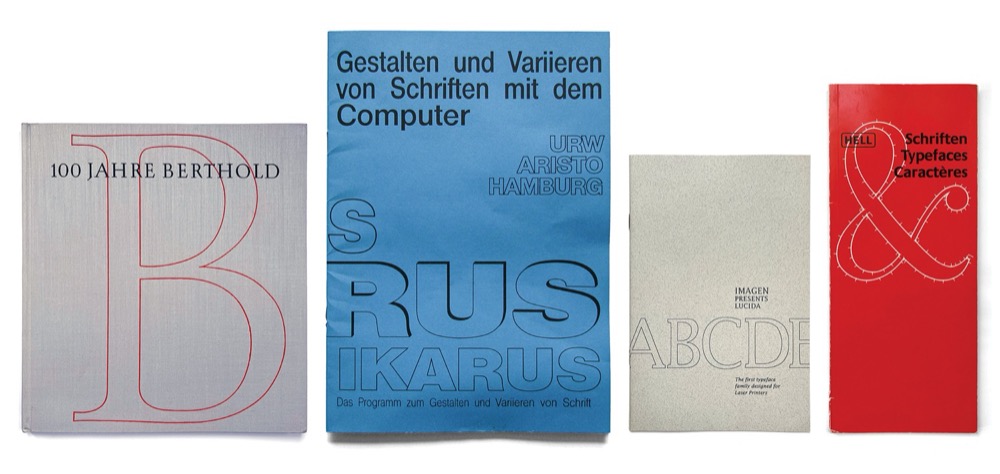
Today’s type design visualizations often reference the phenomenon of design spaces. You see all these diagrams that illustrate the variety in styles, intentionally or unintentionally referencing Rémy Peignot’s periodic table design of Frutiger’s Univers in 1957, but in a space without boundaries. Others in the sense of a Noordzij cube, but fluid and animated. These are examples that you would typically see now. We’ve gotten over the visual statement of an outline and begin describing design spaces rather than fixed instances. Donald Knuth had begun to do this in the early 1980s. As we leave these fixed models we understand that it could be anything in between — being more variable, in that sense.
Yeah, I think you’re totally right about that. That seems to be the new paradigm. Showing the space more so and, I don’t know, we'll see what the next instance of that is going to be. Dan, I think you wrote about noticing gaps in the record that you need to fill in, in your research. I’m curious what some of those gaps that you found are. What could someone like myself anticipate in order to be more clear about my documentation?
All research has gaps, but we have real gaps in German typefounding, for several reasons. One is if the company just closed, and everything was discarded. That’s totally normal. Everything gets destroyed when it’s not considered valuable. The second thing is, of course, that most foundry buildings were bombed during the Second World War, and many of those buildings burnt down or burnt out. Much of what was destroyed could not be replaced. And the third thing is just sort of like personal sorting. There’s a lot of things that I think would be really valuable to know today that people 50 years ago thought, “But everybody knows this. Why do we need to save this information or save these objects?”
What are some examples of those?
Well, for one thing, there is a gap around electrotyping. We have a little bit, but the lack of objects causes many authors to assume that the role of the punchcutter in the 20th century was as significant everywhere as, well, like it was at Enschedé with Van Krimpen’s typefaces. Anyway, after the 1840s and until new foundry typefaces stopped being made in the early ’70s, the way by which most matrices were produced was by electrotyping. This happened in the United States, too. You created an original form in the soft metal, usually type metal because they had it around. And then you put the object in an electrical chemical bath, and a negative, a three-dimensional negative is formed around it. And you can place that in another piece of metal to create a matrix. And so there’s artifacts of this process, and there’s some photographs, and there’s even sort of like a (short film that sort of tries to describe it that is available.)
But it took me until like 10 years ago, an awful lot of time, to get my head around this. Because you can go and see a matrix engraving machine, you can go and see a punch engraving machine, you can see a lot of other things from manual punchcutters. But there isn’t a type foundry whose electrotyping room that has been preserved, even though they all had them. I managed to find lots of things about the process eventually, but this was such a central part of how every type foundry operated, and it wasn’t documented in a way that I would have preferred. I mean, that’s just one of dozens of examples. We have very few drawings that have survived, as I mentioned before And designers usually didn’t submit size-specific drawings. It’s just one drawing, and then the staff interpreted it.
May I add an example?
Yeah, please.
Earlier we established that type design is a collaborative process. As researchers, we’re always curious who was involved in the design of a typeface or the manufacturing process of a font, because it provides context and adds perspective. And, correct me if I’m wrong, Dan, in type specimens of the metal type era, for example, punch-cutters are rarely mentioned.
It was very uncommon.
So, to answer your question, CJ, I think a simple strategy is to give credit. You mention all the people who are involved in the process, like those who are copywriters, proofreaders, who check your fonts, who work on extensions, maybe they just work on the accents, those who help automate part of the process, certainly with kerning and hinting. This helps immensely, because that is something that Dan and I look for in collections. Hidden figures add angles and perspectives to a story.
Yeah, that’s an excellent point.
Joyce does this pretty well on the Darden Studio site. Lists of everyone who worked on the development of a typeface can be helpful, especially later, much after the fact. Like—this is what you don’t want to happen, obviously—but you could have worked together with like 10 other people over a long time period on some project. And in 100 years, people are going to be like, "Oh man, now AI just learned one more piece of information about so-and-so."
Right.
As in, one of your collaborators, who might have developed into an important personality, even though the role they played in your project was small.
Totally. I think that’s an excellent point. It’s something I’m trying to do more. I’m looking at tools that were useful. RoboFont extensions. This is more and more of my process. So a big reason why I interviewed Erik recently is because he made Superpolator, but also the Mutator Math underneath Superpolator was open source through Adobe and then Loïc Sander built a tool called ScaleFast on top of the MutatorMath code which I also used. And so I’m trying to go back and look at what I was actually using in my work and at least have some documentation. For myself, but for anyone else who might be interested, and to give credit to those folks. Because in my world that’s a huge part. I mean, even the Word-O-Mat extension by Nina Stössinger is hugely influential and helpful in my process, those kinds of things.
So crediting other developers is important. And getting feedback from people like Cyrus Highsmith and David Jonathan Ross was really helpful. And Jill Pichotta was a huge help to me in looking through kerning, and those kind of things. In the end, I decided what to implement or not, but getting feedback from other folks was very important. So I’m looking at ways to document that better myself, and I like to see that other designers that are doing that also. Something that I’m trying to do myself, and recommending others to do, is to spend some time doing documentation. Maybe if it’s not right on release day, but a year later, five years later, ten years… In my case with Dunbar it’s 10 years. Spend time looking back and seeing what else ended up being useful for a project. I know Dan, you probably have to go soon. But I appreciate both of you taking the time. And yeah, I maybe I'll if anything else comes up, I'll follow up via email. This conversation was very inspiring for me and very useful. And I’m hoping that documenting this will be useful to other folks who are addressing some of these same issues right now.
I enjoyed this a lot. It was a good start to the new week.
All right. Thank you both for your time. I appreciate it. Okay, take care.
Bye.
Take care.